How to enlarge the SVG icon in material-ui iconButtons?
Solution 1
Note: iconStyle prop is no longer supported on IconButton Material UI making this answer obsolete
You have to set the size of the icon in the iconStyle prop in <IconButton>. Example below from the material-ui docs.
From my experience, if you set just the height or the width, nothing happens--only seems to work when you set height & width to the same value.
import React from 'react';
import IconButton from 'material-ui/IconButton';
import ActionHome from 'material-ui/svg-icons/action/home';

const styles = {

  largeIcon: {
    width: 60,
    height: 60,
  },

};

const IconButtonExampleSize = () => (
  <div>
    <IconButton
      iconStyle={styles.largeIcon}

    >
      <ActionHome />
    </IconButton>
  </div>
);
Solution 2
do this
<SomeIcon className="svg_icons"/>

.svg_icons {
  transform: scale(1.8);
}
just use scale :D it works
Solution 3
I faced the same issue while using the last React version (which is today v16.13.1) and Material-ui (which is today v4.9.14).
How I solved it?
By simply adding this style to the icon button
MyIconButton: {
    '& svg': {
      fontSize: theSizeIWant
    }
}
Complete example
import React from "react";
import { makeStyles } from '@material-ui/core/styles';
import IconButton from '@material-ui/core/IconButton';
import DeleteIcon from '@material-ui/icons/Delete';
const useStyles = makeStyles((theme) => ({
deleteIcon1: {
'& svg': {
fontSize: 25
}
},
deleteIcon2: {
'& svg': {
fontSize: 50
}
},
deleteIcon3: {
'& svg': {
fontSize: 75
}
},
deleteIcon4: {
'& svg': {
fontSize: 100
}
}
}));
export default function App() {
const classes = useStyles();
return (
<div className="App">
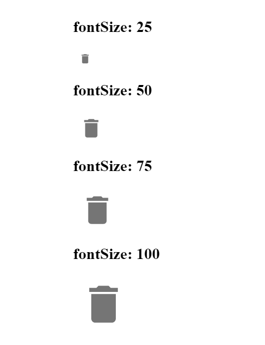
<h1>fontSize: 25</h1>
<IconButton className={classes.deleteIcon1}>
<DeleteIcon />
</IconButton>
<h1>fontSize: 50</h1>
<IconButton className={classes.deleteIcon2}>
<DeleteIcon />
</IconButton>
<h1>fontSize: 75</h1>
<IconButton className={classes.deleteIcon3}>
<DeleteIcon />
</IconButton>
<h1>fontSize: 100</h1>
<IconButton className={classes.deleteIcon4}>
<DeleteIcon />
</IconButton>
</div>
);
}
and the result will be:
Live running code
I created this codesandbox.
Hope this helps!
Solution 4
No. Most of the other answers are unsatisfactory and are poor practice, at least in 2021. This answer is literally answered in the documentation here and doesn't require any CSS hacks to get working.
In MUI, the Button and IconButton components are just essentially wrappers that nest the child Icon element in an <a> or <Link> (react-router) element. They don't have any intrinsic control over the size. Thus, to increase the button size, just increase the size of the Icon child of IconButton using the fontSize property. This will automatically make the button larger.
For instance, to make the IconButton below larger:
<IconButton>
  <Icon />
</IconButton>
We just increase the size of the Icon child directly.
<IconButton>
  <Icon fontSize="large" />
</IconButton>
However, this is largest size you can specify with the fontSize property. To go even larger, we must configure the CSS font-size property manually.
<IconButton>
  <Icon style={{ fontSize: 60 }} />
</IconButton>
Simple as.
EDIT: Apparently, for whatever reason, Button components have a size property that allows their size to be controlled, but IconButton components don't. I'm not sure why MUI is so inconsistent...
Solution 5
With the latest version of material-ui (3.1.0), you can change padding of IconButton and fontSize of SvgIcon to update the looks.
const styles = theme => ({
  smallButton: {
    padding: 6
  },
  largeButton: {
    padding: 24
  },
  largeIcon: {
    fontSize: "3em"
  },
  input: {
    display: "none"
  }
});

function IconButtons(props) {
  const { classes } = props;
  return (
    <div>
      <IconButton className={classes.smallButton} aria-label="Delete">
        <DeleteIcon fontSize="small" />
      </IconButton>
      <IconButton aria-label="Delete">
        <DeleteIcon fontSize="large" />
      </IconButton>
      <IconButton className={classes.largeButton} aria-label="Delete">
        <DeleteIcon className={classes.largeIcon} />
      </IconButton>
    </div>
  );
}
Comments
-
Jun Yin almost 2 years
Has anyone build webpages using react.js and the Material UI library? How should I resize the icon size? It is a svg icon. I just built an "create new" component, which is a piece of material paper with a content add button on the top. Here is the code.
import React from 'react';
import Paper from 'material-ui/lib/paper';
import ContentAdd from 'material-ui/lib/svg-icons/content/add';
import IconButton from 'material-ui/lib/icon-button';


const styleForPaper = {
  width: '96vw',
  height: '20vh',
  margin: 20,
  textAlign: 'center',
  display: 'inline-block',
};

const styleForButton = {
  'marginTop': '7vh',
};


const PaperToAddNewWidgets = () => (
  <div>

    <Paper style={styleForPaper} zDepth={2}>

    <IconButton
        style={styleForButton}
        touch={true}
        tooltip="Add New Widget">

    <ContentAdd/>

    </IconButton>

    </Paper>
  </div>
);

export default PaperToAddNewWidgets;
It looks OK (make sure you are viewing it at full size), but the icon is too small. Then I opened the chrome dev tool, and saw the following html code.
<div style="background-color:#ffffff;transition:all 450ms cubic-bezier(0.23, 1, 0.32, 1) 0ms;box-sizing:border-box;font-family:Roboto, sans-serif;-webkit-tap-highlight-color:rgba(0,0,0,0);box-shadow:0 3px 10px rgba(0,0,0,0.16),
         0 3px 10px rgba(0,0,0,0.23);border-radius:2px;width:96vw;height:20vh;margin:20px;text-align:center;display:inline-block;mui-prepared:;" data-reactid=".0.2.0.1.0"><button style="border:10px;background:none;box-sizing:border-box;display:inline-block;font:inherit;font-family:Roboto, sans-serif;tap-highlight-color:rgba(0, 0, 0, 0);cursor:pointer;text-decoration:none;outline:none;transform:translate3d(0, 0, 0);position:relative;transition:all 450ms cubic-bezier(0.23, 1, 0.32, 1) 0ms;padding:12px;width:48px;height:48px;font-size:0;margin-top:7vh;mui-prepared:;-webkit-appearance:button;" tabindex="0" type="button" data-reactid=".0.2.0.1.0.0"><div data-reactid=".0.2.0.1.0.0.0"><span style="height:100%;width:100%;position:absolute;top:0;left:0;overflow:hidden;mui-prepared:;" data-reactid=".0.2.0.1.0.0.0.0"></span><div style="position: absolute; font-family: Roboto, sans-serif; font-size: 14px; line-height: 32px; padding: 0px 16px; z-index: 3000; color: rgb(255, 255, 255); overflow: hidden; top: -10000px; border-radius: 2px; opacity: 0; left: -44px; transition: top 0ms cubic-bezier(0.23, 1, 0.32, 1) 450ms, transform 450ms cubic-bezier(0.23, 1, 0.32, 1) 0ms, opacity 450ms cubic-bezier(0.23, 1, 0.32, 1) 0ms; box-sizing: border-box; -webkit-user-select: none;" data-reactid=".0.2.0.1.0.0.0.1:0"><div style="position: absolute; left: 50%; top: 0px; transform: translate(-50%, -50%); border-radius: 50%; transition: width 0ms cubic-bezier(0.23, 1, 0.32, 1) 450ms, height 0ms cubic-bezier(0.23, 1, 0.32, 1) 450ms, backgroundColor 450ms cubic-bezier(0.23, 1, 0.32, 1) 0ms; width: 0px; height: 0px; background-color: transparent;" data-reactid=".0.2.0.1.0.0.0.1:0.0"></div><span style="position:relative;white-space:nowrap;mui-prepared:;" data-reactid=".0.2.0.1.0.0.0.1:0.1">Add New Widget</span></div><svg style="display:inline-block;height:24px;width:24px;transition:all 450ms cubic-bezier(0.23, 1, 0.32, 1) 0ms;fill:rgba(0, 0, 0, 0.87);mui-prepared:;-webkit-user-select:none;" viewBox="0 0 24 24" data-reactid=".0.2.0.1.0.0.0.1:2:$/=10"><path d="M19 13h-6v6h-2v-6H5v-2h6V5h2v6h6v2z" data-reactid=".0.2.0.1.0.0.0.1:2:$/=10.0"></path></svg></div></button></div>
Using chrome dev tool, I revised the svg icon size and the viewbox property of svg and made the icon larger in browser. But I am not sure how I can resize the icon size in my code. If I write a CSS file to revise the svg it will be problematic if there are more than one svg elements.
-
Alvin K. about 8 yearsIf you're using
<i class="material-icons">&#abc;</i>, then it is simply updating the NN offont-size: NNpxeg: in jQuery$(".material-icons").css('font-size', "48px"); -
Jun Yin about 8 yearsAlvin, thank you for your insights. "font-size" works for "<i class="material-icons">&#abc;</i>", but does not solve my problems. I used the <ContentAdd/> from 'material-ui/lib/svg-icons/content/add', which is generates svg icons on webpage.
-
Alvin K. about 8 yearsMy bad, to increase SVG Icons, you need to adjust the
style={}of<svg style="display:inline-block;height:24px;width:24px;..., eg: try changingheight:48px; width:48px. There are some icons which are FONT base, for that it isfont-sizetweak -
 Brandon over 7 yearsjust to clarify,
material-ui(in react) isn't based onmaterial design lite. if you're looking for MDL, check out thereact-mdllibrary -
Jun Yin about 7 yearsThanks, @Brandon. I will update the question after I get the privilege to edit questions.
-
shanks_9790 about 3 yearsUse inspect option to track the classname & use your desired style, After each style override use !important to overwrite
-
-
 Clemens Himmer over 7 yearsWow, tried to set the Icon's style itself, had no clue it worked this way. Who designed that? sigh.
 -
madav almost 4 yearsproblem is the width doesn't grow with it causing overlap
-
Tom Stambaugh about 3 yearsIt appears that the
iconStyleprop is no longer supported bymaterial-ui. That makes this accepted answer incorrect. -
 Ale DC over 2 yearsThe scale() method increases or decreases the size of an element (according to the parameters given for the width and height). The following example increases the <div> element to be two times of its original width, and three times of its original height: ``` div { transform: scale(2, 3); } ```