How to fit to screen after changing viewport width on orientation change?
Solution 1
I had this problem and wrote some JavaScript to fix it. I put it on Github here:
https://github.com/incompl/ios-reorient
Here is the code for your convenience:
window.document.addEventListener('orientationchange', function() {
  var iOS = navigator.userAgent.match(/(iPad|iPhone|iPod)/g);
  var viewportmeta = document.querySelector('meta[name="viewport"]');
  if (iOS && viewportmeta) {
    if (viewportmeta.content.match(/width=device-width/)) {
      viewportmeta.content = viewportmeta.content.replace(/width=[^,]+/, 'width=1');
    }
    viewportmeta.content = viewportmeta.content.replace(/width=[^,]+/, 'width=' + window.innerWidth);
  }
  // If you want to hide the address bar on orientation change, uncomment the next line
  // window.scrollTo(0, 0);
}, false);
Solution 2
OK, the answer lay in the *-scale attributes after all.
You can force a specific scale by setting both maximum-scale and minimum-scale to the same value. But you have to sacrifice user scaling by setting the meta tag to <meta name='viewport' content='user-scalable=no' />.
Note that the *-scale settings are relative to the device's screen dimensions—which vary from device to device. Fortunately you can look these up in the screen object in JS.
So, if your content width is under 980, your forced scale should be screen_dimension / content_width.
This updated version of my above JS has made orientation changes work smoothly. Tested on iPhone 4 and iPad 2.
    function adapt_to_orientation() {
      var content_width, screen_dimension;

      if (window.orientation == 0 || window.orientation == 180) {
        // portrait
        content_width = 630;
        screen_dimension = screen.width * 0.98; // fudge factor was necessary in my case
      } else if (window.orientation == 90 || window.orientation == -90) {
        // landscape
        content_width = 950;
        screen_dimension = screen.height;
      }

      var viewport_scale = screen_dimension / content_width;

      // resize viewport
      $('meta[name=viewport]').attr('content',
        'width=' + content_width + ',' +
        'minimum-scale=' + viewport_scale + ', maximum-scale=' + viewport_scale);
    }
Solution 3
use the wisdom of this post and simply get the width and height of the container of your script (window width&height)... https://stackoverflow.com/a/9049670/818732
using this viewport: target-densitydpi=device-dpi, width=device-width, initial-scale=1, user-scalable=no solved my problems on android AND ios. Note that target-densitydpi will be flagged on ALL other devices but Android but won't do any harm. It'll make sure nothing is scaled automatically.
Solution 4
Had a similar problem with iOS, after some testing ended up with a solution you can find here
Reset Zoom on iOS after viewport width change
In my solution zoom is disabled but you can freely remove "user-scalable=no" to make it zoomable.
Adam Florin
Updated on July 05, 2022Comments
-
Adam Florin almost 2 years
I need the viewport width for a page to be 950px in landscape and 630px in portrait. These pixel widths are unfortunately inflexible.
I'm adjusting the width of the DOM content based on orientation using CSS media queries.
I'm listening for orientation change events in JS to resize the viewport on orientation change.
Everything looks good on initial page load (portrait or landscape).
However, after an orientation change, Mobile Safari preserves the previous scale setting, instead of fitting the viewport to the screen. A double-tap or two straightens it out. But I need that to be automatic.
I've attached the source below, and uploaded it to a demo URL.
Below are screen captures taken after orientation changes: from landscape to portrait, and from portrait to landscape.
How can I force Safari to automatically set the viewport width to the screen width? Or am I going about this all wrong?
Changing the various scale settings in the viewport have not helped. Setting
maximum-scale=1.0orinitial-scale=1.0appears to override mywidth, settingwidthtodevice-width(i.e. 1024 or 768 on my iPad 2), leaving dead margin space. Settingminimum-scale=1.0appears to do nothing.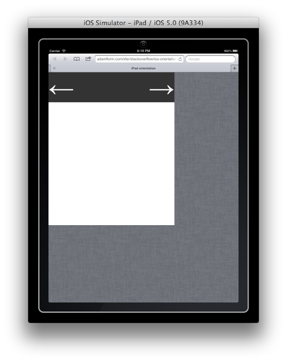
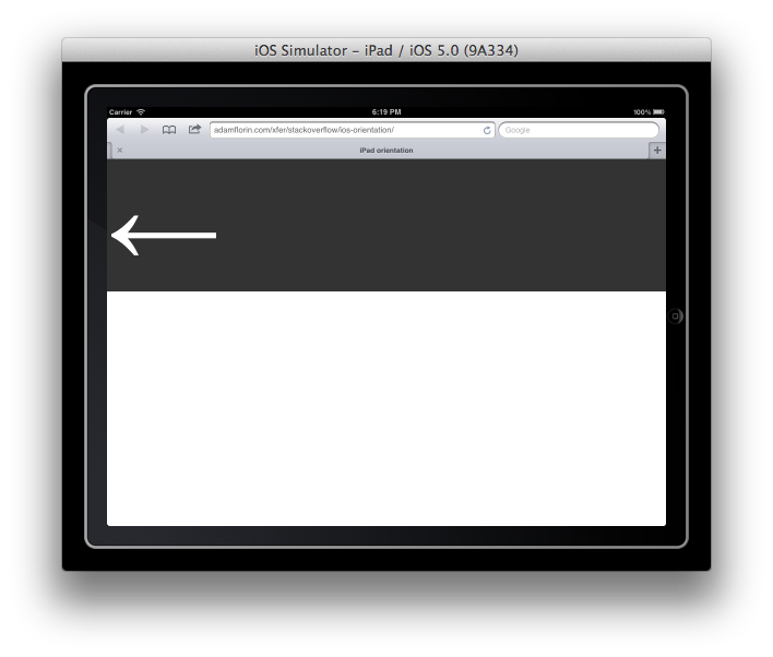
<!DOCTYPE html> <html> <head> <title>iPad orientation</title> <meta name="viewport" content="user-scalable=yes"> <script src="jquery-1.4.2.min.js" type="text/javascript"></script> <script type="text/javascript" charset="utf-8">; /** * update viewport width on orientation change */ function adapt_to_orientation() { // determine new screen_width var screen_width; if (window.orientation == 0 || window.orientation == 180) { // portrait screen_width = 630; } else if (window.orientation == 90 || window.orientation == -90) { // landscape screen_width = 950; } // resize meta viewport $('meta[name=viewport]').attr('content', 'width='+screen_width); } $(document).ready(function() { // bind to handler $('body').bind('orientationchange', adapt_to_orientation); // call now adapt_to_orientation(); }); </script> <style type="text/css" media="screen"> body { margin: 0; } #block { background-color: #333; color: #fff; font-size: 128px; /* landscape */ width: 950px; } #block .right { float: right } @media only screen and (orientation:portrait) { #block { width: 630px; } } </style> </head> <body> <div id="block"> <div class="right">→</div> <div class="left">←</div> </div> </body> </html> -
Rick about 11 yearsI too can confirm the above has wonderful results on an ipad (May 2013)
-
Maya Kathrine Andersen almost 11 yearsObviously screws up the width on many other devices. So not really a good solution. But there is finally something to work with :-)