How to fix footer overlapping content when resizing
Solution 1
Removing position:absolute; from the footer in the css appears to work. Perhaps consider having it set to absolute at wider screen sizes using media queries if having position:absolute is absolutely (pardon the pun) necessary.
I provided a snippet with the absolute positioning removed, as well as the potential addition to a media query, which is commented out, but there to demonstrate.
/* Sticky footer styles
        -------------------------------------------------- */
            html {
              position: relative;
              min-height: 100%;
            }
            body {
              /* Margin bottom by footer height */
              margin-bottom: 60px;
            }
            footer {
              width: 100%;
              /* Set the fixed height of the footer here */
              height: 340px;
              background-color: #f5f5f5;
            }
            /* Custom page CSS
        -------------------------------------------------- */
            /* Not required for template or sticky footer method. */
            body > .container {
              padding: 60px 15px 0;
            }
            .container .text-muted {
              margin: 20px 0;
            }
            footer > .container {
              padding-right: 15px;
              padding-left: 15px;
            }
            code {
              font-size: 80%;
            }
            /*!
         * Start Bootstrap - Freelancer Bootstrap Theme (http://startbootstrap.com)
         * Code licensed under the Apache License v2.0.
         * For details, see http://www.apache.org/licenses/LICENSE-2.0.
         */
            body {
              overflow-x: hidden;
            }
            header {
              text-align: center;
              color: #fff;
              background: #18bc9c;
            }
            header .container {
              padding-top: 100px;
              padding-bottom: 50px;
            }
            @media(min-width:768px) {
              header .container {
                padding-top: 200px;
                padding-bottom: 69px;
              }
              header .intro-text .name {
                font-size: 4.75em;
              }
              header .intro-text .skills {
                font-size: 1.75em;
              }
              /*
                ****Optional****
                footer{
                position:absolute;
                bottom:0px;
                }*/
            }
            @media(min-width:768px) {
              .navbar-fixed-top {
                padding: 25px 0;
                -webkit-transition: padding .3s;
                -moz-transition: padding .3s;
                transition: padding .3s;
              }
              .navbar-fixed-top .navbar-brand {
                font-size: 2em;
                -webkit-transition: all .3s;
                -moz-transition: all .3s;
                transition: all .3s;
              }
              .navbar-fixed-top.navbar-shrink {
                padding: 10px 0;
              }
              .navbar-fixed-top.navbar-shrink .navbar-brand {
                font-size: 1.5em;
              }
            }
            .navbar {
              text-transform: uppercase;
              font-family: Montserrat, "Helvetica Neue", Helvetica, Arial, sans-serif;
              font-weight: 700;
            }
            .navbar a:focus {
              outline: 0;
            }
            .navbar .navbar-nav {
              letter-spacing: 1px;
            }
            .navbar .navbar-nav li a:focus {
              outline: 0;
            }
            .navbar-default,
            .navbar-inverse {
              border: 0;
              background-color: #233140;
            }
            footer {
              color: #fff;
            }
            footer h3 {
              margin-bottom: 30px;
            }
            footer .footer-above {
              padding-top: 50px;
              background-color: #2c3e50;
            }
            footer .footer-col {
              margin-bottom: 50px;
            }
            footer .footer-below {
              padding: 25px 0;
              background-color: #233140;
            }
<!-- Navigation -->
<nav class="navbar navbar-default navbar-fixed-top">
<div class="container">
<!-- Brand and toggle get grouped for better mobile display -->
<div class="navbar-header page-scroll">
<!-- simple code -->
</div>
<!-- Collect the nav links, forms, and other content for toggling -->
<div class="collapse navbar-collapse" id="bs-example-navbar-collapse-1">
<!-- simple code -->
</div>
<!-- /.navbar-collapse -->
</div>
<!-- /.container-fluid -->
</nav>
<!-- Begin page content -->
<header>
<div class="container">
<div class="row">
<div class="col-lg-12">
<img class="img-responsive" src="<?php echo base_url(); ?>assets/img/simple_img.png" alt="" style="height: 200px;">
<div class="intro-text">
<!-- simple intro -->
</div>
</div>
</div>
</div>
</header>
<footer class="text-center">
<div class="footer-above">
<div class="container">
<div class="row">
<div class="footer-col col-md-4">
<h3>Location</h3>
<p>3481 Melrose Place
<br>Beverly Hills, CA 90210</p>
</div>
<div class="footer-col col-md-4">
<h3>Around the Web</h3>
<ul class="list-inline">
<!-- some social networks -->
</ul>
</div>
<div class="footer-col col-md-4">
<h3>About Freelancer</h3>
<p>Freelance is a free to use, open source Bootstrap theme created by <a href="http://startbootstrap.com">Start Bootstrap</a>.</p>
</div>
</div>
</div>
</div>
<div class="footer-below">
<div class="container">
<div class="row">
<div class="col-lg-12">
Copyright © Author
<?php echo date( "Y"); ?>
</div>
</div>
</div>
</div>
</footer>Solution 2
The way Bootstrap sees how you want to change sizes for different screen sizes are in the column size identifiers. And each number is a fraction of 12.
<div class="footer-col col-md-4">
means you want the footer to take 4/12 of the screen on devices medium or higher. To designate that you want it to be different on different sizes, you would put something like
<div class="footer-col col-md-4 col-sm-12">
to mean that you want it to take up 4/12 of the screen on medium devices or larger, and 12/12 of the screen on small devices up to medium.
Dan
Updated on June 28, 2022Comments
-
Dan almost 2 years
I have a problem with a template. On a large screen, it's look fine, like this:
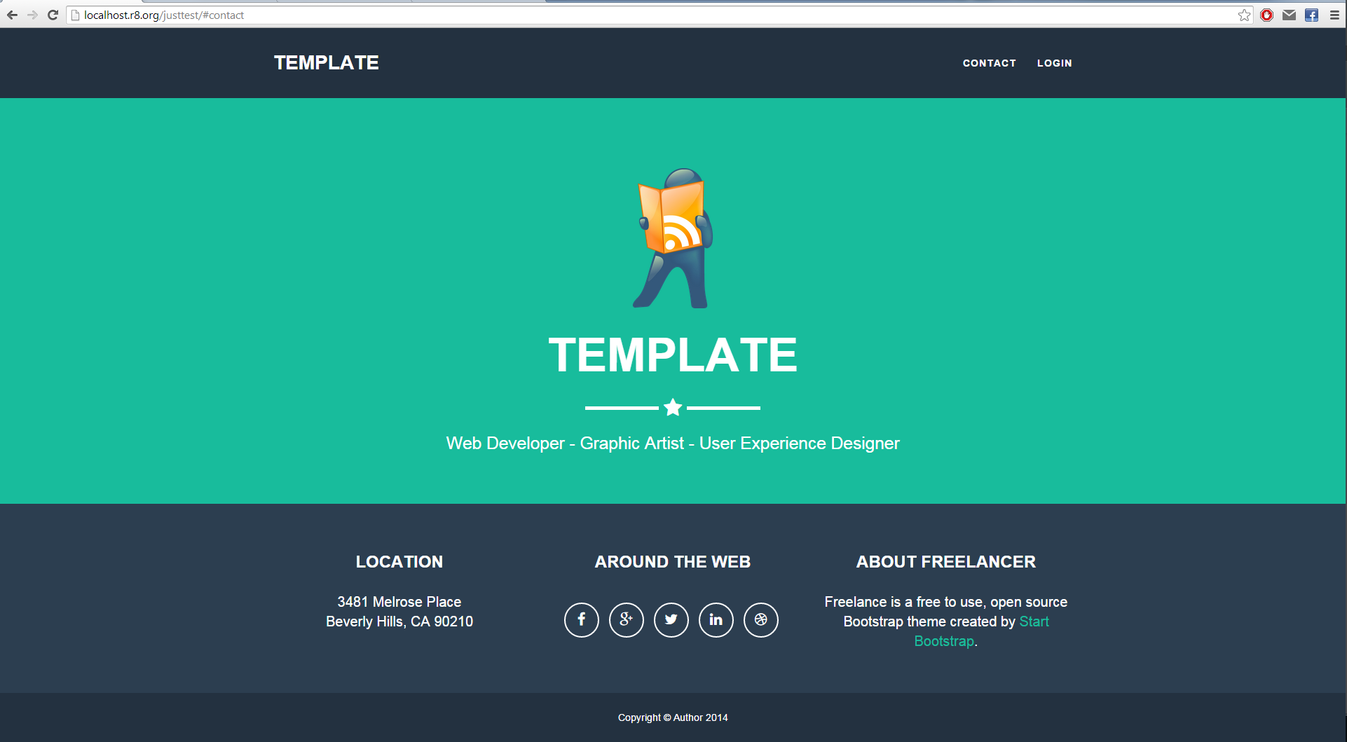
But when I resize my browser, the content won't push the footer down. Here is a picture:

Here is my code, which is too long so forgive me. index.php
<!-- Navigation --> <nav class="navbar navbar-default navbar-fixed-top"> <div class="container"> <!-- Brand and toggle get grouped for better mobile display --> <div class="navbar-header page-scroll"> <!-- simple code --> </div> <!-- Collect the nav links, forms, and other content for toggling --> <div class="collapse navbar-collapse" id="bs-example-navbar-collapse-1"> <!-- simple code --> </div> <!-- /.navbar-collapse --> </div> <!-- /.container-fluid --> </nav> <!-- Begin page content --> <header> <div class="container"> <div class="row"> <div class="col-lg-12"> <img class="img-responsive" src="<?php echo base_url(); ?>assets/img/simple_img.png" alt="" style="height: 200px;"> <div class="intro-text"> <!-- simple intro --> </div> </div> </div> </div> </header> <footer class="text-center"> <div class="footer-above"> <div class="container"> <div class="row"> <div class="footer-col col-md-4"> <h3>Location</h3> <p>3481 Melrose Place<br>Beverly Hills, CA 90210</p> </div> <div class="footer-col col-md-4"> <h3>Around the Web</h3> <ul class="list-inline"> <!-- some social networks --> </ul> </div> <div class="footer-col col-md-4"> <h3>About Freelancer</h3> <p>Freelance is a free to use, open source Bootstrap theme created by <a href="http://startbootstrap.com">Start Bootstrap</a>.</p> </div> </div> </div> </div> <div class="footer-below"> <div class="container"> <div class="row"> <div class="col-lg-12"> Copyright © Author <?php echo date("Y"); ?> </div> </div> </div> </div> </footer>Here is my Css, which is also too long so forgive me( I deleted some irrelevant code ).
            /* Sticky footer styles
        -------------------------------------------------- */
        html {
          position: relative;
          min-height: 100%;
        }
        body {
          /* Margin bottom by footer height */
          margin-bottom: 60px;
        }
        footer {
          position: absolute;
          bottom: 0;
          width: 100%;
          /* Set the fixed height of the footer here */
          height: 340px;
          background-color: #f5f5f5;
        }


        /* Custom page CSS
        -------------------------------------------------- */
        /* Not required for template or sticky footer method. */

        body > .container {
          padding: 60px 15px 0;
        }
        .container .text-muted {
          margin: 20px 0;
        }

        footer > .container {
          padding-right: 15px;
          padding-left: 15px;
        }

        code {
          font-size: 80%;
        }

        /*!
         * Start Bootstrap - Freelancer Bootstrap Theme (http://startbootstrap.com)
         * Code licensed under the Apache License v2.0.
         * For details, see http://www.apache.org/licenses/LICENSE-2.0.
         */

        body {
            overflow-x: hidden;
        }

        header {
            text-align: center;
            color: #fff;
            background: #18bc9c;
        }

        header .container {
            padding-top: 100px;
            padding-bottom: 50px;
        }

        @media(min-width:768px) {
            header .container {
                padding-top: 200px;
                padding-bottom: 69px;
            }

            header .intro-text .name {
                font-size: 4.75em;
            }

            header .intro-text .skills {
                font-size: 1.75em;
            }
        }

        @media(min-width:768px) {
            .navbar-fixed-top {
                padding: 25px 0;
                -webkit-transition: padding .3s;
                -moz-transition: padding .3s;
                transition: padding .3s;
            }

            .navbar-fixed-top .navbar-brand {
                font-size: 2em;
                -webkit-transition: all .3s;
                -moz-transition: all .3s;
                transition: all .3s;
            }

            .navbar-fixed-top.navbar-shrink {
                padding: 10px 0;
            }

            .navbar-fixed-top.navbar-shrink .navbar-brand {
                font-size: 1.5em;
            }
        }

        .navbar {
            text-transform: uppercase;
            font-family: Montserrat,"Helvetica Neue",Helvetica,Arial,sans-serif;
            font-weight: 700;
        }

        .navbar a:focus {
            outline: 0;
        }

        .navbar .navbar-nav {
            letter-spacing: 1px;
        }

        .navbar .navbar-nav li a:focus {
            outline: 0;
        }

        .navbar-default,
        .navbar-inverse {
            border: 0;
            background-color:#233140;
        }

        footer {
            color: #fff;
        }

        footer h3 {
            margin-bottom: 30px;
        }

        footer .footer-above {
            padding-top: 50px;
            background-color: #2c3e50;
        }

        footer .footer-col {
            margin-bottom: 50px;
        }

        footer .footer-below {
            padding: 25px 0;
            background-color: #233140;
        }
How can I solve this, so the page content will push the footer down...at any size of browser. Any help is appreciated.
-
mwebber over 9 yearsYour footer is positioned absolutely at bottom(sticky) and will always appear there. remove its absolute positioning and it should appear under the header
-
Dan over 9 yearsI try to change to relative, but then a white space appear wright under footer...
-
mwebber over 9 yearsyou can use media queries, to change it only for mobile devices.
-
Dan over 9 yearsYep...that's it...i missed that ..Thank you
-