How to have badge icon at corner of a layout
Solution 1
Use a FrameLayout (instead of RelativeLayout) and put button and image into it.
Position the image (cirle with number) and button via
android:layout_gravity="top|left"
android:layout_marginTop="Xdp"
android:layout_marginLeft="Xdp"
Hope this will helps you
Solution 2
Maybe a little old, but if someone reads this post, now you have solution with "new" ConstraintLayout.
So first I prefer to do this in new layout file (name of the file: user_cart_with_badge.xml) which I will include it in toolbar.
So in this, file I will define icon that I want to use it, and text, that will be used as badge.
Content of this file:
    <?xml version="1.0" encoding="utf-8"?>
<android.support.constraint.ConstraintLayout xmlns:android="http://schemas.android.com/apk/res/android"
    xmlns:app="http://schemas.android.com/apk/res-auto"
    xmlns:tools="http://schemas.android.com/tools"
        android:id="@+id/layoutforprofileimage"
        android:layout_width="wrap_content"
        android:layout_height="wrap_content">

    <ImageButton
        android:id="@+id/btnOpenCart"
        android:layout_width="30dp"
        android:layout_height="30dp"
        android:layout_marginBottom="8dp"
        android:layout_marginEnd="8dp"
        android:layout_marginStart="8dp"
        android:layout_marginTop="8dp"
        android:background="?android:attr/selectableItemBackground"
        android:gravity="end"
        app:srcCompat="@drawable/ic_menu_shooping_cart"
        app:layout_constraintBottom_toBottomOf="parent"
        app:layout_constraintEnd_toEndOf="parent"
        app:layout_constraintStart_toStartOf="parent"
        app:layout_constraintTop_toTopOf="parent" />

    <TextView
        android:id="@+id/text"
        android:layout_width="wrap_content"
        android:layout_height="wrap_content"
        android:layout_alignParentEnd="true"
        android:layout_alignParentRight="true"
        android:layout_alignParentTop="true"
        android:layout_gravity="center_horizontal"
        android:layout_marginBottom="16dp"
        android:layout_marginStart="16dp"
        android:layout_marginLeft="16dp"
        android:layout_marginTop="8dp"
        android:adjustViewBounds="true"
        android:gravity="center"
        android:minHeight="17sp"
        android:minWidth="17sp"
        android:padding="3dp"
        android:paddingBottom="1dp"
        android:paddingLeft="4dp"
        android:paddingRight="4dp"
        android:scaleType="fitStart"
        android:text="3"
        android:textColor="#ffffff"
        android:textSize="12sp"
        android:visibility="visible"
        android:background="@drawable/badge_background"
        app:layout_constraintBottom_toBottomOf="@+id/btnOpenCart"
        app:layout_constraintEnd_toEndOf="parent"
        app:layout_constraintStart_toStartOf="@+id/btnOpenCart"
        app:layout_constraintTop_toTopOf="parent" />

</android.support.constraint.ConstraintLayout>
Now, we should also define background for our TextView badge. Create new file in your drawable folder, I have called it "badge_background.xml". I think that on this link you can see more about shapes for this background, if you don't like mine.
Content of this file:
<?xml version="1.0" encoding="utf-8"?>
<shape xmlns:android="http://schemas.android.com/apk/res/android"
    android:shape="oval">
    <corners android:radius="2dp" />
    <solid
        android:color="#ff4848"/>

    <padding
        android:bottom="6dp"
        android:left="6dp"
        android:right="6dp"
        android:top="6dp" />
</shape>
And finally all you need now is to include content of user_cart_with_badge.xml layout, to file/layout where you need this custom image with badge. Let's say that you need it in toolbar.
<android.support.v7.widget.Toolbar
        android:id="@+id/toolbarMeat"
        android:layout_width="match_parent"
        android:layout_height="?attr/actionBarSize"
        android:background="?attr/colorPrimary"
        app:theme="@style/AppTheme.Toolbar"
        android:gravity="end">


        <include
            android:id="@+id/cardContainerForSettingsData"
            layout="@layout/user_cart_with_badge"
            android:layout_width="wrap_content"
            android:layout_height="50dp"
            android:layout_marginBottom="8dp"
            android:layout_marginEnd="8dp"
            android:layout_marginStart="8dp"
            android:layout_marginTop="8dp"
            app:layout_constraintBottom_toBottomOf="parent"
            app:layout_constraintEnd_toEndOf="parent"
            app:layout_constraintStart_toStartOf="parent"
            app:layout_constraintTop_toBottomOf="@+id/user_info_section" />


    </android.support.v7.widget.Toolbar>
Hope, that this will help someone, who reads this, after years.
Solution 3
 It can be done like this
 <RelativeLayout xmlns:android="http://schemas.android.com/apk/res/android"
    xmlns:tools="http://schemas.android.com/tools"
    android:id="@+id/layoutforprofileimage"
    android:layout_width="100dp"
    android:layout_height="100dp">

<ImageView
    android:id="@+id/image"
    android:layout_width="100dp"
    android:padding="2dp"
    android:src="@drawable/image"
    android:layout_height="100dp"
    android:layout_margin="6dp"/>

<TextView
    android:id="@+id/text"
    android:layout_width="wrap_content"
    android:layout_height="wrap_content"
    android:scaleType="fitStart"
    android:layout_marginRight="0dp"
    android:padding="2dp"
    android:background="@drawable/button_pressed"
    android:gravity="center"
    android:minWidth="17sp"
    android:adjustViewBounds="true"
    android:minHeight="17sp"
    android:paddingBottom="1dp"
    android:paddingLeft="4dp"
    android:paddingRight="4dp"
    android:text="0"
    android:textColor="#ffffffff"
    android:textSize="12sp"
    android:visibility="visible"
    android:layout_gravity="center_horizontal"
    android:layout_alignParentTop="true"
    android:layout_alignParentEnd="true"
    />

</RelativeLayout>
Solution 4
Try this way to get BadgeCounter
public class BadgeDrawable extends Drawable {

   private float mTextSize;
   private Paint mBadgePaint;
   private Paint mBadgePaint1;
   private Paint mTextPaint;
   private Rect mTxtRect = new Rect();

   private String mCount = "";
   private boolean mWillDraw = false;

   public BadgeDrawable(Context context) {
      mTextSize = context.getResources().getDimension(R.dimen.badge_text_size);
      mBadgePaint = new Paint();
      mBadgePaint.setColor(Color.RED);
      mBadgePaint.setAntiAlias(true);
      mBadgePaint.setStyle(Paint.Style.FILL);
      mBadgePaint1 = new Paint();
      mBadgePaint1.setColor(Color.parseColor("#EEEEEE"));
      mBadgePaint1.setAntiAlias(true);
      mBadgePaint1.setStyle(Paint.Style.FILL);

      mTextPaint = new Paint();
      mTextPaint.setColor(Color.WHITE);
      mTextPaint.setTypeface(Typeface.DEFAULT);
      mTextPaint.setTextSize(mTextSize);
      mTextPaint.setAntiAlias(true);
      mTextPaint.setTextAlign(Paint.Align.CENTER);
   }

   @Override
   public void draw(Canvas canvas) {
      if (!mWillDraw) {
         return;
      }
      Rect bounds = getBounds();
      float width = bounds.right - bounds.left;
      float height = bounds.bottom - bounds.top;
      // Position the badge in the top-right quadrant of the icon.

  /*Using Math.max rather than Math.min */
      float radius = ((Math.max(width, height) / 2)) / 2;
      float centerX = (width - radius - 1) +10;
      float centerY = radius -5;
      if(mCount.length() <= 2){
         // Draw badge circle.
         canvas.drawCircle(centerX, centerY, radius+9, mBadgePaint1);
         canvas.drawCircle(centerX, centerY, radius+7, mBadgePaint);
      }
      else{
         canvas.drawCircle(centerX, centerY, radius+10, mBadgePaint1);
         canvas.drawCircle(centerX, centerY, radius+8, mBadgePaint);
      }
      // Draw badge count text inside the circle.
      mTextPaint.getTextBounds(mCount, 0, mCount.length(), mTxtRect);
      float textHeight = mTxtRect.bottom - mTxtRect.top;
      float textY = centerY + (textHeight / 2f);
      if(mCount.length() > 2)
         canvas.drawText("99+", centerX, textY, mTextPaint);
      else
         canvas.drawText(mCount, centerX, textY, mTextPaint);
   }

   /*
    Sets the count (i.e notifications) to display.
     */
   public void setCount(String count) {
      mCount = count;
      // Only draw a badge if there are notifications.
      mWillDraw = !count.equalsIgnoreCase("0");
      invalidateSelf();
   }

   @Override
   public void setAlpha(int alpha) {
      // do nothing
   }

   @Override
   public void setColorFilter(ColorFilter cf) {
      // do nothing
   }

   @Override
   public int getOpacity() {
      return PixelFormat.UNKNOWN;
   }
}
or if you want Badge on your app icon try to use ShortcutBadger
Solution 5
I might be very late in posting this but I was stuck on this and found a very easy solution for this but using align right and align top is the easiest way I found. Hope this is helpful to some. 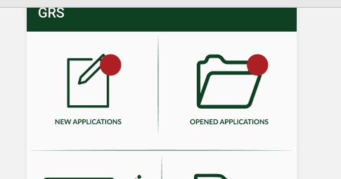
<RelativeLayout
                    android:layout_width="match_parent"
                    android:layout_height="match_parent">
                    <ImageView
                        android:id="@+id/opened"
                        android:layout_width="wrap_content"
                        android:layout_height="wrap_content"
                        android:background="@drawable/opened"
                        android:layout_centerInParent="true"
                        android:layout_marginTop="@dimen/_10sdp"
                        />
                    <TextView
                        android:id="@+id/notsopened"
                        android:layout_alignRight="@+id/opened"
                        android:layout_alignTop="@+id/opened"
                        android:background="@drawable/notification_iconmain"
                        android:layout_width="wrap_content"
                        android:layout_height="wrap_content" />
                </RelativeLayout>
young_08
Updated on October 18, 2020Comments
-
young_08 over 3 years
I wanted to have a badge at corner of a layout . I managed to get badge inside the layout but not able to achieve at corner of it .
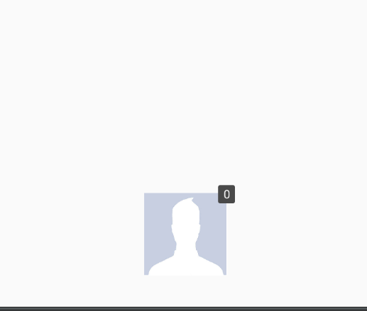
Currently my code gives me :
What i want : i want to have this badge to over right top corner of an layout .
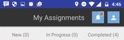
I want something like this :
Toolbar.xml
<?xml version="1.0" encoding="utf-8"?>
<android.support.v7.widget.Toolbar xmlns:android="http://schemas.android.com/apk/res/android"
    xmlns:app="http://schemas.android.com/apk/res-auto"
    xmlns:tools="http://schemas.android.com/tools"
    android:layout_width="match_parent"
    android:layout_height="@dimen/toolbar_height"
    android:background="@color/toolbar_color"
    android:contentInsetLeft="0dp"
    android:contentInsetStart="0dp"
    android:elevation="4dp"
    android:theme="@style/ThemeOverlay.AppCompat.Dark"
    app:contentInsetLeft="0dp"
    app:contentInsetStart="0dp">
    <LinearLayout
        android:layout_width="match_parent"
        android:layout_height="match_parent"
        android:weightSum="1"
        android:orientation="horizontal">

        <TextView
            android:layout_width="wrap_content"
            android:layout_height="wrap_content"
            android:id="@+id/textview"
            android:text="My Assignments"
            android:layout_gravity="center"
            android:gravity="center"
            android:layout_marginLeft="90dp"
            android:layout_weight="0.5"
            android:textSize="20sp"
            />

        <RelativeLayout
        android:id="@+id/bell_linearlayout1"
        android:layout_width="35dp"
        android:layout_height="35dp"
        android:layout_gravity="center"
        android:layout_marginLeft="15dp">

        <RelativeLayout
            android:id="@+id/bell_linearlayout"
            android:layout_width="50dp"
            android:layout_height="50dp"
            android:layout_gravity="center"
            android:background="#75aadb">
            <ImageView
                android:layout_width="match_parent"
                android:layout_height="wrap_content"
                android:layout_marginTop="2dp"
                android:layout_centerInParent="true"
                android:id="@+id/cartIconImageView"
                android:src="@drawable/notification"/>
        </RelativeLayout>

        <RelativeLayout
            android:layout_width="25dip"
            android:layout_height="25dip"
            android:gravity="end|top|right"
            android:layout_alignParentTop="true"
            android:layout_marginBottom="100dp"
            android:layout_marginLeft="20dp">

            <TextView
                android:id="@+id/textView1"
                android:layout_width="15dp"
                android:layout_height="15dp"
                android:layout_alignParentTop="true"
                android:background="@drawable/badge" />
        </RelativeLayout>

</RelativeLayout>
        <LinearLayout
            android:layout_width="35dp"
            android:layout_height="35dp"
            android:background="#75aadb"
            android:id="@+id/accountinfo_layout"
            android:layout_gravity="center"
            android:layout_marginLeft="10dp">
            <ImageView
                android:layout_width="match_parent"
                android:layout_height="wrap_content"
                android:layout_marginTop="1dp"
                android:src="@drawable/profile"/>

        </LinearLayout>


    </LinearLayout>
    </android.support.v7.widget.Toolbar>
Drawable badge.xml
<?xml version="1.0" encoding="utf-8"?>
<shape xmlns:android="http://schemas.android.com/apk/res/android"
    android:shape="rectangle">
    <corners android:radius="8dp" />
    <solid android:color="#f20000" />
    <stroke
        android:width="2dip"
        android:color="#FFF" />
    <padding
        android:bottom="6dp"
        android:left="6dp"
        android:right="6dp"
        android:top="6dp" />
</shape>
Please help .
-
young_08 almost 8 yearsThis will also give me badge inside view instead at right top corner .
-
 Ganesh Gudghe almost 8 years@young_08 please set the margin like homeimageviewbadge.setBadgeMargin(5, 0);
 -
Ganesh Gudghe almost 8 yearsand also set the padding of your layout like imageview.setPadding(0, 0, 10, 0);
-
young_08 almost 8 yearswhat is this ? Can you brief?Where i have to do changes?
-
young_08 almost 8 yearsbut i have to add a number or text inside badge for this . RIght ? but i want simple red dot .
-
 SaravInfern almost 8 yearswhat i have done is aligned the textview to the relative layout's top edge and added a imageview with margin so the text view appears like a badge view.
 -
 Milind Vyas almost 8 yearshave you set margin top left proper?
 -
young_08 almost 8 yearsyes this could able to achieve . But this result in image view smaller in size . I want it at corner of Relative layout .
-
young_08 almost 8 yearsThis is for icon in actionbar . i am not sure i can use this on layout .
-
Ganesh Gudghe almost 8 yearsdo not set text add badge background color like setBadgeBackgroundColor(Color.RED);
-
young_08 almost 8 yearsCan you tell me how ? i am not able to get it . Little snippetor something
-
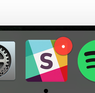
young_08 almost 8 yearsi want similar like slack screenshot i attached in my question .
-
young_08 almost 8 yearsShortcutBadger is for an notification on Home screen App icon . I guess !
-
young_08 almost 8 yearsSnippet is not spoon feeding, dude
-
young_08 almost 8 yearsi know and i am really grateful of that , but the problem is what ever you suggested is for action bar menu . And i don't understand how to use it as per my requirement .
-
young_08 almost 8 yearsyes but it is for launchers . For home icon notification . and i want inside app notification .