How to label scatterplot points by name?
Solution 1
Well I did not think this was possible until I went and checked. In some previous version of Excel I could not do this. I am currently using Excel 2013.
This is what you want to do in a scatter plot:
right click on your data point
select "Format Data Labels" (note you may have to add data labels first)
- put a check mark in "Values from Cells"
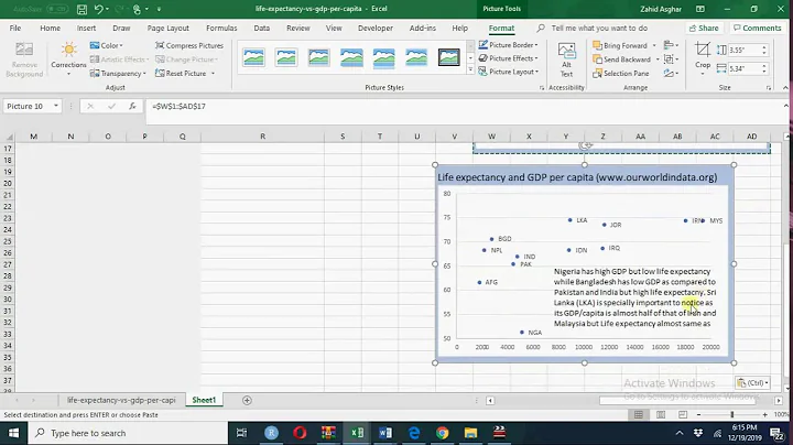
- click on "select range" and select your range of labels you want on the points

UPDATE: Colouring Individual Labels
In order to colour the labels individually use the following steps:
- select a label. When you first select, all labels for the series should get a box around them like the graph above.
- Select the individual label you are interested in editing. Only the label you have selected should have a box around it like the graph below.
- On the right hand side, as shown below, Select "TEXT OPTIONS".
- Expand the "TEXT FILL" category if required.
- Second from the bottom of the category list is "COLOR", select the colour you want from the pallet.
If you have the entire series selected instead of the individual label, text formatting changes should apply to all labels instead of just one.

Solution 2
None of these worked for me. I'm on a mac using Microsoft 360. I found this which DID work: This workaround is for Excel 2010 and 2007, it is best for a small number of chart data points.
Click twice on a label to select it. Click in formula bar. Type = Use your mouse to click on a cell that contains the value you want to use. The formula bar changes to perhaps =Sheet1!$D$3
Repeat step 1 to 5 with remaining data labels.
Simple
Solution 3
For all those who don't have the option in Excel (like me), there is a macro which works and is explained here: https://www.get-digital-help.com/2015/08/03/custom-data-labels-in-x-y-scatter-chart/ Very useful
Solution 4
Another convoluted answer which should technically work and is ok for a small number of data points is to plot all your data points as 1 series in order to get your connecting line. Then plot each point as its own series. Then format data labels to display series name for each of the individual data points.
In short it works ok for a small data set or just key points from a data set.
Related videos on Youtube
 10 : 31
 03 : 13
 04 : 13
 02 : 44
 20 : 23
 05 : 00
 17 : 13
loonyuni
Updated on October 15, 2021Comments
-
loonyuni over 2 years
I am trying to figure out how to get labels to show on either Google sheets, Excel, or Numbers.
I have information that looks like this
name|x_val|y_val
----------------
a   |    1|    1
b   |    2|    4
c   |    1|    2
Then I would want my final graph to look like this.
4|      .(c)
3|
2|  .(b)
1|  .(a)
 |__ __ __ __
0   1  2  3  4
Like why can't I label each of these points with its name? I can only seem to label the value, e.g,
(c)would show4Is the only solution D3?
-
 Forward Ed about 8 yearsis this a scatter plot?
 -
zx8754 about 8 yearsYou mentioned D3, how about R? See this example.
-
 Eric Schnipke about 7 yearsIs this question better suited for Superuser?
-
-
loonyuni about 8 yearsI just got IT to give me Microsoft Office 2016 for Mac, but unfortunately Excel for Mac does not have this feature :(. Thanks though
-
Tom Bowen about 6 yearsThis is excellent. All official documentation I can find from Microsoft explains how to do this with clumsy macros. This is the perfect solution.
-
 Si Mon almost 6 yearsI use excel 365 (build 1805) on windows and I don't have the option "value from cells" :( any other way?
 -
Forward Ed almost 6 years@SiMon Not that I am aware of. If you have a small data set you may have the option in the other answer available to you.
-
nyan314sn over 5 yearsHow can you make each of label a different color here ?
-
Chris Jenks almost 5 yearsThanks. I'm using Excel 2016 on a PC but this helped me figure out how to label one point (by double clicking to select it, then right clicking) rather than all points as in the top answer.
-
 Pedro77 over 4 yearsHow can you make each of label be a legend item instead?
 -
Forward Ed over 4 years@Pedro77 only series name and data point style for the series show up in the legend. In order to have each data point show up in the legend you would need to create a series for each point you want in the legend and only include the data for those points in the series. When plotting each of those series format the series to only include the data points and not show the line connecting. You can then make a series of all the data points which would superimpose on top of the other series. Configure it to only show the line. That is the only way I can think of doing it, unless I misunderstood