How to make a Bootstrap 4 full width dropdown in Navbar?
Use w-100 (width:100%) on the dropdown-menu, and make sure the parent .dropdown
is position-static to allow the menu to expand to full width...
<nav class="navbar navbar-expand-lg">
    <a class="navbar-brand" href="#" style="color: red;">LOGO GOES HERE</a>
    <button class="navbar-toggler" type="button" data-toggle="collapse" data-target="#navbarSupportedContent" aria-controls="navbarSupportedContent" aria-expanded="false" aria-label="Toggle navigation">
        <span class="navbar-toggler-icon"></span>
    </button>
    <div class="collapse navbar-collapse" id="navbarSupportedContent">
        <ul class="navbar-nav">
            <li class="nav-item dropdown position-static">
                <a class="nav-link dropdown-toggle" href="#" id="navbarDropdown" role="button" data-toggle="dropdown" aria-haspopup="true" aria-expanded="false">
          Dropdown
        </a>
                <div class="dropdown-menu w-100" aria-labelledby="navbarDropdown">
                    <a class="dropdown-item" href="#">Action</a>
                    <a class="dropdown-item" href="#">Another action</a>
                    <div class="dropdown-divider"></div>
                    <a class="dropdown-item" href="#">Something else here</a>
                </div>
            </li>
        </ul>
    </div>
</nav>
https://www.codeply.com/go/0QHWWNsMyI
Alternative, set min-width in CSS:
https://www.codeply.com/go/fClz4WpC8u/bootstrap-4-dropdown-width
Retros
Updated on July 05, 2022Comments
-
Retros almost 2 years
I'm trying to make a full-width dropdown that looks like a collapse item - the full-width collapsable navigations that websites now use often. But I cannot figure out how to do it.
I've tried adding Bootstrap's collapse plugin to it, but that didn't work. Is it considered safe practice to add more than one .navbar-collapse class to a navigation bar?
Or should my approach be just editing Bootstrap's dropdown? And if so, how should I do it?
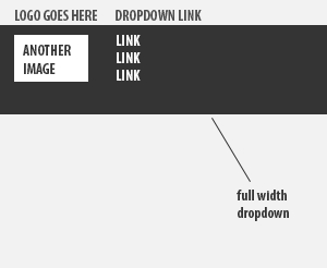
Here's an image to show you exactly what I'm trying to achieve:
And here's the outline of my code, please view snipped in full width:
<link rel="stylesheet" href="https://maxcdn.bootstrapcdn.com/bootstrap/4.0.0/css/bootstrap.min.css" integrity="sha384-Gn5384xqQ1aoWXA+058RXPxPg6fy4IWvTNh0E263XmFcJlSAwiGgFAW/dAiS6JXm" crossorigin="anonymous"> <script src="https://code.jquery.com/jquery-3.2.1.slim.min.js" integrity="sha384-KJ3o2DKtIkvYIK3UENzmM7KCkRr/rE9/Qpg6aAZGJwFDMVNA/GpGFF93hXpG5KkN" crossorigin="anonymous"></script> <script src="https://cdnjs.cloudflare.com/ajax/libs/popper.js/1.12.9/umd/popper.min.js" integrity="sha384-ApNbgh9B+Y1QKtv3Rn7W3mgPxhU9K/ScQsAP7hUibX39j7fakFPskvXusvfa0b4Q" crossorigin="anonymous"></script> <script src="https://maxcdn.bootstrapcdn.com/bootstrap/4.0.0/js/bootstrap.min.js" integrity="sha384-JZR6Spejh4U02d8jOt6vLEHfe/JQGiRRSQQxSfFWpi1MquVdAyjUar5+76PVCmYl" crossorigin="anonymous"></script> <nav class="navbar navbar-expand-lg"> <a class="navbar-brand" href="#" style="color: red;">LOGO GOES HERE</a> <button class="navbar-toggler" type="button" data-toggle="collapse" data-target="#navbarSupportedContent" aria-controls="navbarSupportedContent" aria-expanded="false" aria-label="Toggle navigation"> <span class="navbar-toggler-icon"></span> </button> <div class="collapse navbar-collapse" id="navbarSupportedContent"> <ul class="navbar-nav"> <li class="nav-item dropdown"> <a class="nav-link dropdown-toggle" href="#" id="navbarDropdown" role="button" data-toggle="dropdown" aria-haspopup="true" aria-expanded="false"> Dropdown </a> <div class="dropdown-menu" aria-labelledby="navbarDropdown"> <a class="dropdown-item" href="#">Action</a> <a class="dropdown-item" href="#">Another action</a> <div class="dropdown-divider"></div> <a class="dropdown-item" href="#">Something else here</a> </div> </li> </div> </nav> -
Retros about 6 yearsThanks, Zim. This would work. But is this the best solution if I want to keep dropdown links just below the dropdown title, like in my picture?
-
 Zim about 6 yearsAFAIK there's no way to do that
 -
 Vishvesh Phadnis almost 6 yearsThanks @ZimSystem I had same problem for dropdown menu. Your answer helped.