How to make an image link to a phone number only on mobile using CSS and HTML?
Deleted my old answer, because it was poor. Please try this http://jsfiddle.net/qDUqS/
The telephone number looks the same both in small screen and in big screen, but it acts like a link, only on smaller screen.
Html:
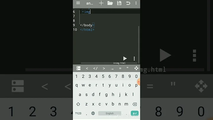
<span class="phone"><img src="http://goo.gl/PdeeU" /><a href="tel:18001234567">1-800-123-4567</a><p>1-800-123-4567</p></span>
CSS:
.phone
{
    background-color: #152C48;
    -moz-border-radius: 5px;
    -webkit-border-radius: 5px;
    -khtml-border-radius: 5px;
    border-radius: 5px;
    padding: 4px;
}
a
{
    display: inline-block;
    text-decoration: none;
    color: #ffffff;
    padding: 0px;
}
img
    {
        vertical-align: middle;
        width: 24px;
        height: 24px;
        padding: 0px;
    }
p
{
    display: none;
    color: #ffffff;
    padding: 0px;
}

@media only screen and (min-width: 480px) and (max-width: 1920px)
{
    a
    {
        display: none;
    }
    p
     {
        display: inline-block;
     }
}
Related videos on Youtube
 03 : 17
 35 : 35
 01 : 55
 13 : 59
 07 : 14
 02 : 49
Ryan
Updated on June 04, 2022Comments
-
Ryan almost 2 years
Instead of just having text for example
If I do
<a href="tel:18001234567">1-800-123-4567</a>then it will be broken on desktops.If I do
(800) 123-4567then it will display as the number on desktop but should automatically become a link on Android and iPhoneBut if I want to make an image like this:

Is there a solution, possibly with media query or any other way. That I can make this image display on desktop and mobile but on mobile function as a button? This is for email so only HTML/CSS options.
Based on the answers I have this and it didn't work either:
@media screen and (min-width: 0px) and (max-width: 400px) {
#my-image { display: block; }  /* show it on small screens */
#my-link { display: none; }  /* hide it on small screens */
}

@media screen and (min-width: 401px) and (max-width: 1024px) {
#my-image { display: none; }   /* hide for all below 401px*/
#my-link { display: block; }   /* show for all above 401px*/
}
Along with:
<div id="my-image">
<a href="tel:1-800-328-4766">Call Now!</a>
</div>

<div id="my-link">
Call 1-800-328-4766
</div>
And it still is not working, both links are showing up.
-
Kees Sonnema almost 11 yearsEdited my question. have a look it works now :)
-
-
Ryan almost 11 yearsThanks I found this yesterday, but then it doesn't show on desktops. I want the image to show on both but only be a link on mobiles.
-
Ryan almost 11 yearsMaybe I'm missing something but that is still hiding and showing the image, not the
tel:link so how does this answer the question? -
Kees Sonnema almost 11 yearsno you make two seperate divs. one for image and one for link. you put the image ONLY in the div class="my image" and NOT in the link. so when you are visiting it on desktop the div class="my image" is hidden and the div class="my link" is visible. and otherwise for phone.
-
Ryan almost 11 yearsI will when I can (have to wait for timer). Although I think shouldn't the two
#my-imageat the bottom be#my-link -
Kees Sonnema almost 11 yearsYes sorry I just edited it in a working jsfiddle will update my code.
-
 Gimmy almost 11 yearsYour jsFiddle it.s just a trick. He deosn't want to make images from all his numbers. He wants to display his links as buttons.
 -
Kees Sonnema almost 11 yearsI think the best way is just wait for his accept on one of our answers.
-
Ryan almost 11 yearsEdited my question. This isn't working and on your jsFiddle I can only see the result but in the result I see both as well.
-
Kees Sonnema almost 11 yearsyes that's because of the max-width from the link media query. you can set it to whatever you want say 2000 or something.
-
Kees Sonnema almost 11 yearsnow it works. jsfiddle.net/ZJyw2/1/embedded/result I've changed the max-width to 3024 instead of 1024.
-
Ryan almost 11 yearsDoesnt work in gmail is why I haven't marked this correct yet. I'm trying to figure out a work-around. Currently both display in gmail.
-
Ryan almost 11 yearsHavent forgotten about this just busy on a different email at the moment. I'll see if this works when I have a moment. Thanks