How to make in CSS an overlay over an image?
Solution 1
You can achieve this with this simple CSS/HTML:
.image-container {
    position: relative;
    width: 200px;
    height: 300px;
}
.image-container .after {
    position: absolute;
    top: 0;
    left: 0;
    width: 100%;
    height: 100%;
    display: none;
    color: #FFF;
}
.image-container:hover .after {
    display: block;
    background: rgba(0, 0, 0, .6);
}
HTML
<div class="image-container">
    <img src="http://lorempixel.com/300/200" />
    <div class="after">This is some content</div>
</div>
Demo: http://jsfiddle.net/6Mt3Q/
UPD: Here is one nice final demo with some extra stylings.
.image-container {
    position: relative;
    display: inline-block;
}
.image-container img {display: block;}
.image-container .after {
    position: absolute;
    top: 0;
    left: 0;
    width: 100%;
    height: 100%;
    display: none;
    color: #FFF;
}
.image-container:hover .after {
    display: block;
    background: rgba(0, 0, 0, .6);
}
.image-container .after .content {
    position: absolute;
    bottom: 0;
    font-family: Arial;
    text-align: center;
    width: 100%;
    box-sizing: border-box;
    padding: 5px;
}
.image-container .after .zoom {
    color: #DDD;
    font-size: 48px;
    position: absolute;
    top: 50%;
    left: 50%;
    margin: -30px 0 0 -19px;
    height: 50px;
    width: 45px;
    cursor: pointer;
}
.image-container .after .zoom:hover {
    color: #FFF;
}
<link href="//netdna.bootstrapcdn.com/font-awesome/4.0.3/css/font-awesome.min.css" rel="stylesheet"/>
<div class="image-container">
<img src="http://lorempixel.com/300/180" />
<div class="after">
<span class="content">This is some content. It can be long and span several lines.</span>
<span class="zoom">
<i class="fa fa-search"></i>
</span>
</div>
</div>Solution 2
You could use a pseudo element for this, and have your image on a hover:
.image {
  position: relative;
  height: 300px;
  width: 300px;
  background: url(http://lorempixel.com/300/300);
}
.image:before {
  content: "";
  position: absolute;
  top: 0;
  left: 0;
  height: 100%;
  width: 100%;
  transition: all 0.8s;
  opacity: 0;
  background: url(http://lorempixel.com/300/200);
  background-size: 100% 100%;
}
.image:hover:before {
  opacity: 0.8;
}
<div class="image"></div>Solution 3
Putting this answer here as it is the top result in Google.
If you want a quick and simple way:
filter: brightness(0.2);
*Not compatible with IE
Solution 4
A bit late for this, but this thread comes up in Google as a top result when searching for an overlay method.
You could simply use a background-blend-mode
.foo {
    background-image: url(images/image1.png), url(images/image2.png);
    background-color: violet;
    background-blend-mode: screen multiply;
}
What this does is it takes the second image, and it blends it with the background colour by using the multiply blend mode, and then it blends the first image with the second image and the background colour by using the screen blend mode. There are 16 different blend modes that you could use to achieve any overlay.
multiply, screen, overlay, darken, lighten, color-dodge, color-burn, hard-light, soft-light, difference, exclusion, hue, saturation, color and luminosity.
Related videos on Youtube
 11 : 37
 08 : 11
 09 : 02
 07 : 57
 07 : 32
 01 : 16
user984621
Updated on March 13, 2022Comments
-
user984621 about 2 years
I am trying to achieve something like this:
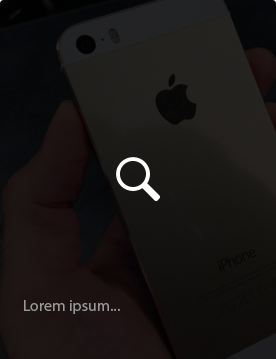
When I hover over an image, I would like to put on that image this dark color with some text and the icon.
I am stuck here. I found some tutorials but they didn't work out for this case. Also, another issue -- every image has a different height. The width is always the same.
How can this effect be achieved?
-
 Ranveer over 10 yearspossible duplicate of How to overlay images
-
-
user984621 over 10 yearsBut the problem is that I don't know the height of the .image-container.
-
user984621 over 10 yearsI played with it and it seems to be working, thanks dfsq! Just one thing - how could I stick the text always at the bottom of the respective image? Thank you
-
user984621 over 10 yearsI am fighting yet with placing the icon in the middle of the hovered area -- is there any effective way how to put it there? Thx
-
 bassplayer7 almost 8 yearsThis is a great idea. However the main problem is that it requires both images to be background images. If the primary image is an HTML
<img />, it doesn't work. Also, at the time,background-blend-modeis not well supported: late versions of Chrome and FF with partial support in Safari (caniuse.com/#search=background-blend-mode) -
GibsonFX about 7 yearsBy using display:none, you've stopped the ability to use any sort of animation and transition effect, Which I think is an important aesthetic to getting overlays to look good.
-
dfsq about 7 years@LukeJonGibson Haha, and that's why this answer is not useful and needs to be downvoted.
-
 Adam over 4 years@user984621 did you find a way to place the text in the middle?
 -
 Cohan over 4 yearsThe post is 6 years old and the accepted answer has 100+ votes, some of which are in the past few months. There's nothing wrong with your answer, but perhaps you can expand more as to why your answer might be useful for people reading this in 2020. Is this a new feature of css?
 -
 Andrew Samole over 4 yearsFilter has been around for years. I didn't see it in any of the answers so I thought I could help people who are still navigating to this page for a much quicker solution.
 -
Cohan over 4 yearsHopefully it's useful to those who come across it. Your post just had showed up in the "Late Answers" queue. Since it's not really my realm, I think it would be cool to see a little more in your answer as to how this compares to the other answers. Maybe supply a jsfiddle to compare against the top answer.
-
salsaverde about 3 yearsThis is exactly what I was looking for! Thank you.
-
 Camille Basbous about 3 yearsuse <br/> on HTML element as much as you want till satisfied. <div class="after"><br/><br/>This is some content</div>
 -
Sri Nithya Sharabheshwarananda about 2 yearsthis is a nice additional comment / insight