How to make one circle inside of another using CSS
65,171
Solution 1
Ta da!
Explained in the CSS comments:
 #outer-circle {
   background: #385a94;
   border-radius: 50%;
   height: 500px;
   width: 500px;
   position: relative;
   /*
    Child elements with absolute positioning will be
    positioned relative to this div
   */
 }
 #inner-circle {
   position: absolute;
   background: #a9aaab;
   border-radius: 50%;
   height: 300px;
   width: 300px;
   /*
    Put top edge and left edge in the center
   */
   top: 50%;
   left: 50%;
   margin: -150px 0px 0px -150px;
   /*
    Offset the position correctly with
    minus half of the width and minus half of the height
   */
 }
<div id="outer-circle">
<div id="inner-circle">
</div>
</div>Solution 2
You don't need extra elements in CSS3
You can do it all with one element and a box-shadow.
CSS
#outer-circle {
    background: #385a94;
    border-radius: 50%;
    height:300px;
    width:300px;
    position: relative;
    box-shadow: 0 0 0 100px black;
    margin:100px;
}
Solution 3
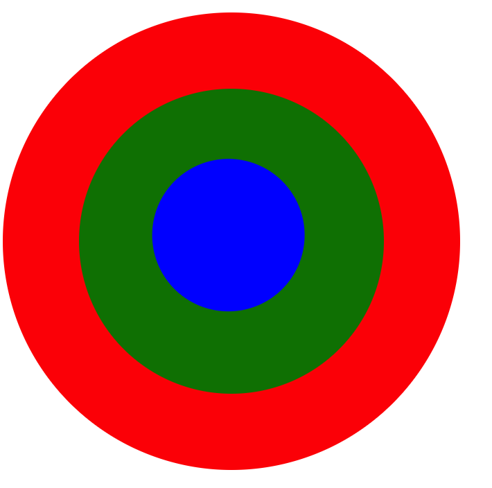
If you want to use only one div to add circle inside circle, then use box-shadow.
div {
  border-radius: 50%;
  box-shadow: 0px 0px 0px 10px red, 0px 0px 0px 20px green, 0px 0px 0px 30px yellow, 0px 0px 0px 40px pink;
  width: 100px;
  height:100px;
  margin: 3em;
}<div></div>Solution 4
Solved this by using CSS transform property:
You can refer to this JS fiddle link for below output:
http://jsfiddle.net/suprabhasupi/74b1ptne/
div {
  border-radius: 50%;
  /* border: 1px solid red; */
}
.circle1 {
  position: relative;
  width: 300px;
  height: 300px;
  background-color: red;
}
.circle2 {
  transform: translate(25%, 25%);
  width: 200px;
  height: 200px;
  background-color: green;
}
.circle3 {
   transform: translate(48%, 46%);
  width: 100px;
  height: 100px;
  background-color: blue;
}
<div class="circle1">
<div class="circle2">
<div class="circle3">
</div>
</div>
</div>Solution 5
Use position: relative on the outer circle, position:absolute on the inner circle, and set all offset to the same value. Let the automatic calculation of height and width handle the rest (JSFiddle):
#outer-circle {
    position:relative;
    background: #385a94;
    border-radius: 50%;
    height:500px;
    width:500px;
}
#inner-circle {
    position:absolute;
    background: #a9aaab;
    border-radius: 50%;
    right: 100px;
    left: 100px;
    top: 100px;
    bottom: 100px;
    /* no margin, no width, they get automatically calculated*/
}
Related videos on Youtube
 15 : 19
Introducing Divs and controlling them with classes and ids
 06 : 22
How To Make An Element Rotate Around Another One With CSS
 09 : 20
How to make a Triangle and circle in css - html div element
 02 : 03
How to Draw a Circle with CSS | How to Draw CSS Shapes-Tutorial 2 | CSS Tutorials
 05 : 00
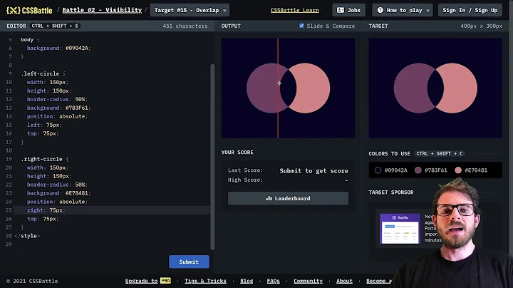
CSS Battle - #15 Overlap
01 : 20
CSS : How to make one circle inside of another using CSS
 09 : 30
how to make a circle inside a circle! using html and css
01 : 18
How to make one circle inside of another using CSS - CSS
Author by
scapegoat17
Updated on July 09, 2022Comments
-
scapegoat17 almost 2 years
I am trying to make one circle inside of another circle using css, but I am having an issue making it completely centered. I am close, but still not there. Any ideas?
<div id="content">
    <h1>Test Circle</h1>
    <div id="outer-circle">
        <div id="inner-circle">
            <span id="inside-content"></span>
        </div>
    </div>
</div>
Here is my CSS:
#outer-circle {
    background: #385a94;
    border-radius: 50%;
    height:500px;
    width:500px;
}
#inner-circle {
    position: relative;
    background: #a9aaab;
    border-radius: 50%;
    height:300px;
    width:300px;
    margin: 0px 0px 0px 100px;
}
Also, here is a fiddle: http://jsfiddle.net/972SF/
-
scapegoat17 about 10 yearsIt's like magic! haha. Thank you. I will be marking you as the answer as soon as SO lets me!
-
 agconti about 10 yearsMy thoughts exactly +1.
 -
Aniruddha Pondhe about 10 years@scapegoat17 Try the above solution.
-
Sgnl almost 7 yearsthis answer is super spicy. Thanks!
-
 Alex W over 5 yearsI edited your answer to include the code that was previously only available on your jsFiddle. In the future, please include the relevant code in your answers so that the answer is still useful in the event that a 3rd party website is removed or otherwise unavailable. Please also try to avoid posting duplicate answers or answers that are very similar, as I see you have deleted one that looks the same.
 -
 Dcoder14 over 3 yearsnice, this is the best solution I think using only one div.