How to mimic the Material-design raised button style, even for pre-Lollipop (minus the special effects)?
Solution 1
Updated Answer: It is recommended that you rely on Google's appcompat library to backport material design styles to your app. It seems to no longer backport the raised button (instead using flat buttons), but still adequately backports a button that matches the material design style. It is my recommendation that you go with this approach.
If you still wish to backport the raised button effect, you will need to rely on a 3rd party material design library, or you can look at my old solution below using the CardView and implement your own.
To setup the appcompat library with Google's official Material Design backport:
compile "com.android.support:appcompat-v7:+"
Then you need to set your application theme in your styles.xml file.
<!-- Base application theme. -->
<style name="AppTheme" parent="Theme.AppCompat.Light.DarkActionBar">
    <!-- Customize your theme here. -->
    <item name="colorPrimary">@color/colorPrimary</item>
    <item name="colorPrimaryDark">@color/colorPrimaryDark</item>
    <item name="colorAccent">@color/colorAccent</item>
</style>
And in your AndroidManifest.xml ensure the theme above is set properly:
<application
    android:allowBackup="false"
    android:icon="@mipmap/ic_launcher"
    android:label="@string/app_name"
    android:supportsRtl="false"
    android:theme="@style/AppTheme">
After the above setup, ensure all your Activity's extend from AppCompatActivity, and from there all your Buttons will be inflated with a Material Design style.
If you are using a custom Button implementation in your project, ensure that instead of extending Button, extend AppCompatButton. That goes for most of your custom Views: AppCompatTextView, AppCompatEditText, etc...
How does it work?
All of your Android xml layouts are inflated using something called a LayoutInflater. The LayoutInflater is provided by the Activity, and has the option of having a LayoutInflaterFactory provided to it so that you can override default implementations of standard Android widgets, like Button and TextView. When you use an AppCompatActivity, it's providing you with a non-standard LayoutInflater, which is inflating special instances of the widgets that support Material Design!
------------------------------------------------- Old Answer: -------------------------------------------------
So Android has given us the CardView to replicate such behavior. It provides a View with a rounded corners, that applies a drop shadow. You will probably also want to look at the #setCardElevation() method.
You can add the CardView Library to your Gradle Project:
compile 'com.android.support:cardview-v7:+'
The CardView will use the Lollipop implementation to do this if it's available (as Lollipops shadows are better), otherwise it will replicate it as best as it can.
Here is a sample:
<android.support.v7.widget.CardView
        xmlns:android="http://schemas.android.com/apk/res/android"
        xmlns:card_view="http://schemas.android.com/apk/res-auto"
        android:layout_width="wrap_content"
        android:layout_height="wrap_content"
        card_view:cardBackgroundColor="#ffd9d9d9"
        card_view:cardCornerRadius="2dp"
        android:layout_margin="6dp"
        card_view:cardElevation="6dp">

    <TextView android:id="@+id/text"
            android:layout_width="wrap_content"
            android:layout_height="wrap_content"
            android:paddingTop="8.5dp"
            android:paddingBottom="8.5dp"
            android:paddingLeft="12dp"
            android:paddingRight="12dp"
            android:textColor="#de000000"
            android:fontFamily="sans-serif-medium"
            android:text="NORMAL" />

</android.support.v7.widget.CardView>
The above code running on 5.0: 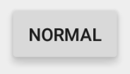
The above code running on 4.4.4: 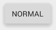
It looks like there is a discrepancy in the fonts, as in the sans-serif-medium has a different font weight or isn't supported on 4.4.4, but that can be easily fixed by including the latest version of Roboto and overriding the fonts on the TextViews.
The material documentation you post point to an an "Elevated Button". CardView's are how we make "Elevated" anything.
Solution 2
Add the compat library to your app. (The most current version can be found here.) Do this by adding a dependency within your build.gradle file:
dependencies {
    compile fileTree(dir: 'libs', include: ['*.jar'])
    compile 'com.android.support:appcompat-v7:21.0.3'
}
Declate your apptheme in a styles.xml file located in the values directory:
<resources>
    <!-- Base application theme. -->
    <style name="AppTheme" parent="Theme.AppCompat.Light.DarkActionBar">
        <!-- Customize your theme here. -->
        <item name="colorPrimary">@color/theme_primary</item>
        <item name="colorAccent">@color/theme_accent_1</item>
        <item name="actionMenuTextColor">@color/theme_text</item>
    </style>
</resources>
Set the declared style as the one to use for your application in the manifest.xml file:
<application
    android:icon="@drawable/ic_launcher"
    android:theme="@style/AppTheme"/>
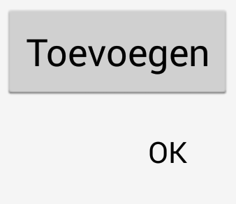
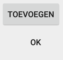
In your layouts declare a raised button as follows
<Button
    android:id="@+id/addButton"
    android:layout_width="wrap_content"
    android:layout_height="match_parent"
    android:text="@string/title_add" />
Declare a flat button style as follows:
<Button
    android:id="@+id/okbutton"
    style="?android:attr/borderlessButtonStyle"
    android:layout_width="wrap_content"
    android:layout_height="wrap_content"
    android:text="@android:string/ok" />
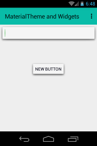
Result on both a 4.4 (a phone) and a 5.0 (a tablet) device:
Details can be found in the official documentation: http://developer.android.com/training/material/theme.html
Solution 3
I achieve same effect using,
android:background="@android:drawable/dialog_holo_light_frame"
My tested output:
Solution 4
This one is hacky according to Yigit (google dev on cardview) but does a descent job.
You can use negative numbers in order to get rid of the padding and margin inside of CardView.
Tested on api 15 nexus one and nexus 4 emulators. This solution will work on pre lollipop.
<android.support.v7.widget.CardView
    android:id="@+id/elevated_button_card"
    card_view:cardElevation="2dp"
    android:layout_width="match_parent"
    android:layout_height="wrap_content"
    card_view:cardMaxElevation="8dp"
    card_view:contentPadding="-2dp"
    android:layout_marginBottom="-2dp"
    card_view:cardCornerRadius="0dp">
    <Button
        android:id="@+id/elevated_button"
        style="?android:attr/borderlessButtonStyle"
        android:layout_width="match_parent"
        android:layout_height="match_parent"
        android:text="Add New Exercise"/
</android.support.v7.widget.CardView>
Code:
        final CardView cardView = (CardView) rootView.findViewById(R.id.elevated_button_card);
        final Button button = (Button) rootView.findViewById(R.id.elevated_button);
        button.setOnTouchListener(new View.OnTouchListener() {
            ObjectAnimator o1 = ObjectAnimator.ofFloat(cardView, "cardElevation", 2, 8)
                    .setDuration
                            (80);
            ObjectAnimator o2 = ObjectAnimator.ofFloat(cardView, "cardElevation", 8, 2)
                    .setDuration
                            (80);

            @Override
            public boolean onTouch(View v, MotionEvent event) {

                switch (event.getAction()) {
                    case MotionEvent.ACTION_DOWN:
                        o1.start();
                        break;
                    case MotionEvent.ACTION_CANCEL:
                    case MotionEvent.ACTION_UP:
                        o2.start();
                        break;
                }
                return false;
            }
        });
Solution 5
I'm working on a material compatibility library. I wrote my own Button class with material-like styles, animated shadows and the touch ripple effect. Although it's not perfect yet, You can try it here.
android developer
Really like to develop Android apps & libraries on my spare time. Github website: https://github.com/AndroidDeveloperLB/ My spare time apps: https://play.google.com/store/apps/developer?id=AndroidDeveloperLB
Updated on July 24, 2022Comments
-
android developer almost 2 years
Google has shown some nice ways that buttons are shown on Lollipop here.
I'm talking about both the raised and the flat buttons.
How can I mimic them on pre-Lollipop versions, except for the special effects (ripple etc...) ?
I'm talking about this and this.
Of course, on Lollipop and above, I'd like to use the special effects.
I know that there are multiple (and even many) posts about this already, but I don't see any that tries to mimic it completely.
-
 spierce7 over 9 years@androiddeveloper Maybe I'm confused as to what you want exactly, but in any of the links that you post, you can replicate the look of any of the states with a CardView and a TextView inside of it (minus the ripple). If you are talking about the pressed state, where it animates up, you'd use an ObjectAnimator.ofFloat and you'd do it on the "cardElevation" property. If necessary, I can draw up some code samples and edit my answer. Is that what you'd like me to do?
 -
android developer over 9 yearsPlease look at the links I've put. A card doesn't really have the same states as a button, though it would be nice to know how to do it for a card too.
-
spierce7 over 9 yearsSo you are thinking of the CardView as only a card, not a View that casts a shadow, giving the appearance of a Z direction, which is what it is. It's meant to be used for just such an application. I'll write up a code sample for you, and show you what I mean.
-
android developer over 9 yearsIt's a special view (and a container of others). I'm thinking about what should be the official way to make things work as Google has shown.
-
spierce7 over 9 yearsWell Material isn't just Android only. It's a design spec that is cross platform. In order for us to implement the "Raised Button" as per the Material design spec, we were given the CardView. The CardView should be used to implement any "Raised" view, as it allows us to use the elevation attribute in 5.0 that you would use to do this otherwise. I've edited my code and included a sample. Chett Haus at Google IO mentioned they almost didn't give us the CardView as it's "so easy to do yourself". I disagree with him, but anyways, this is what they've given us. Best of luck :-)
-
android developer over 9 yearsOK, I've tried to use your method, but the "buttons" don't seem to be able to be pressed. They don't have any effect when being pressed at all... What should I do? according to what you've put, you use "cardBackgroundColor", but there is not other option, for normal background (looked here too: developer.android.com/reference/android/support/v7/widget/… ) ?
-
davidtbernal over 9 yearsI don't believe this information is correct. Android 5 added elevation to any view, which should include buttons. Also, reading the Android docs and looking at the examples they give, it seems pretty clear they intend CardView to be a container for various things.
-
spierce7 over 9 years@notJim How is that different from what's been said? The question is about backporting. Elevation isn't backported to every view in Android. It's only been backported through the CardView. So if you want something with elevation on a device pre 5.0, you have to use the CardView.
-
spierce7 over 9 years@androiddeveloper I've been playing around with this for the past hour, and I see what you mean. It's difficult to add a pressed color to the CardView. The best I got is setting the colors on the TextView, but the CardView seems to have padding that can't be removed, so it ends up looking ugly. If you are determined to have a full backport of the button, you could create your own custom view that extends CardView, and intercept touch events, manually calling setCardBackgroundColor. You could get what you want with that, but it's a reasonable amount of work.
-
spierce7 over 9 years@androiddeveloper If you have experience working with Android View's, I'd probably go the override CardView approach. If you don't there are a few libraries that might have what you want: github.com/navasmdc/MaterialDesignLibrary#buttons
-
 Admin over 9 yearsAs far as I can tell this results in a button that is raised on press but is flat when not pressed. Tested on 5.0.1, appcompat-v7, 21.0.3.
 -
Servus7 about 9 yearsThe first button is from Holo.Light and not from appcompat-v7. Just compare the upper-case of the two buttons. It's different.
-
 0101100101 about 9 yearsThe approach using CardView is genius. Combine it with a library providing Ripple and you got perfect Material buttons. I completely dropped the Material Design Library in favor of this due to several unaesthetic aspects / bugs.
 -
ThanosFisherman almost 9 yearsHey what does cardMaxElevation do?
-
Asi Mugrabi almost 9 yearsIt is optional. It is used to ensure that card will never elevate above 8dp later in code.
-
android developer almost 9 yearsLooks nice, but what happens when you click on it?
-
 Ranjithkumar almost 9 yearsIt give only elevation for pre-lollipop devices.no other effects.
 -
 RexSplode over 8 yearsThis is lateral thinking in action! :)
 -
RexSplode over 8 yearsIf you want to implement pressed behavior, you can add a simple button under it. On cardview click make cardview.setVisibility(View.GONE), and button.setVisibility(View.VISIBLE), Thread.sleep(100); and return cardview back:)
-
 Rémy DAVID over 8 yearsThis does not work, there is a padding space between the button and the cardview so the ripple effect don't go up to the edge, if you disable the padding, the pressed state gets beyond the edge on Android 4.
 -
Alen Siljak over 7 yearsThe new solution is great when combined with @Ranjith Kumar's shadow. It is simpler to add a Linear Layout parent with a shadow and 0 padding to get the full effect.
-
MPelletier over 7 years@spierce7 I made a barebone app to reproduce this and I'm still not seeing raised buttons. I've actually started a new question specifically to help implement this solution here: stackoverflow.com/questions/40108069/… Can you help?