How to mimic word-break: break-word; for IE9, IE11 and Firefox
Solution 1
I have had good success in Chrome, Firefox and IE with using only:
word-break: break-word;
word-wrap: break-word;
In my problem case I was already using:
display: table-cell;
and I ended up having to include
max-width: 440px;
to get wrapping in all browsers. In most cases the max-width was not necessary.
Solution 2
#grid2{
    white-space: pre-wrap;
    word-wrap: break-word;
}
This should work for IE11, but not for IE9
Sudhansu Choudhary
Updated on November 19, 2020Comments
-
Sudhansu Choudhary over 3 years
How to mimic
word-break: break-word;for IE9, IE11 and Firefox?It seems to work in Chrome. I have learnt and understood that it is a is non-standard, webkit only.
FYI, I have tried using,
white-space: pre-wrap;And some more like,
overflow-wrap: break-word;Also tried the below mentioned CSS,
 word-wrap:  break-word;
 word-break: break-word;
But these don't seem to work.
I can't provide fixed width to the span(which contains the text) by making it
display: block;explicitly as the text is dynamic and will differ according to the user's Geo-location. Currently we support around 18 languages.This is how the code looks,
The html,
<div id="grid2">
     <span id="theSpan">Product Support</span>
</div>
The CSS,
#theSpan{
   white-space: pre-wrap;      /* CSS3 */
   white-space: -moz-pre-wrap; /* Firefox */
   white-space: -pre-wrap;     /* Opera 7 */
   white-space: -o-pre-wrap;   /* Opera 7 */
   word-wrap: break-word;      /* IE */
   word-break: break-all;
}

#grid2{
   width: 100px;
}
It looks like this,
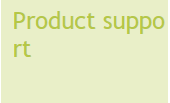
I want it to be like,

Please note:
I had to useword-break: break-all;as for Some of the languages the translated text is too long and it overflows out of the grid. The text 'Product Support' is dynamic.Update:
I have a fixed width for the div with id, grid2. In one of the languages the translated text is too long, it's a Single word and it flows out of the grid2 div.Updated the code too.