How to provide shadow to Button
Solution 1
Use this approach to get your desired look.
button_selector.xml :
<selector xmlns:android="http://schemas.android.com/apk/res/android">
<item>
    <layer-list>
        <item android:right="5dp" android:top="5dp">
            <shape>
                <corners android:radius="3dp" />
                <solid android:color="#D6D6D6" />
            </shape>
        </item>
        <item android:bottom="2dp" android:left="2dp">
            <shape>
                <gradient android:angle="270"
                    android:endColor="#E2E2E2" android:startColor="#BABABA" />
                <stroke android:width="1dp" android:color="#BABABA" />
                <corners android:radius="4dp" />
                <padding android:bottom="10dp" android:left="10dp"
                    android:right="10dp" android:top="10dp" />
            </shape>
        </item>
    </layer-list>
</item>

</selector>
And in your xml layout:
<Button
   android:background="@drawable/button_selector"
   ...
   ..
/>
Solution 2
For android version 5.0 & above
try the Elevation for other views..
android:elevation="10dp"
For Buttons,
android:stateListAnimator="@anim/button_state_list_animator"
button_state_list_animator.xml - https://android.googlesource.com/platform/frameworks/base/+/master/core/res/res/anim/button_state_list_anim_material.xml
below 5.0 version,
For all views,
android:background="@android:drawable/dialog_holo_light_frame"
My output:
Solution 3
Here is my button with shadow cw_button_shadow.xml inside drawable folder
<?xml version="1.0" encoding="utf-8"?>
<selector xmlns:android="http://schemas.android.com/apk/res/android">
    <item android:state_pressed="false">
        <layer-list>
            <!-- SHADOW -->
            <item>
                <shape>
                    <solid android:color="@color/red_400"/>
                    <!-- alttan gölge -->
                    <corners android:radius="19dp"/>
                </shape>
            </item>
            <!-- BUTTON alttan gölge
              android:right="5px" to make it round-->
            <item
                android:bottom="5px"
                >
                <shape>
                    <padding android:bottom="5dp"/>
                    <gradient
                        android:startColor="#1c4985"
                        android:endColor="#163969"
                        android:angle="270" />
                    <corners
                        android:radius="19dp"/>
                    <padding
                        android:left="10dp"
                        android:top="10dp"
                        android:right="5dp"
                        android:bottom="10dp"/>
                </shape>
            </item>
        </layer-list>
    </item>

    <item android:state_pressed="true">
        <layer-list>
            <!-- SHADOW -->
            <item>
                <shape>
                    <solid android:color="#102746"/>
                    <corners android:radius="19dp"/>

                </shape>
            </item>
            <!-- BUTTON -->
            <item android:bottom="5px">
                <shape>
                    <padding android:bottom="5dp"/>
                    <gradient
                        android:startColor="#1c4985"
                        android:endColor="#163969"
                        android:angle="270" />
                    <corners
                        android:radius="19dp"/>
                    <padding
                        android:left="10dp"
                        android:top="10dp"
                        android:right="5dp"
                        android:bottom="10dp"/>
                </shape>
            </item>
        </layer-list>
    </item>
</selector>
How to use. in Button xml, you can resize your height and weight
<Button
                android:text="+ add friends"
                android:layout_width="120dp"
                android:layout_height="40dp"
               android:background="@drawable/cw_button_shadow" />

Solution 4
If you are targeting pre-Lollipop devices, you can use Shadow-Layout, since it easy and you can use it in different kind of layouts.
Add shadow-layout to your Gradle file:
dependencies {
    compile 'com.github.dmytrodanylyk.shadow-layout:library:1.0.1'
}
At the top the xml layout where you have your button, add to the top:
xmlns:app="http://schemas.android.com/apk/res-auto"
it will make available the custom attributes.
Then you put a shadow layout around you Button:
<com.dd.ShadowLayout
        android:layout_marginTop="16dp"
        android:layout_width="wrap_content"
        android:layout_height="wrap_content"
        app:sl_shadowRadius="4dp"
        app:sl_shadowColor="#AA000000"
        app:sl_dx="0dp"
        app:sl_dy="0dp"
        app:sl_cornerRadius="56dp">

       <YourButton
          .... />

</com.dd.ShadowLayout>
You can then tweak the app: settings to match your required shadow.
Hope it helps.
Solution 5
I've tried the code from above and made my own shadow which is little bit closer to what I am trying to achieve. Maybe it will help others too.
<selector xmlns:android="http://schemas.android.com/apk/res/android">
    <item>
        <layer-list>
            <item android:left="5dp" android:top="5dp">
                <shape>
                    <corners android:radius="3dp" />
                    <gradient
                        android:angle="315"
                        android:endColor="@android:color/transparent"
                        android:startColor="@android:color/black"
                        android:type="radial"
                        android:centerX="0.55"
                        android:centerY="0"
                        android:gradientRadius="300"/>
                    <padding android:bottom="1dp" android:left="0dp" android:right="3dp" android:top="0dp" />
                </shape>
            </item>
            <item android:bottom="2dp" android:left="3dp">
                <shape>
                    <corners android:radius="1dp" />
                    <solid android:color="@color/colorPrimary" />


                </shape>
            </item>
        </layer-list>
    </item>

</selector>
Chintan Rathod
Keen to learn new technology, especially #Android. 190 person to earn Android Gold badge 338 person to earn Android Silver badge Like to share my experience and experiments on code at Chintanrathod.com, YouTube and Github. You can follow me on Twitter : @chintanrathod16 Google+ : +chintanrathod16 profile for Chintan C# Corner - A Social Community of Developers and Programmers http://www.c-sharpcorner.com/members/chintan-rathod2/flair.png
Updated on July 08, 2022Comments
-
Chintan Rathod almost 2 years
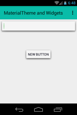
As you can see in image, I want shadow behind a
Button. I have createdButtonwith rounded corners. But problem is I can't generate a shadow behind thatButton. How can I achieve this? -
JohnnyLambada over 10 yearsThis looks cool, but when I tried this intellij didn't like it. When I looked at the doc for
itemit saysandroid:drawableis required. -
myforums over 9 yearsclosing </selector> tag is missing
-
 Admin almost 9 yearsIt's not exactly what the asker wanted as this solution makes the opposite: gradient button background and solid shadow color. And this seemes very different from outer shadow
 -
 JohnyTex almost 9 yearsCan I make it so that a textColor selector is baked into the above selector -so I don't have to set both background textColor each time I define a button, but only needs to set the background...?
 -
 jrichview about 8 yearsI'd like to use this approach, but my buttons are created dynamically (i.e. in code) in a grid control, not declaratively (actually, I'm using Xamarin free version, so Mono lib). Doesn't seem to be a straightforward method to set just any attribute.
 -
 Ranjithkumar about 8 years@jrichview see this answer & also comment stackoverflow.com/a/24459128/3879847
 -
forsberg about 8 yearsPoor lib, with deprecations, plus no more supported. Besides, it seems like it allows only for dark / black shadows, not light ones.
-
 CoolMind almost 6 yearsPlease, attach a screenshot.
 -
CoolMind almost 6 years
<selector>and<item>are not needed. The image is reverted, as @user4702646 said. -
 Egor about 5 yearsHey, how can I use this as drawable, if I set the shape of my button with drawable?
 -
Jono almost 5 yearsthe bottom corner left has a hard edge
-
 Ahmad Sattout over 3 yearsWhy is this an accepted answer? It looks no where near the desired shadow
 -
Jeffrey Blattman over 2 yearsThis results in a non(well, barely)-gradated shadow, because the gradient is applied not just to the visible shadow part but the entire offset shape.
-
Jeffrey Blattman over 2 yearsThis is actually the most accurate answer. Unfortunately trying to get a designer to work with 9-patch isn't an easy thing.