How to set up different Auto Layout constraints for different screen sizes
Solution 1
Without writing a single line of Code!
Once my junior developer asked me the same question that how can I differentiate between iPhoneSE and iPhone6 for some constraint at that time there was only one solution that was writing some thing like
if device == iPhoneSE {
   constant = 44
} else if device == iPhone6 {
   constant = 52
}
To overcome this issue I created a library Layout Helper so now you can update constraint for each device without writing a single line of code.
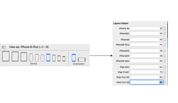
Step 1
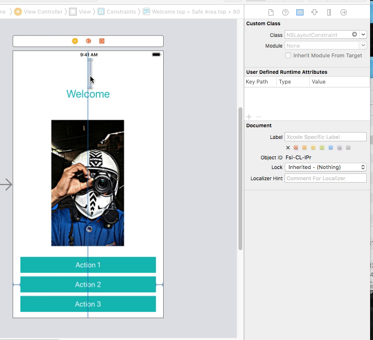
Assign the NSLayoutHelper to your constraint
Step 2
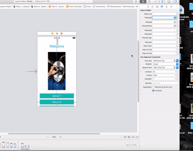
Update the constraint for the device you want
Step 3
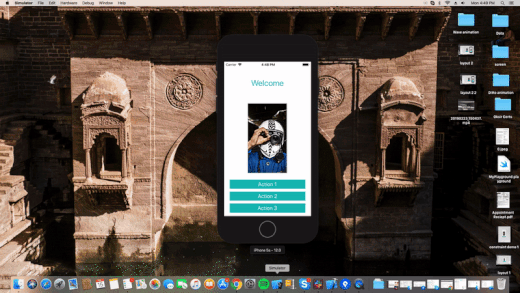
Run the app and see the MAGIC
Solution 2
Very easy. You can change constants values for difference size classes in Storyboard. I am giving u a few steps after which you will be able to grasp it.
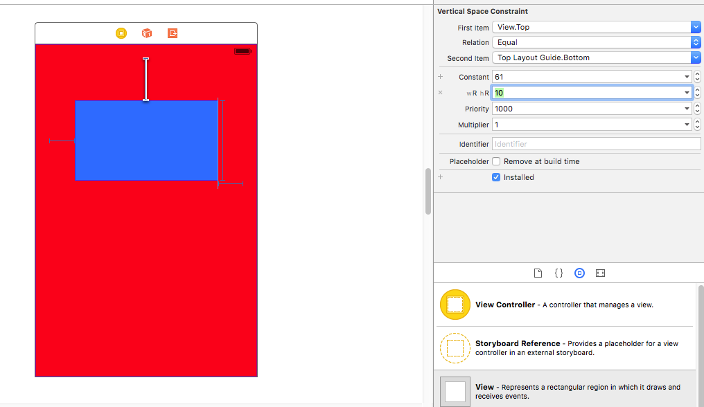
First we create constants as you can see on this view
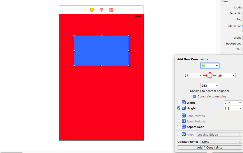
Next we select the constant we want to change the value in other size classes.
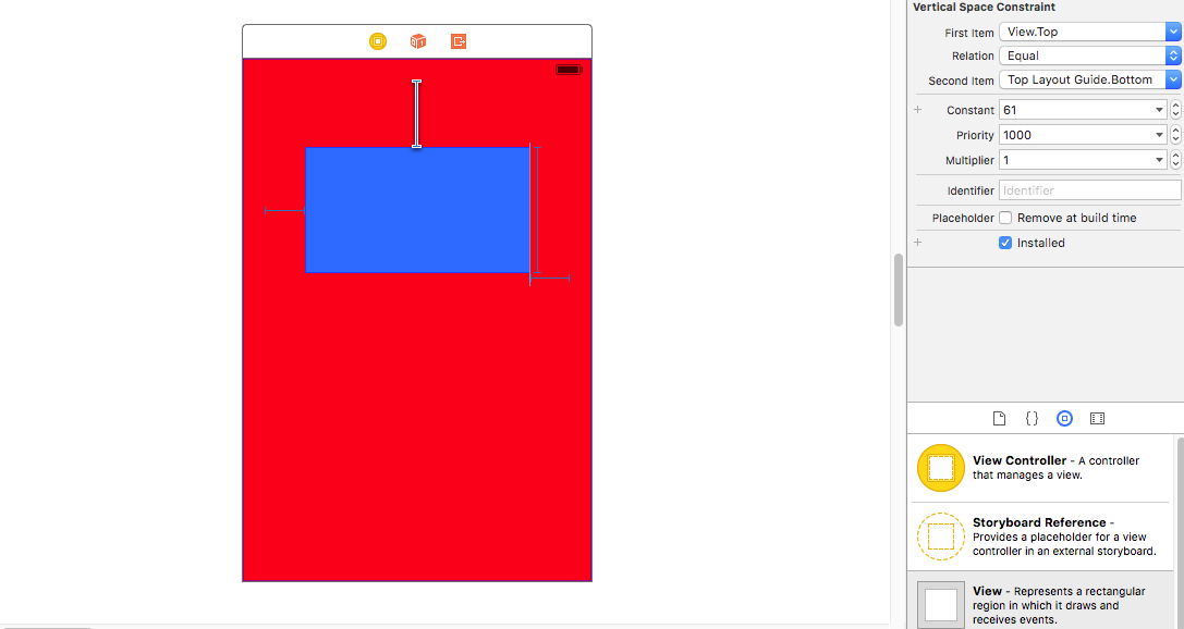
Now comes the tricky part. In the attribute inspector after selecting the constant, you can see the value of the constant. Right beside you can see the PLUS (+) sign, left of the "constant".
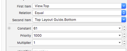
Click on it and select your size class that you want. Here i have selected Regular Height Regular Width i.e for iPad sizes.
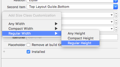
Next we give it a new value. So the constant, which normally is of value 61, will function as 10 when rendered in a size class of iPad size classes.
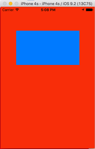
Here is the output --
iPhone 4:
iPad Air:
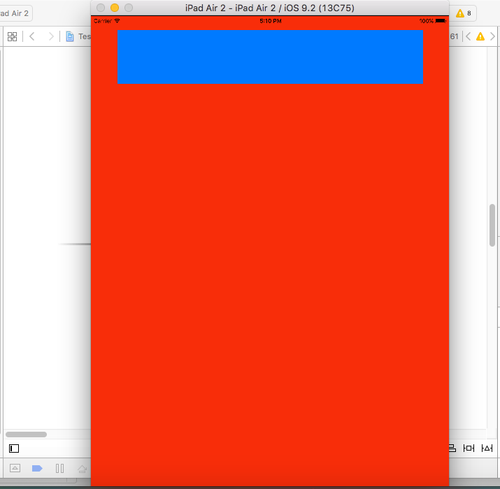
As you can see, the same constants has different value in runtime corresponding to different size classes.
Hope my explanation helped you.
Solution 3
Finally, I`ve found the solution which works in my case.
- I put the transparent view and added Align Center X/Y to Superview(background image) with the needed offset in the way which it suits my frame for posters(on the background image)- Constraints for the transparent view
- Then I attach Equal width/height to my Superview(background image) for that transparent view and change multiplier in equal width(manually I picked 0.61)
- After that, I landed my 1 poster. I also centered both vertically and horizontally with offset and used this set of constraints- Proportional width to Superview, Aspect ratio.
- And the last I disposed my second poster with this constraints- Leading space to Poster1, Align CenterY to Poster1(with the offset in my case) and Equal width/height. Constraints for the Poster 1/2
As the result, I have really adaptive Autolayout which works almost great on iPhones 5-6-6+
Solution 4
You can use BayKit for this job.
What is BayKit:
Calculates the global offset for all screen sizes by depending on given screen size and given offset.
How to use BayKit: Usage is very easy, just import BayKit and set constant value with BayKit like this:
import BayKit

class MyViewController: UIViewController {
lazy var box = UIView()
let magicOffset = BayKit()

override func viewDidLoad() {
    super.viewDidLoad()
    view.addSubview(box)
    box.translatesAutoresizingMaskIntoConstraints = false

    box.leadingAnchor.constraint(equalTo: view.leadingAnchor, constant: magicOffset.offseter(scaleFactor: 1.0,
    offset: 24, direction: .horizontal, currentDeviceBound: BayKit.DeviceList.iPhone5.screenWidth)).isActive = true
}
}
As you can see this line calculating offset for all screen sizes:
magicOffset.offseter(scaleFactor: 1.0, offset: 24, direction: .horizontal, currentDeviceBound: BayKit.DeviceList.iPhone5.screenWidth)
Offseter Features:
- scaleFactor: You can set if you want bigger or smaller then given offset(for default set 1.0).
- offset: Preferred constant in tested device.
- direction: Which direction are you looking for,i.e. (for width, leading, trailing use .horizontal,for height, top, bottom use .vertical)
- currentDeviceBound: Find your best fit device and set as a main device with this. BayKit will calculate constraints with depending on your best fit screen!
Example Result:
Comments
-
Vitya Shurapov about 4 years
I have a tableView with static cells. The cell contains an ImageView which fills it completely. And I have another smaller ImageViews atop. I position this ImageViews with constraints. I have a question about resizing the constraints. How can I set different constraint constants for different devices sizes without programming if/else loops. Is there a way to set it in the storyboard? I have a leading constraint to parent layout for example with an constant value of 10. This is okay for the iPhone 5 screen, but on an iPhone 6/ 6 plus screen it should be higher than 10.
iPhone5 Autolayout

iPhone6 Autolayout

-
Vitya Shurapov almost 8 yearsSaheb, thank you a lot!! Such a nice answer and it fully covers one part of my issue- it works with devices which have different SizeClasses(iPhone/iPad). And what can I do when it`s all about scaling because background image that fills my cell is wider on iPhone6 than on iPhone5! this makes two top posters shifted relative to the background image as you could see above.
-
 Saheb Roy almost 8 yearsfor other devices such as iPhone4 and 5, with same size classes you can manually check and alter the constraints or you can design your images in that aspect.
 -
Vitya Shurapov almost 8 yearsI know about this solution and I`m still looking for the universal one which will work with any device;-))
-
Saheb Roy almost 8 yearsUsing size classes will work on any device. You see there in storyboard there is a H and V sign. Well you select them according to the respective size classes and start designing. With that you will get 1 storyboard for all designs and sizes
-
Vitya Shurapov almost 8 yearsThe point is that iPhone5 and 6 have same size class in Portrait and a different scale of the image on the screen.
-
DBIT almost 6 yearsThey could have made this a lot more intuitive by naming the size classes after actual devices.
-
Saheb Roy over 5 yearsNo actually that would make it even more cumbersome, as Size classes also conceive the different size and orientation of the devices as well.
-
 tryKuldeepTanwar about 5 yearsThank you @Vitya Shurapov for marking the answer correct!
 -
Vitya Shurapov about 5 yearsInteresting solution! Thank you! :)
-
shubham mishra almost 5 yearsAwesome solution bro, Thanks
-
Nauman Aslam over 4 years@dreamBegin I tried your library but it doesn't really do anything. I was able to set varying values for different devices but it doesn't really effects when I run. Any suggestions?
-
tryKuldeepTanwar over 4 yearsThere must someting you were missing, can you elaborate more? @NaumanAslam
-
Nauman Aslam over 4 years@dreamBegin in fact I was! I actually imported your's xcodeproj to my existing project and although I was able to see it in storyboard, it wasn't rendering on the simulators. Tried by copying all of the swift files in to my project and it worked like a charm. btw, Thanks for this wonderful solutions
-
 Pressing_Keys_24_7 almost 4 years@tryKuldeepTanwar I have imported the folder into my project and changed the class of the constraints to NSLayoutHelper. But, as I change the constraints for different devices, it is resulting in changed in all the devices. Any suggestions for this? Thanks!
 -
tryKuldeepTanwar almost 4 years@Pressing_Keys_24_7 can you elaborate more? also you can use cocopods for importing the library no need to import manually now.
-
Pressing_Keys_24_7 almost 4 years@tryKuldeepTanwar Yes, I have done that and it's working perfectly now! Thanks for the help! Really appreciate it and thanks for sharing this useful library!