How to use CSS (and JavaScript?) to create a blurred, "frosted" background?
Solution 1
Thanks for the inspiration... It led me to this canvas plugin which does the trick
New and Improved: -webkit- and Firefox Working Example, now re-sizable/fluid.
JS
$(document).ready(function () {
    frost = function () {
        var w = $('#main-view').width();
        html2canvas(document.body, {
            onrendered: function (canvas) {
                document.body.appendChild(canvas);
                $('canvas').wrap('<div id="contain" />');
            },
            width: w,
            height: 30
        });
        $('canvas, #partial-overlay, #cover').hide();
        $('#cover').fadeIn('slow', function () {
            $('#partial-overlay').fadeIn('slow');
        });
    };

    $('body').append('<div id="cover"></div><svg id="svg-image-blur"><filter id="blur-effect-1"><feGaussianBlur stdDeviation="2"/></filter></svg>');

    $('#main-view').click(function () {
        frost();
        $('#partial-overlay').addClass('vis');
        $(window).resize(function () {
            $('canvas, #partial-overlay, #cover').hide();
        });

        function onResize() {
            if ($('#partial-overlay').hasClass('vis')) {
                frost();
            }
        }
        var timer;
        $(window).bind('resize', function () {
            timer && clearTimeout(timer);
            timer = setTimeout(onResize, 50);
        });

    });

    $('#partial-overlay').click(function () {
        $('#partial-overlay').removeClass('vis');
        $('canvas, #partial-overlay, #cover').hide();
    });
});
CSS
#main-view {
    width:75%;
    height:50%;
    box-sizing: border-box;
    margin:8px;
}
#partial-overlay {
    display:none;
    width: 100%;
    height: 20px;
    position: absolute;
    top: 0;
    left: 0;
    z-index:99;
    background: rgba(255, 255, 255, 0.2);
    cursor:pointer;
}
canvas {
    position: absolute;
    top: 0;
    left: 0;
    -webkit-filter:blur(5px);
    filter: url(#blur-effect-1);
}
#cover {
    display:none;
    height:19px;
    width:100%;
    background:#fff;
    top:0;
    left:0;
    position:absolute;
}
#contain {
    height:20px;
    width:100%;
    overflow:hidden;
    position:absolute;
    top:0;
    left:0;
}
svg {
    height:0;
    width:0;
}
HTML
<div id="main-view">
    <div style="width: 10%; height: 20%; background: #f00; float: left"></div>To my left is a red box
    <br>Now there is just text
    <br>Text that goes on for a few pixels
    <br>or even more</div>
<div id="partial-overlay">Here is some content</div>
I put it in a click function, because I figured it would be the most likely use case. It will work just as well on document ready.
Although the canvas representation wont be pixel perfect, I don't think it will really matter in most cases because its being blurred.
Update: As requested this is now re-sizable. I also moved the cover div into the JS and added an svg fall back for Firefox. The resizing requires the canvas to be redrawn on each re-size, so I set it up to hide the canvas, overlay, etc while you're resizing and then replace it when the re-size stops.
Solution 2
Basically you could have a overlay placeholder where you duplicate the main content and sync the scrolling of both divs, than apply css blur filter on the overlay only.
A simple javascript will do:
$(document).ready(function(){
  $('.overlay').append( $('.content').html() );
  $('.content').on('scroll', function(){
    $('.overlay').scrollTop($(this).scrollTop());
  });
});
And for the CSS:
.overlay {
    overflow:hidden;
    -webkit-filter: blur(.25em);
    background:#fff;
}
I put together a working example for you (webkit only):
Have fun! :)
Solution 3
Recently, a new -webkit-backdrop-filter. This is currently supported in Safari 9.0, and Chrome behind a flag.
Demo:
#blurred {
  -webkit-backdrop-filter: blur(10px);
  width: 200px;
  height: 100px;
  position: fixed;
  top: 50px;
  left: 50px;
  border: 3px solid white;
}
<img src="https://upload.wikimedia.org/wikipedia/commons/e/eb/Ash_Tree_-_geograph.org.uk_-_590710.jpg">
<div id="blurred"> Blurred </div>Support right now is only Safari. Chrome and Opera have this under a flag.
Note: Today -webkit-backdrop-filter still doesn't have great support so for now if you want to get this effect, the best way is using SVG's feGaussianBlur
Solution 4
CSS only solution:
backdrop-filter: blur(4px);
Solution 5
I've made some css-trick without backdrop-filter because chrome doesn't support it by default
My original code with sass: https://codepen.io/mixal_bl4/pen/EwPMWo
$(()=>{
  let sdm = $('.some-draggable-modal');
  sdm.center().draggable();
});

jQuery.fn.center = function () {
    this.css("position","absolute");
    this.css("top", Math.max(0, (($(window).height() - $(this).outerHeight()) / 2) +
                                                $(window).scrollTop()) + "px");
    this.css("left", Math.max(0, (($(window).width() - $(this).outerWidth()) / 2) +
                                                $(window).scrollLeft()) + "px");
    return this;
};
body {
background: -webkit-repeating-linear-gradient(135deg, #fff, #fff 25px, #e2edc1 25px, #e2edc1 50px) fixed;
background: repeating-linear-gradient(-45deg, #fff, #fff 25px, #e2edc1 25px, #e2edc1 50px) fixed;
background-attachment: fixed;
background-size: cover;
}
html:before,
body:before {
content: "";
display: block;
position: absolute;
top: 0;
left: 0;
right: 0;
bottom: 0;
background: rgba(0, 0, 0, 0.3);
}
html .some-draggable-modal,
body .some-draggable-modal {
width: 150px;
height: 150px;
border: 1px solid lime;
display: -webkit-box;
display: -ms-flexbox;
display: flex;
place-content: center;
-webkit-box-orient: vertical;
-webkit-box-direction: normal;
-ms-flex-direction: column;
flex-direction: column;
text-align: center;
border-radius: 6px;
cursor: move;
position: relative;
overflow: hidden;
}
html .some-draggable-modal .title,
body .some-draggable-modal .title {
position: relative;
z-index: 1;
color: black;
}
html .some-draggable-modal:before,
body .some-draggable-modal:before {
content: "";
position: absolute;
top: 0;
left: 0;
right: 0;
bottom: 0;
background: -webkit-repeating-linear-gradient(135deg, #fff, #fff 25px, #e2edc1 25px, #e2edc1 50px) fixed;
background: repeating-linear-gradient(-45deg, #fff, #fff 25px, #e2edc1 25px, #e2edc1 50px) fixed;
background-attachment: fixed;
background-size: cover;
}
html .some-draggable-modal:hover:before,
body .some-draggable-modal:hover:before {
-webkit-filter: blur(2px);
filter: blur(2px);
}
html .some-draggable-modal:hover:after,
body .some-draggable-modal:hover:after {
content: "filter: blur(2px)";
position: absolute;
left: 0;
right: 0;
bottom: 10px;
color: green;
}<script src="//cdnjs.cloudflare.com/ajax/libs/jquery/3.2.1/jquery.min.js"></script>
<script src="//cdnjs.cloudflare.com/ajax/libs/jqueryui/1.12.1/jquery-ui.min.js"></script>
<div class="some-draggable-modal">
<span class="title">You can drag me :)</span>
</div>
Aaron Yodaiken
John Jay Scholar of Economics at Columbia. Love coding, designing, and learning to make the world a better place. Learn more about what I’m up to at www.aaronyodaiken.com.
Updated on July 18, 2022Comments
-
Aaron Yodaiken almost 2 years
I'm trying to create an iOS 7 style frosted look with HTML5, CSS3 and JavaScript which can work on webkit browsers.
Technically, given the following HTML:
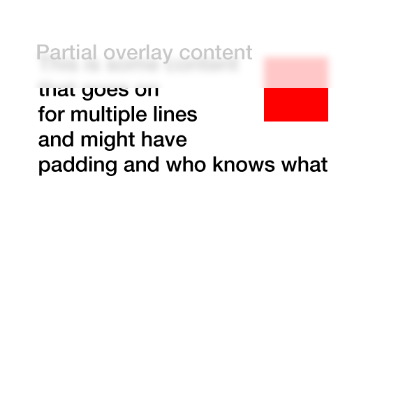
<style>
  #partial-overlay {
    width: 100%;
    height: 20px;
    background: rgba(255, 255, 255, .2); /* TODO frost */
    position: fixed;
    top: 0;
    left: 0;
  }
</style>
<div id="main-view">
  <div style="width: 50px; height: 50px; background: #f00"></div>
  To my left is a red box<br>
  Now there is just text<br>
  Text that goes on for a few pixels <br>
  or even more
</div>
<div id="partial-overlay">
  Here is some content
</div>
I'd like to apply something like a
-webkit-filter: blur(5px)to the first 20px horizontally of#main-view.If the CSS was modified to be
#partial-overlay { width: 20px; height: 100%; ...}then I'd need to apply the-webkit-filter: blur(5px)to the first 20px vertically.The obvious solution is to use javascript to make a clone of the
#main-view, setoverflow: hiddenand then change the width/height as appropriate but that seems to me hard to generalize to more complex pages/CSS structures.Is there a better way to achieve this with minimal performance hit and maximal generalizability?
EDIT: Here is an example of what I'm trying to achieve:
-
Aaron Yodaiken almost 11 yearsSorry, I am trying to blur the background of the rectangle, not the rectangle itself.
-
 Connor almost 11 yearsWhat do you mean? Inside it? or behind it?
 -
Antony almost 11 yearsDid you see the image in the question? Yours looks nothing like it.
-
Connor almost 11 yearsThanks man, seems like the asker has gone offline... I can host the page till he comes back... Also what you do come back, what is this being used for? It looks pretty cool!
-
Matthew Blancarte almost 11 yearsHmmmm... I don't think this truly accomplishes what OP is asking for. You've just added two divs that have blurs to make it seem like they have the overlay blur.
-
Connor almost 11 yearsWell, its the only way this will work... so... I agree with you but, what else can we give him?
-
Aaron Yodaiken almost 11 yearsIt's a good effort, but all you're doing is blurring a white div on top of the unblurred #main-view, which gives an appearance of the partially covered content being slightly blurred.
-
Aaron Yodaiken almost 11 yearsIf you could somehow make an example where the background image is made by one of those "javascript screenshot" things and then blurred, that might be a really smart answer.
-
Aaron Yodaiken almost 11 yearsThis is just about the trick. The only problem is that the blur fades out at the edges of the canvas (not really a problem around the edges, but definitely at the bottom). Perhaps this can be fixed with some wrapper divs and whatnot, but I couldn't seem to get it to work quickly.
-
Aaron Yodaiken almost 11 yearsIt looks decent, but it's still not blurring the same as if the canvas was cut off at 20px or whatever which is what I'm ultimately aiming for.
-
Aaron Yodaiken almost 11 yearsThere's something funny going on with text in the blur (it's not fully blurring or maybe the canvas is really not transparent or something like that). See jsfiddle.net/TfWs3/33
-
Connor almost 11 yearsSorry, then its not possible
-
 apaul almost 11 years@AaronYodaiken if you need it to be a little more cross browser compatible check this out, you can use svg as a fall back for firefox jsfiddle.net/apaul34208/TfWs3/61
 -
Aaron Yodaiken almost 11 yearsIf you could make a contained JS function that does everything with fluid width and whatnot (like Ken did) I'll give you the bounty for you hard work over this. Thanks!
-
Keith over 10 yearsI've expanded on this to blur the background using an SVG filter: JS Fiddle - FX only but much quicker than using
html2canvas. -
 vals over 10 years@Keith Thanks ! It is a real pitty that the background: element feature isn't more widely available, it would allow a lot of posibilities
 -
mredig over 9 yearsThis seems to be by far the simplest and most elegant solution I've come across.
-
Automatico about 9 yearsThis approach is pretty awesome, however I can see some uneven frosting on the top-part of the div. Any idea what might cause this?
-
Gerson Goulart about 9 years@Cort3z, this is due to the fading out of the blur effect (which allows you to see the regular text underneath. To better understand, look at the images in the blur example in this post: html5rocks.com/en/tutorials/filters/understanding-css (note the edges of the image in the right fading to white). To account for that and have a sharp edge with blurred content you'd have to make the blurred content a little bigger and then clip it (or make it go off-canvas) for a sharper edge). I hope I made it clearer... This example should have a sharper edge: jsfiddle.net/kmxD3/105
-
Automatico about 9 years@GersonGoulart Awesome! Thanks for the explanation :)
-
 Admin almost 9 yearsThere is a similar question, but I don't feel like digging into this to make it work for that question. Could you offer some input there?
 -
trusktr over 8 yearsThis is the official solution. Can set this as the answer?
-
 Zach Saucier over 8 yearsThanks vals, as always ;)
 -
vals over 8 years@ZachSaucier Hi ! Happy to see you again !. As a strange coincidence, I was in Poland in september (a familiar wedding, nothing related with software :-)
-
Luca Steeb over 8 years@trusktr No, because it's only available in Safari, which is not really popular compared to Chrome and Firefox.
-
trusktr over 8 years@LucaSteeb Chrome supports it now, behind a flag. Hopefully this becomes the answer in the near future, as backdrop-filter will be the actual way to do it. The other answers are just cheap hacks.
-
Luca Steeb about 8 years@trusktr Cheap hacks is maybe a bit exaggerated, but generally you're right. The problem is that even when all new browsers support it, what are you doing with users which are using old browsers - it's probably not a small amount..
-
trusktr about 8 years@LucaSteeb Indeed, that's a problem, but doesn't change the fact that the other methods are still just hacks. Native has had this ability forever. It's finally time for the Web to start getting real features.