How use the real Floating Action Button (FAB) Extended?
Solution 1
- Add the dependencies in your Gradle file:
implementation 'com.google.android.material:material:1.1.0-alpha04'
in your xml file:
<com.google.android.material.floatingactionbutton.ExtendedFloatingActionButton
            android:id="@+id/fab"
            android:layout_width="wrap_content"
            android:layout_height="wrap_content"
            android:layout_gravity="bottom|end"
            android:layout_alignParentBottom="true"
            android:layout_alignParentEnd="true"
            android:layout_margin="@dimen/fab_margin"
            android:text="Create"
            app:icon="@drawable/outline_home_24" />
Solution 2
You can create a utility class that animates a MaterialButton to an Extended FloatingActionButton using a ConstraintLayout. You'll first need to declare the two states of the MaterialButton in xml, and then use the TransitionManager to animate between them.
You can read a medium post about it here, in the meantime, I'll add bits of relevant code here.
Collapsed FAB state:
<?xml version="1.0" encoding="utf-8"?>
<android.support.constraint.ConstraintLayout android:id="@+id/extend_fab_container"
    xmlns:android="http://schemas.android.com/apk/res/android"
    xmlns:app="http://schemas.android.com/apk/res-auto"
    android:layout_width="wrap_content"
    android:layout_height="wrap_content"
    android:background="@drawable/bg_fab"
    android:elevation="8dp">

    <android.support.design.button.MaterialButton
        android:id="@+id/fab"
        style="@style/Widget.MaterialComponents.Button.UnelevatedButton"
        android:layout_width="56dp"
        android:layout_height="56dp"
        app:cornerRadius="56dp"
        app:layout_constraintBottom_toBottomOf="parent"
        app:layout_constraintLeft_toLeftOf="parent"
        app:layout_constraintRight_toRightOf="parent"
        app:layout_constraintTop_toTopOf="parent" />
</android.support.constraint.ConstraintLayout>
Extended FAB State:
<?xml version="1.0" encoding="utf-8"?>
<android.support.constraint.ConstraintLayout android:id="@+id/extend_fab_container"
    xmlns:android="http://schemas.android.com/apk/res/android"
    xmlns:app="http://schemas.android.com/apk/res-auto"
    android:layout_width="wrap_content"
    android:layout_height="wrap_content"
    android:elevation="8dp"
    android:background="@drawable/bg_fab">

    <android.support.design.button.MaterialButton
        android:id="@+id/fab"
        style="@style/Widget.MaterialComponents.Button.UnelevatedButton"
        android:layout_width="wrap_content"
        android:layout_height="wrap_content"
        app:cornerRadius="56dp"
        app:layout_constraintBottom_toBottomOf="parent"
        app:layout_constraintLeft_toLeftOf="parent"
        app:layout_constraintRight_toRightOf="parent"
        app:layout_constraintTop_toTopOf="parent" />
</android.support.constraint.ConstraintLayout>
Background Drawable:
<?xml version="1.0" encoding="utf-8"?>
<shape xmlns:android="http://schemas.android.com/apk/res/android">
    <solid android:color="@color/colorAccent" />
    <corners android:radius="56dp" />
</shape>
And relevant Java Expansion code:
private void setExtended(boolean extended, boolean force) {
    if (isAnimating || (extended && isExtended() && !force)) return;

    ConstraintSet set = new ConstraintSet();
    set.clone(container.getContext(), extended ? R.layout.fab_extended : R.layout.fab_collapsed);

    TransitionManager.beginDelayedTransition(container, new AutoTransition()
            .addListener(listener).setDuration(150));

    if (extended) button.setText(currentText);
    else button.setText("");

    set.applyTo(container);
}
Solution 3
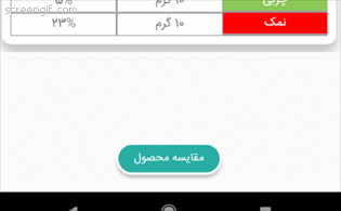
You can use this library to do that. (I used another way) But I used a FancyButton to create a round and awesome button in coordinator layout as below:
    <mehdi.sakout.fancybuttons.FancyButton
    android:id="@+id/actMain_btnCompare"
    app:layout_behavior="@string/fab_transformation_sheet_behavior"
    android:layout_width="125dp"
    android:layout_height="38dp"
    android:layout_gravity="bottom|center"
    android:layout_margin="20dp"
    android:elevation="3dp"
    android:padding="2dp"
    fancy:fb_borderColor="@color/white"
    fancy:fb_borderWidth="3dp"
    fancy:fb_defaultColor="@color/colorPrimaryDark"
    fancy:fb_radius="20dp"
    fancy:fb_text="مقایسه محصول"
    fancy:fb_textColor="@color/white"
    fancy:fb_textGravity="center"
    fancy:fb_textSize="13sp" />
and result is:

That can have icon in it (see FancyButton).
with app:layout_behavior="@string/fab_transformation_sheet_behavior" it acts like fab as below:
Good luck.
Canato
In a serious relationship with Android, Java, Kotlin and mobile experience. Google Entusiast If I can help you, talk with me! E-mail/hangout: [email protected] Besides being a developer I love to listening music, play as DJ, produce music, make partys, dance, workout, play American football, have deep conversations, play RPG, read books, see series and study. Had a Party company for 6-7 years while doing my graduation, with big events (8k people, 3 stages, etc), but now I decided to focus on code and learning UI/UX. As I already had worked on marketing in Facebook and Google Ads and with user I'm looking forward for focus in how user should be happy using softwares. While can do a good middle camp between areas.
Updated on August 04, 2020Comments
-
Canato almost 4 years
To remove any doubts or thoughts about duplicate: on Material Design is defined what is "extended".
But most of the people confuses "extended" with "Type of Transition: Speed Dial", what make hard to find solutions. Like here
Question So what I'm looking forward is how setup the FAB with text and a extended size.
Today my code is like this:
<android.support.design.widget.FloatingActionButton
    android:id="@+id/maps_main_distance_btn"
    android:layout_width="0dp"
    android:layout_height="wrap_content"
    android:layout_marginBottom="8dp"
    android:text="@string/str_distance_btn"
    app:elevation="0dp"
    app:layout_constraintBottom_toBottomOf="parent"
    app:layout_constraintEnd_toEndOf="parent"
    app:layout_constraintStart_toStartOf="parent" />
But my button look like this:

No text and no right format. I'm using it in a Constraint Layout.
-
Canato almost 6 yearsI tried now, but didn't work for me. Can you say what dimens are you using? and if you have a picture of the result? Thanks.
-
Canato over 5 yearsI see this but how it's the behaviour when a snackBar message appears? it moves up? cover the message or get covered?
-
Tunji_D over 5 years@Canato the FAB will move up like it does in the Support Library
-
Sjd about 5 yearsGive this person a medal !!
-
 Guillaume about 5 yearsDon't forget to put material component theme, like 'Theme.MaterialComponents.NoActionBar'
 -
 Farid almost 5 years@Canato this is not a solution. Android won't let you define a custom background for FAB the way this guy has done. He has probably believed it will apply to FAB like other views but not :))
 -
Farid almost 5 yearsThe point I didn't get is why you're not simply using FlaotingActonButtonExtended of material design library
-
Canato almost 5 years@FARID thanks, I didn't put this as solution, I even said that didn't work for me
-
Canato almost 5 years@FARID if you pay attention for the date of the answer you can see that was not launch yet.
-
Farid almost 5 years@CanatovI didn't mean you. I meant the guy who posted this answer
-
 Артем Ильинский almost 5 yearsGreat! Thank's!
 -
sreedwish k jagan over 4 yearsIf your activity theme not inherit 'Theme.MaterialComponents.NoActionBar' , you must include android:theme="@style/Theme.MaterialComponents.NoActionBar" as an attribute of the button. Otherwise there is a chance to get layout inflate exception
-
McFizz over 3 yearsThis does not seem to work with material v
1.1.0(no alpha) or a newer version (I tried v1.2.1). Why do I need1.1.0-alpha04for this to work? Is there anywhere I can verify/check if there are newer implementations I can use that include this?