IFrame height issues on iOS (mobile safari)
Solution 1
It looks like this: How to get an IFrame to be responsive in iOS Safari?
iFrames have an issue on iOS only, so you have to adapt your iframe to it.
You can put a div wrapping the iframe, set css on the iframe and, what worked for me, was to add: put the attribute scrolling='no'.
Wishing you luck.
Solution 2
I got the same issue. And after tried all solutions I could find, I finally found how to solve it.
This issue is caused by the iOS Safari, it will auto-expend the hight of iframe to fit the page content inside.
If you put the scrolling='no' attribute to the iframe as <iframe scrolling='no' src='content.html'>, this issue could be solved but the iframe could not show the full content of the page, the content which exceeds the frame will be cut.
So we need to put a div wrapping the iframe, and handle the scroll event in it.
<style>
.demo-iframe-holder {
  width: 500px;
  height: 500px;
  -webkit-overflow-scrolling: touch;
  overflow-y: scroll;
}

.demo-iframe-holder iframe {
  height: 100%;
  width: 100%;
}
</style>

<html>
<body>
    <div class="demo-iframe-holder">
        <iframe src="content.html" />
    </div>
</body>
</html>
references:
https://davidwalsh.name/scroll-iframes-ios
How to get an IFrame to be responsive in iOS Safari?
Hope it helps.
Solution 3
PROBLEM:
I was having the same issue. Sizing/styling the iframe's container div and adding scrolling="no" to the iframe didn't work for me. Having a scrolling overflow like Freya describes wasn't an option, either, because the contents of my iframe needed to size depending on the parent container. Here's how my original (not working, overflowing its container) iframe code was structured:
<style>
    .iframe-wrapper {
        position: relative;
        height: 500px;
        width:   100%;
    }

    .iframe {
        display: block;
        position: absolute;
        top:    0;
        bottom: 0;
        left:   0;
        right:  0;
        width:  100%;
        height: 100%;
    }
</style>

<div class="iframe-wrapper">
    <iframe frameborder="0" scrolling="no" class="iframe" src="content.html"></iframe>
</div>
SOLUTION:
This super simple little CSS hack did the trick:
<style>
    .iframe-wrapper {
        position: relative;
        height: 500px;
        width:   100%;
    }

    .iframe {
        display: block;
        position: absolute;
        top:    0;
        bottom: 0;
        left:   0;
        right:  0;
        width:  100px;
        min-width:  100%;
        height: 100px;
        min-height: 100%;
    }
</style>

<div class="iframe-wrapper">
    <iframe frameborder="0" scrolling="no" class="iframe" src="content.html"></iframe>
</div>
Set the iframe's height/width to some small, random pixel value. Set it's min-height & min-width to what you actually want the height/width to be. This completely fixed the issue for me.
suamikim
Updated on July 09, 2022Comments
-
suamikim almost 2 years
Example page source:
<!DOCTYPE html>
<html lang="en">
<head>
    <meta charset="UTF-8">
    <meta name="viewport" content="width=device-width, initial-scale=1, maximum-scale=1, user-scalable=no">
    <title>Page</title>
</head>
<body>
<div class="main" style="height: 100%;">
    <div class="header" style="height: 100px; background-color: green;"></div>

    <iframe src="http://www.wikipedia.com"
            style="height: 200px; width: 100%; border: none;"></iframe>

    <div class="footer" style="height: 100px; background-color: green;"></div>
</div>
</body>
</html>
The problem is, that
heightof200pxfrom the IFrames inline style is ignored on mobile safari: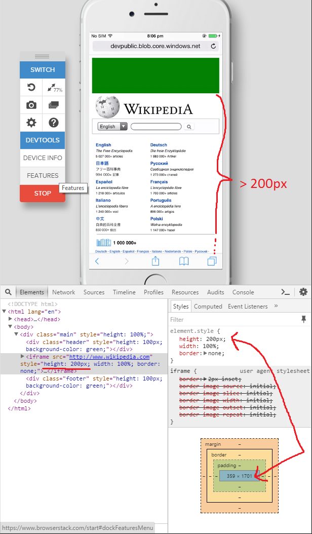
Also I'd like to change the height of the IFrame dynamically via vanilla JavaScript which is not working at all with the following code:
document.getElementsByTagName('iframe')[0].style.height = "100px"The value of the
heightstyle is changed correctly according to the dev tools but it's simply ignored since the actually rendered height of the IFrame doesn't change.This only seems to be a problem in mobile Safari and is working as expected on the latest versions of desktop Safari, Firefox, Chrome, Androids WebView etc.
Testpage: http://devpublic.blob.core.windows.net/scriptstest/index.html
Ps.: I tested this with various devices on browserstack and also took the screenshots there since I don't have no actual iDevice at hand.