Is it possible to use display:block on td in HTML email, to achieve responsive table design?
Solution 1
The accepted answer provides some great info but it doesn't address the question directly. I've been experimenting with responsive emails recently and have come up with some good solutions others might find useful. Here we go...
To answer the question, you can use display:block; to make table columns behave as rows on some mobile devices (Android, iOS and Kindle).
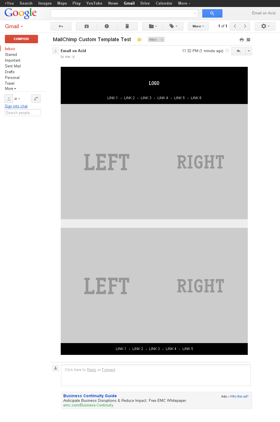
Here's an example showing how you would make a 2 column layout stack (left columns on top of right column) on mobile devices.
HTML
<table class="deviceWidth" width="100%" cellpadding="0" cellspacing="0" border="0" style="border-collapse: collapse; mso-table-lspace:0pt; mso-table-rspace:0pt; ">
  <tr>
    <td width="50%" align="right" class="full">
      <p style="mso-table-lspace:0;mso-table-rspace:0; padding:0; margin:0;">
        <a href="#"><img src="http://placehold.it/440x440&text=LEFT" alt="" border="0" style="display: block; width:100%; height:auto;" /></a>
      </p>
    </td>
    <td width="50%" align="left" class="full">
        <a href="#"><img src="http://placehold.it/440x440&text=RIGHT" alt="" border="0" style="display: block; width:100%; height:auto;" /></a>
    </td>
  </tr>
</table>
CSS
@media only screen and (max-width: 640px)  {
    body[yahoo] .deviceWidth {width:440px!important; }  T

    body[yahoo] .full {
        display:block;
        width:100%;
    }
}
Note: The body[yahoo] selector prevents Yahoo from rendering the media queries. The body element of my email has a yahoo="fix" attribute.
The above CSS says that if the screen is less than 640px in width then the tds with a class of full should display:block with width:100%.
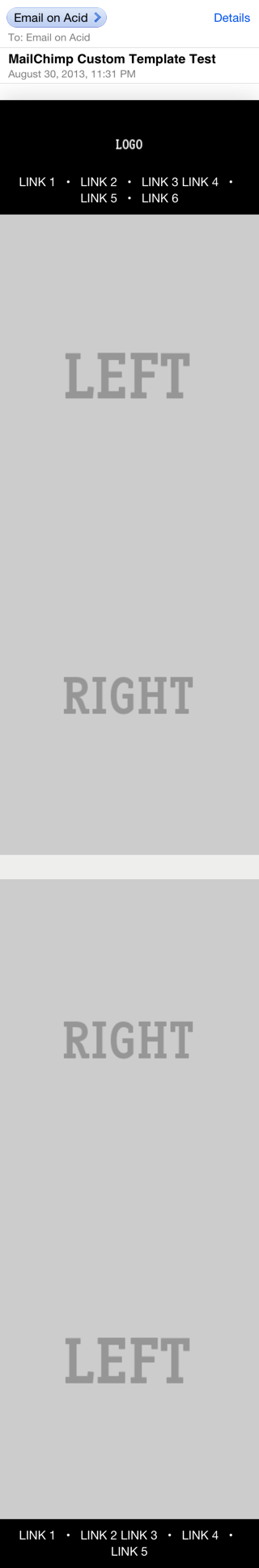
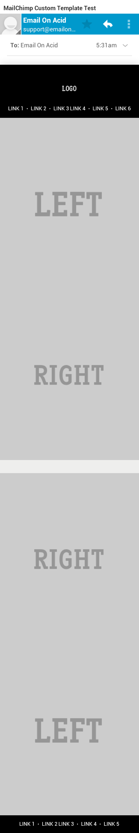
Now, let's get a bit fancier. Sometimes you'll want the column on the left to stack BELOW the column on the right. To do this we can use dir="rtl" on the containing table to flip the order of the columns. The CSS stays the same, here's the new HTML:
HTML
<table class="deviceWidth" dir="rtl"  width="100%" cellpadding="0" cellspacing="0" border="0" style="border-collapse: collapse; mso-table-lspace:0pt; mso-table-rspace:0pt; ">
  <tr>
    <td width="50%" dir="ltr" align="right" class="full">
      <p style="mso-table-lspace:0;mso-table-rspace:0; padding:0; margin:0;">
        <a href="#"><img src="http://placehold.it/440x440&text=RIGHT" alt="" border="0" style="display: block; width:100%; height:auto;" /></a>
      </p>
    </td>
    <td width="50%" dir="ltr" align="left" class="full">
        <a href="#"><img src="http://placehold.it/440x440&text=LEFT" alt="" border="0" style="display: block; width:100%; height:auto;" /></a>
    </td>
  </tr>
</table>
By adding the dir="rtl" we're telling it to reverse the order of the columns. The first column (in the flow of the HTML) is being displayed on the right, the second column (in the HTML) on the left. For screens smaller than 640px it displays the first column (the column on the right) first, and the second column (the column on the left) second.
Here's the full HTML and CSS and a screenshots from Gmail and iOS 5 are attached.
Solution 2
I suggest you refer to this: http://www.campaignmonitor.com/css/
While not very up to date, it's a great resource in terms of css support for emails. Unfortunately when building email templates you need to consider not only browsers, but different clients e.g. Outlook and the css support they offer is notoriously poor.
On top of that, mail providers like gmail tend to strip certain parts of your document (e.g. the head tag) so it becomes really difficult to apply any responsive design concepts to an audience (the email clients) that has very poor support for even basic css.
Solution 3
I was able to make it work, here is the result: https://litmus.com/pub/d9ac198
Here is a code I use to force td to behave like rows:
table[class="magic"],
table[class="magic"] tbody,
table[class="magic"] tr,
table[class="magic"] td {
    display: block !important;
    width: 100%;
}
Solution 4
Another approach is to work with 2 designs in one e-mail: one for desktop readers, and one for mobile readers, as demosntrated here.
Chris
Updated on July 09, 2022Comments
-
Chris almost 2 years
This fantastic article describes how to create responsive tables which scale fabulously to mobile browsers.
Now I'm trying to apply the same technique to html emails but
display:blockjust won't seem to work in html emails.To reproduce the issue:
Save the following code as an HTML page:
<!DOCTYPE html PUBLIC "-//W3C//DTD XHTML 1.0 Transitional//EN" "http://www.w3.org/TR/xhtml1/DTD/xhtml1-transitional.dtd">
<html>
<head>
    <meta charset="utf-8">
    <style type="text/css">
        @media only screen and (max-width: 760px), screen and (max-device-width: 480px)  {
            /* Force table to not be like tables anymore */
            table, td, tbody, tr{
                    display: block;
                    width:100%;
                    padding:0;
                    clear:both;
            }
            td {
                    /* Behave  like a "row" */
                    position: relative !important;
            }
        }
    </style>
</head>
<body>
    <table style="width:100%;">
        <tr>
            <td style="border:1px solid red;">1/1</td>
            <td style="border:1px solid red;">1/2</td>
            <td style="border:1px solid red;">1/3</td>
        </tr>
        <tr>
            <td style="border:1px solid red;">2/1</td>
            <td style="border:1px solid red;">2/2</td>
            <td style="border:1px solid red;">2/3</td>
        </tr>
    </table>
</body>
</html>
Open the page in Safari
Resize the window to note how the table changes with a smaller window-size
Press CMD+i or
File->MailContents of this page to create a HTML emailResize the email window to note how the table still resizes correctly
Send the email to yourself and open it.
Now notice how the email indeed responds to the media query but unsuccessfully restyles the table.
I have yet to find an email client that actually displays the table correctly. Is this a dead-end or do you have ideas of workarounds?
-
Chris about 11 yearsInteresting! Could you please post the full source?
-
Chanpory almost 10 yearsI just tried your exact code by copying and pasting into Litmus, and it doesn't seem to stack for me in iPhone 5. I also tried this technique in an email which I sent to myself. Perhaps, display:block on
tdelements are no longer working on iphone. -
Brett DeWoody almost 10 years@Chanpory - Did you make sure to keep the media query? Some ESPs will remove <styles> from the header, and in order for this to work in iOS the <styles> need to stay in the header.
-
Chanpory almost 10 yearsTurns out I was missing the
<!DOCTYPE>and<body>elements! That will break the layouts, even if the media queries and<style>is there. #facepalm -
BinarySolo about 7 yearsIf it's not working for you on iOS, the answer is here. You need to set display: block and width: 100% on the table rows (tr) as well as on the cells (td). Took me ages to see it, even if it was right in front of me :|