Is there a WPF control to select a range looking like a slider?
Solution 1
You can use RangeSlider from AvalonControlsLibrary.
Example:
<avalon:RangeSlider RangeStart="0" RangeStop="100"
                    RangeSelectionChanged="RangeSlider_RangeSelectionChanged"/>
Where avalon is:
xmlns:avalon="http://schemas.AvalonControls/AvalonControlsLibrary/Controls"
RangeSelectionChanged event hadler:
private void RangeSlider_RangeSelectionChanged(object sender, AC.AvalonControlsLibrary.Controls.RangeSelectionChangedEventArgs e)
{
    Console.WriteLine("e.NewRangeStart: " + e.NewRangeStart);
    Console.WriteLine("e.NewRangeStop: " + e.NewRangeStop);
}
Solution 2
The MahApps.Metro library provides a great RangeSlider control. Here is an example of them from the demo application:
Solution 3
Slider bar has a property IsSelectionRangeEnabled. check the sample: http://social.msdn.microsoft.com/Forums/en-US/wpf/thread/a9eb8697-3ae4-4045-9508-a75d6168a8af/
Solution 4
UPDATE: Avalon controls is the older predecessor to the WPF Extended Toolkit, which now includes the AvalonDock.
RangeSlider is part of the WPF Extended toolkit.
Solution 5
As @kmatyaszek already said AvalonControlsLibrary is great free (Microsoft Public License (Ms-PL)) Library of controls.
However i found for myself basic styles for RangeSlider not very satisfy.
Here is style for more modern version for it (RangeSlider.xaml):
        <ResourceDictionary xmlns="http://schemas.microsoft.com/winfx/2006/xaml/presentation" xmlns:x="http://schemas.microsoft.com/winfx/2006/xaml"
            xmlns:drawing="clr-namespace:System.Drawing;assembly=System.Drawing" >

    <SolidColorBrush x:Key="BrushSliderEdge" Color="LightGray" />
    <SolidColorBrush x:Key="BrushSliderActiveArea" Color="DeepSkyBlue" />
    <SolidColorBrush x:Key="BrushSliderThumb" Color="LightSkyBlue" />
    <SolidColorBrush x:Key="BrushSliderThumbBorder" Color="DeepSkyBlue" />

    <Style x:Key="SliderEdge" TargetType="RepeatButton">
    <Setter Property="Focusable" Value="false" />
    <Setter Property="IsTabStop" Value="false" />
    <Setter Property="OverridesDefaultStyle" Value="true" />
    <Setter Property="SnapsToDevicePixels" Value="true" />
    <Setter Property="Template">
        <Setter.Value>
        <ControlTemplate TargetType="RepeatButton">
            <Border Height="3" Background="{StaticResource BrushSliderEdge}" BorderBrush="{StaticResource BrushSliderEdge}" BorderThickness="1" />
        </ControlTemplate>
        </Setter.Value>
    </Setter>
    </Style>
    <Style x:Key="SliderInner" TargetType="Thumb">
    <Setter Property="OverridesDefaultStyle" Value="true" />
    <Setter Property="SnapsToDevicePixels" Value="true" />
    <Setter Property="Template">
        <Setter.Value>
        <ControlTemplate TargetType="Thumb">
            <Border Height="3" Background="{StaticResource BrushSliderActiveArea}" BorderBrush="{StaticResource BrushSliderThumbBorder}" BorderThickness="1" />
        </ControlTemplate>
        </Setter.Value>
    </Setter>
    </Style>


    <Style x:Key="SliderThumb" TargetType="Thumb">
    <Setter Property="OverridesDefaultStyle" Value="true" />
    <Setter Property="SnapsToDevicePixels" Value="true" />
    <Setter Property="Template">
        <Setter.Value>
        <ControlTemplate TargetType="Thumb">
            <Ellipse Width="10" Height="10" Fill="{StaticResource BrushSliderThumb}" />
        </ControlTemplate>
        </Setter.Value>
    </Setter>
    </Style>

    <Style TargetType="{x:Type local:RangeSlider}">
    <Setter Property="Template">
        <Setter.Value>
        <ControlTemplate TargetType="{x:Type local:RangeSlider}">
            <StackPanel Name="PART_RangeSliderContainer" Orientation="Horizontal">
            <RepeatButton Name="PART_LeftEdge" Style="{StaticResource SliderEdge}" />
            <Thumb Name="PART_LeftThumb" Cursor="SizeWE" Style="{StaticResource SliderThumb}" />
            <Thumb Name="PART_MiddleThumb" MinWidth="10" Cursor="ScrollAll" Style="{StaticResource SliderInner}" />
            <Thumb Name="PART_RightThumb" Cursor="SizeWE" Style="{StaticResource SliderThumb}" />
            <RepeatButton Name="PART_RightEdge" Style="{StaticResource SliderEdge}" />
            </StackPanel>
        </ControlTemplate>
        </Setter.Value>
    </Setter>
    </Style>
</ResourceDictionary>
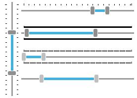
Here is example how it will look (you can change colors by changing brushes color values):

Replace with it base style from: http://avaloncontrolslib.codeplex.com/SourceControl/latest#trunk/AvalonControlsLibrary/Themes/RangeSlider.xaml
And use for control: http://avaloncontrolslib.codeplex.com/SourceControl/latest#trunk/AvalonControlsLibrary/Controls/RangeSlider.cs
Example of control usage in .NET 4.5
<UserControl x:Class="MyProject.MyUserControl"
         xmlns="http://schemas.microsoft.com/winfx/2006/xaml/presentation"
         xmlns:x="http://schemas.microsoft.com/winfx/2006/xaml"
         xmlns:d="http://schemas.microsoft.com/expression/blend/2008"
         xmlns:mc="http://schemas.openxmlformats.org/markup-compatibility/2006"
         xmlns:wpf="clr-namespace:Library.WPF;assembly=Library"
         MinWidth="700"
         HorizontalAlignment="Left"
         DataContext="{Binding RelativeSource={RelativeSource Self}}"
         mc:Ignorable="d">
<UserControl.Resources>
    <ResourceDictionary Source="/Library;component/WPF/RangeSlider/RangeSlider.xaml" />
</UserControl.Resources>

<StackPanel>
                <wpf:RangeSlider Width="400"
                                 MinRange="0"
                                 RangeStart="10"
                                 RangeStartSelected="{Binding MyValue_Min}"
                                 RangeStop="100"
                                 RangeStopSelected="{Binding MyValue_Max}" />
 </StackPanel>
In above example:
Assembly where control data located: Library
Namespace: Library.WPF
- /WPF/RangeSlider/RangeSlider.xaml <-- xaml style
- /WPF/RangeSlider/RangeSlider.cs <-- control code
Michel Keijzers
I'm a professional software engineer, working at Altran. I have interest in OO languages and have C++/C# knowledge (MCTS, WinForm, WPF applications). Until recently, I wrote an app for Korg music synthesizers (PCG Tools) and try to learn myself WPF at the same time. Lately, I'm into Arduino/STM32, learning the basics (and more) of electronics, and trying to build a MIDI/DMX device for MIDI keyboards and DMX512 lighting devices.
Updated on June 04, 2022Comments
-
Michel Keijzers almost 2 years
Is there a WPF control looking like a slider (or maybe Slider itself), that has both a minimum and maximum value instead of a single value to let the user select a range?