Jetpack compose. Date time picker
Solution 1
It seems they are still working on it, in the meantime if you need something very simple you can use the inter-ops of compose with Android Views:
@Composable
fun DatePicker(onDateSelected: (LocalDate) -> Unit, onDismissRequest: () -> Unit) {
    val selDate = remember { mutableStateOf(LocalDate.now()) }

    //todo - add strings to resource after POC
    Dialog(onDismissRequest = { onDismissRequest() }, properties = DialogProperties()) {
        Column(
            modifier = Modifier
                .wrapContentSize()
                .background(
                    color = MaterialTheme.colors.surface,
                    shape = RoundedCornerShape(size = 16.dp)
                )
        ) {
            Column(
                Modifier
                    .defaultMinSize(minHeight = 72.dp)
                    .fillMaxWidth()
                    .background(
                        color = MaterialTheme.colors.primary,
                        shape = RoundedCornerShape(topStart = 16.dp, topEnd = 16.dp)
                    )
                    .padding(16.dp)
            ) {
                Text(
                    text = "Select date".toUpperCase(Locale.ENGLISH),
                    style = MaterialTheme.typography.caption,
                    color = MaterialTheme.colors.onPrimary
                )

                Spacer(modifier = Modifier.size(24.dp))

                Text(
                    text = selDate.value.format(DateTimeFormatter.ofPattern("MMM d, YYYY")),
                    style = MaterialTheme.typography.h4,
                    color = MaterialTheme.colors.onPrimary
                )

                Spacer(modifier = Modifier.size(16.dp))
            }

            CustomCalendarView(onDateSelected = {
                selDate.value = it
            })

            Spacer(modifier = Modifier.size(8.dp))

            Row(
                modifier = Modifier
                    .align(Alignment.End)
                    .padding(bottom = 16.dp, end = 16.dp)
            ) {
                TextButton(
                    onClick = onDismissRequest
                ) {
                    //TODO - hardcode string
                    Text(
                        text = "Cancel",
                        style = MaterialTheme.typography.button,
                        color = MaterialTheme.colors.onPrimary
                    )
                }

                TextButton(
                    onClick = {
                        onDateSelected(selDate.value)
                        onDismissRequest()
                    }
                ) {
                    //TODO - hardcode string
                    Text(
                        text = "OK",
                        style = MaterialTheme.typography.button,
                        color = MaterialTheme.colors.onPrimary
                    )
                }

            }
        }
    }
}

@Composable
fun CustomCalendarView(onDateSelected: (LocalDate) -> Unit) {
    // Adds view to Compose
    AndroidView(
        modifier = Modifier.wrapContentSize(),
        factory = { context ->
            CalendarView(ContextThemeWrapper(context, R.style.CalenderViewCustom))
        },
        update = { view ->
            view.minDate = // contraints
            view.maxDate = // contraints

            view.setOnDateChangeListener { _, year, month, dayOfMonth ->
                onDateSelected(
                    LocalDate
                        .now()
                        .withMonth(month + 1)
                        .withYear(year)
                        .withDayOfMonth(dayOfMonth)
                )
            }
        }
    )
}

<style name="CalenderViewCustom" parent="ThemeOverlay.MaterialComponents.MaterialCalendar">
        <item name="colorAccent"><day selection color></item>
        <item name="colorOnPrimary"><text color></item>
        <item name="colorSurface"><background color></item>
</style>
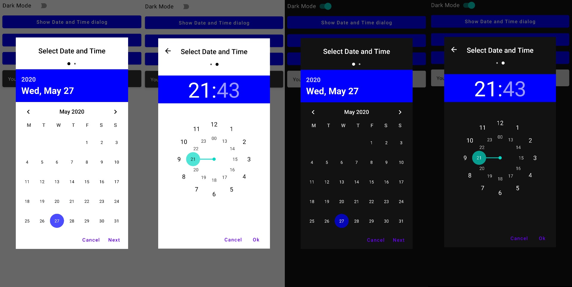
You will end up with a result like this:

Solution 2
Using a library
As of writing, It's not implemented yet. But there is an open-source library Compose Material Dialogs
Without a library
You can Also do this without a library, you can put it inside onclick action
private fun showDatePicker() {
    val picker = MaterialDatePicker.Builder.datePicker().build()
    activity?.let {
        picker.show(it.supportFragmentManager, picker.toString())
        picker.addOnPositiveButtonClickListener {

        }
    }
}
Solution 3
You can show date picker with few line in jetpack compose
 AndroidView(
            { CalendarView(it) },
            modifier = Modifier.wrapContentWidth(),
            update = { views ->
                views.setOnDateChangeListener { calendarView, i, i2, i3 ->
                }
            }
        )
Solution 4
Currently, jetpack compose is in Alpha state and there is no DateTime Picker in androidx.ui.*. But, Later android team will add it or make jetpack compose to interoperate with other components like android.widget.DatePicker Or we can develop beautiful Date Time Picker from stratch using jetpack compose like something flutter does
For now,
class DateTimeActivity : AppCompatActivity() {

    override fun onCreate(savedInstanceState: Bundle?) {
        super.onCreate(savedInstanceState)

        val c = Calendar.getInstance()
        val year = c.get(Calendar.YEAR)
        val month = c.get(Calendar.MONTH)
        val day = c.get(Calendar.DAY_OF_MONTH)
        val mHour = c[Calendar.HOUR_OF_DAY]
        val mMinute = c[Calendar.MINUTE]

        val datePickerDialog = DatePickerDialog(
            this, DatePickerDialog.OnDateSetListener
            { datePicker: DatePicker, day: Int, month: Int, year: Int ->
                setContent {
                    Column {
                        Text("$day, $month, $year")
                    }
                }
            }, year, month, day
        )


        val timePickerDialog = TimePickerDialog(
            this,
            TimePickerDialog.OnTimeSetListener { view, hourOfDay, minute ->
                setContent {
                    Column {
                        Text("$hourOfDay:$minute")
                    }
                }
            }, mHour, mMinute, false
        )


        setContent {
            Column {
                Button(text = "Date",
                    style = OutlinedButtonStyle(),
                    onClick = {
                        datePickerDialog.show()
                    })
                Button(text = "Time",
                    style = OutlinedButtonStyle(),
                    onClick = {
                        timePickerDialog.show()
                    })
            }
        }
    }
}
Solution 5
Without 3rd party library, Using Android View solution:
import android.app.TimePickerDialog

@Composable
fun ShowTimePicker(context: Context, initHour: Int, initMinute: Int) {
    val time = remember { mutableStateOf("") }
    val timePickerDialog = TimePickerDialog(
        context,
        {_, hour : Int, minute: Int ->
            time.value = "$hour:$minute"
        }, initHour, initMinute, false
    )
    Button(onClick = {
        timePickerDialog.show()
    }) {
        Text(text = "Open Time Picker")
    }
}

Thanks to Kiran-Bahalaskar
Dmitrii Kargashin
Updated on June 12, 2022Comments
-
Dmitrii Kargashin about 2 years
Does the jetpack compose have the date time picker view or I should create it by myself? I have tried to google it but I couldn't find ready to use component.
-
mama over 2 yearsThat is nice. could you get the time as well?
-
 ritwikshanker over 2 yearsThis solution requires a minimum API level of 26.
 -
ShadeToD over 2 years@ritwikshanker If u need to use this solution in lower API just change LocalDate to Date
-
 Arnyminer Z over 2 yearsI've adapted a little bit the code as suggested by @ShadeToD, and now it's compatible with Material Design 3. Take a look at my gist: gist.github.com/ArnyminerZ/31b82f559e3bfe42ef336f72854c5854
 -
Oleksii Malovanyi over 2 yearsIt looks cool, but there is one serious issue: on activity rotation the picker would remain on the screen, but the listener would be un-attached. Also, there is no way to dismiss date-picker on orientation change as onDispose is called much later when the picker is not attached to the fragment manager..
-
 Rushabh Shah about 2 yearsHow can I add range selection to it? @Rohit Jakhar
 -
 Gilbert about 2 yearsYou can get context using:
val context = LocalContext.current