justify-content: space-between failing to align elements as expected
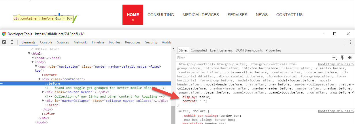
The problem is a conflict with the Bootstrap stylesheet, which places pseudo-elements in your flex container. This causes space-between to calculate multiple flex items as opposed to just two.
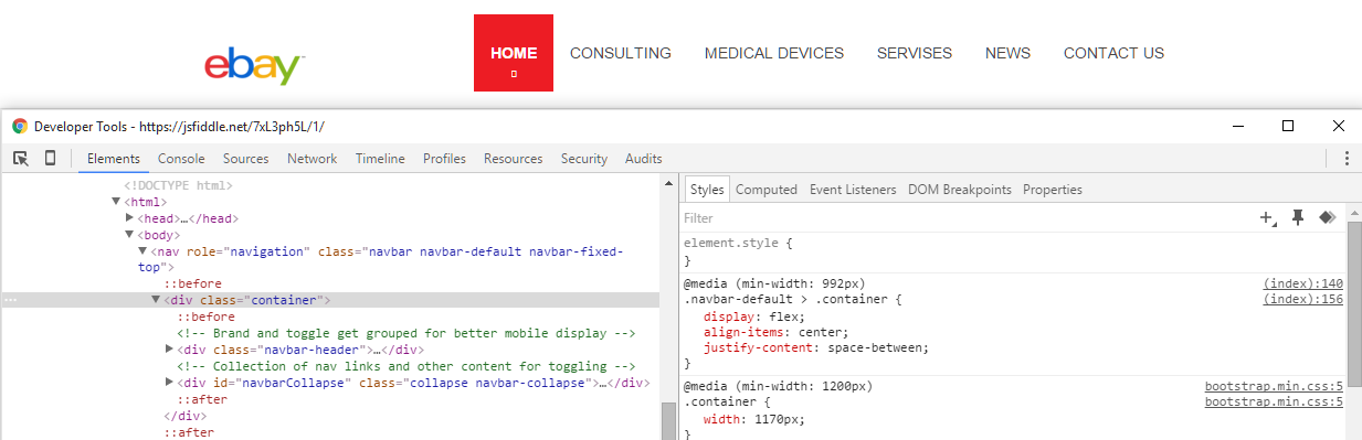
Here's your flex container:
The logo and nav menu are aligned with justify-content: space-between, but are not positioned at opposite edges. The alignment looks more like space-around.
Here's Bootstrap's ::before and ::after pseudo-elements (or pseudo-flex items):
As noted in Firefox documentation:
In-flow
::afterand::beforepseudo-elements are flex items.
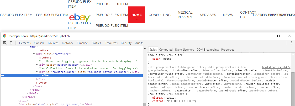
Let's put some content in the pseudos:
Like shining a black light in a motel room, you see a lot of stuff you wish wasn't there.
Remove (or override) the pseudo-elements and your problem is gone:

More details about flex containers and pseudo-elements:
- Pseudo elements breaking justify-content: space-between in flexbox layout
- Properly sizing and aligning the flex item(s) on the last row
- Methods for Aligning Flex Items along the Main Axis (see Box #81)
Comments
-
Alexander Solonik about 2 years
I needed to use flexbox to center my navigation and hence I came up with the following:
.navbar-brand > img {
  width: 100px;
}
.navbar-default {
  background-color: #fff;
  border-color: #fff;
  -webkit-box-shadow: 0 0 3px rgba(0, 0, 0, .3);
  box-shadow: 0 0 3px rgba(0, 0, 0, .3);
}
.navbar-default .navbar-nav > li > a {
  color: #464646;
  text-transform: uppercase;
}
.navbar-default .navbar-nav > li > a:hover,
.navbar-default .navbar-nav > li > a:focus,
.navbar-default .navbar-nav > li > a:active {
  color: #727272;
}
.navbar-default .navbar-nav > li:not(.active) > a:before {
  content: '';
  position: absolute;
  bottom: 0;
  left: 30%;
  right: 30%;
  height: 1px;
  background: #ed1c24;
  opacity: 0;
  -webkit-transform: translateY(10px);
  -ms-transform: translateY(10px);
  -o-transform: translateY(10px);
  transform: translateY(10px);
  -webkit-transition: all .3s;
  -o-transition: all .3s;
  transition: all .3s;
}
.navbar-default .navbar-nav > li > a:hover:before {
  opacity: 1;
  -webkit-transform: none;
  -ms-transform: none;
  -o-transform: none;
  transform: none;
}
.navbar-default .navbar-nav > li:first-child > a {
  font-weight: 700;
}
.navbar-default .navbar-nav > li.active > a {
  background: #ed1c24;
  color: #fff;
  padding-top: 25px;
  padding-bottom: 25px;
  position: relative;
  -webkit-transition: all .3s;
  -o-transition: all .3s;
  transition: all .3s;
}
.navbar-default .navbar-nav > li.active > a:hover,
.navbar-default .navbar-nav > li.active > a:focus,
.navbar-default .navbar-nav > li.active > a:active {
  background: #e0222a;
  color: #fff;
}
.navbar-default .navbar-nav > li.active:hover > a:after {
  bottom: 0;
}
.navbar-default .navbar-nav > li.active > a:after {
  font-family: FontAwesome;
  content: '\f078';
  position: absolute;
  bottom: 5px;
  font-size: 0.6em;
  /*opacity: 0.8;*/
  left: 50%;
  -webkit-transform: translateX(-50%);
  -ms-transform: translateX(-50%);
  -o-transform: translateX(-50%);
  transform: translateX(-50%);
  -webkit-transition: all .3s;
  -o-transition: all .3s;
  transition: all .3s;
}
/* use flexbox to center align nav elements above 992px */

@media (max-width: 992px) {
  .navbar-default .navbar-nav > li > a {
    text-align: center;
  }
  .navbar-collapse {
    max-height: 350px;
    overflow-y: hidden;
  }
}
@media (min-width: 992px) {
  .navbar-default {
    display: flex;
    align-items: center;
    justify-content: space-between;
  }
  .navbar-default {
    min-height: 100px;
  }
  .navbar-default .navbar-right {
    display: flex;
    align-items: center;
  }
  .navbar-default > .container {
    display: flex;
    align-items: center;
    justify-content: space-between;
  }
}
<link href="https://maxcdn.bootstrapcdn.com/bootstrap/3.3.6/css/bootstrap.min.css" rel="stylesheet" /> <nav role="navigation" class="navbar navbar-default navbar-fixed-top"> <div class="container"> <!-- Brand and toggle get grouped for better mobile display --> <div class="navbar-header"> <button type="button" data-target="#navbarCollapse" data-toggle="collapse" class="navbar-toggle"> <span class="sr-only">Toggle navigation</span> <span class="icon-bar"></span> <span class="icon-bar"></span> <span class="icon-bar"></span> </button> <a href="index.html" class="navbar-brand"> <img src="https://upload.wikimedia.org/wikipedia/commons/4/48/EBay_logo.png" alt="Logo"> </a> </div> <!-- Collection of nav links and other content for toggling --> <div id="navbarCollapse" class="collapse navbar-collapse"> <ul class="nav navbar-nav navbar-right"> <li class="active"><a href="index.html">Home</a> </li> <li><a href="consulting.html">CONSULTING</a> </li> <li><a href="devices.html">Medical Devices</a> </li> <li><a href="">Servises</a> </li> <li><a href="">News</a> </li> <li><a href="">Contact Us</a> </li> </ul> </div> </div> </nav>As you can see from the HTML , the
.containerhas two child elements.I have the following CSS applied to the
.containerelement:.navbar-default > .container{ display: flex; align-items:center; justify-content:space-between; }The problem is
space-betweendoesn't make the two child elements of the container to be at the left and right edges of the container.The behaviour that I want is that the two child elements should be on the left and right edge, this can be achieved using floats, I.E., I float one child to the left and one to the right.
Also if you apply
flex-startandflex-endthe elements will be pulled to the edge but, withflex-startandflex-end, both elements will be pulled to one side. Hence I need to usespace-between.Can somebody tell me why is
space-betweennot working ? This bug is causing a huge alignment issue on my whole site, please somebody tell me what am I doing wrong.