Keeping a fixed div alligned while resizing
Solution 1
Maybe this is what you're looking for? http://jsfiddle.net/myjruLvr/9/
I added an extra parent <div> outside the icons and the main content, and then gave it padding equal to the width of the icons + 10px margin. And instead of position: fixed;, I've used position: absolute;.
Alternatively, you can also use the float property for the icons.
http://jsfiddle.net/myjruLvr/11/
That's a rough example. The icons are floated on their respective sides and the centered <div> will have margins on either sides equal to the width of the icons + 10px.
EDIT:
It seems you're asking for something like a sticky menu, but made purely out of CSS. Sadly position:fixed positions an element relative to the browser viewport, regardless of how it's parent is positioned, and I guess that's pretty much the reason why we have several jquery alternatives for this.
Solution 2
You have to add the fixed position units. Update your CSS like below.
 .navblue {
    position: fixed;
    left:0;
    top:0;
}

.navorange {
   position: fixed;
   top:0;
   right:0;
}
EDIT
Based on your comments below, Here is updated CSS.
#container {
width: 100%;
padding-left:70px;
padding-right:70px;
box-sizing:border-box;
}

.navblue {
position: fixed;
left:0px;
top:0;
}

.navorange {
position: fixed;
top:0;
right:0px;
}

.navblue ul {
list-style: none;
padding-left: 0;
}

.navblue a {
display: block;
font-family: Pictoss;
font-size: 20px;
padding: 2px 20px 38px 20px;
background:#017da1;
width: 20px;
text-decoration: none;
overflow: hidden;
text-shadow: 0 -1px 1px black;
border-radius: 50px;
color: white;
height: 20px;
margin-bottom: 10px;
border: 5px solid #017da1;
-webkit-transition: all ease-in-out .3s;
-webkit-background-clip: padding-box;
}

.navorange a {
display: block;
font-family: Pictoss;
font-size: 20px;
padding: 2px 20px 38px 20px;
background: #e9500c;
width: 20px;
text-decoration: none;
overflow: hidden;
text-shadow: 0 -1px 1px black;
border-radius:50px;
color: white;
height: 20px;
margin-bottom: 10px;
border: 5px solid #e9500c;
}
.navorange ul {
list-style: none;
padding-left: 0;
}

#biglist {
height: 500px;
background-color: #e3e3e3;
width:100%;
border-radius: 5px;
color: #000;
border-color: transparent;
box-sizing:border-box;
}
KenB
Updated on June 04, 2022Comments
-
KenB almost 2 years
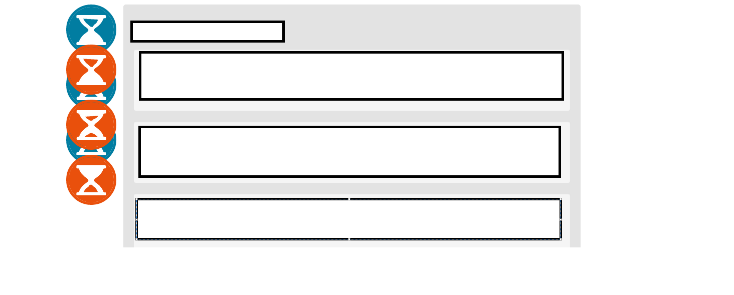
I want to make a menu to the left and to the right of a list. The menu's have to be fixed, and I want them to always be 10 px of the list, even when I am resizing.
I made the list 'position: relative' and I would like the menu's to be placed relative to the list.

As you can see, I would like it so the orange buttons are the same distance from the list as the blue buttons, even when I resize it.
I tried to use margins, left, right, padding... but nothing seems to work.
Here is some css I used:
With this css, it looks like this:
.navblue {
        float: left;
        position: fixed;
    }

    .navorange {
       float: right;
       position: fixed;
    }


    .navblue ul {
        list-style: none;
        padding-left: 0;
    }

    .navorange ul {
        list-style: none;
        padding-left: 0;
    }

    #biglist {
        background-color: #e3e3e3;
        width: 80%;
        padding: 20px;
        border-radius: 5px;
        color: #000;
        border-color: transparent;
        margin-left: auto;
        margin-right: auto;
    }
Thank you very much if you can help.
-
KenB about 9 yearsI tried that, but on bigger screens it doensn't present well. The goal is to get the 2 nav bars both like 10px left and right of the list. gyazo.com/144ddd50da5ce66767235e675b922293
-
Suresh Ponnukalai about 9 yearsif you create fiddle, we can easily identify your problem.
-
Suresh Ponnukalai about 9 yearslooks good on the fiddle. i think you just want 10px gap left and right sides.
-
KenB about 9 yearsyes, i want a 10px gap between the buttons and the list ALWAYS, even when i am resizing. because, when you make the window width really large, they just go to the sides, and dont stick to the list. tl;dr When i make the screen bigger, the 10px gap, becomes a 100px gap for example, and i want a permanent 10px gap
-
KenB about 9 yearsYes, that's the right position i need, but if i scroll it has to stay on the screen. (Like with position:fixed, it has to stay on screen)
-
DriftingSteps about 9 years
position:fixedpositions the element relative to the browser viewport and hence breaks the design, which isn't what you're looking for, I think. -
KenB about 9 yearsExactly, i need the fixed scrolling part, but the absolute design part
-
DriftingSteps about 9 yearsOnce the
<div>reaches a certain location, a class HAS to be added to it to make it fixed, and to achieve that, we have to use js. I don't think there is a CSS only solution yet.