Make custom org chart responsive. CSS, HTML, Bootstrap
Solution 1
Target the width of 3rd+ level items:
.tree li li li a {
    width: auto;
}
in addition, Target only 1st level anchors:
.tree > ul > li > a {
    width: auto;
}
Target only 2nd level anchors:
.tree > ul > li > ul > li > a {
    width: auto;
}
etc.
Solution 2
    <div class="content">
      <h1>Responsive Organization Chart</h1>
      <figure class="org-chart cf">
        <ul class="administration">
          <li>
            <ul class="director">
              <li>
                <a href="#"><span>Director</span></a>
                <ul class="subdirector">
                  <li><a href="#"><span>Assistante Director</span></a></li>
                </ul>
                <ul class="departments cf">
                  <li><a href="#"><span>Administration</span></a></li>

                  <li class="department dep-a">
                    <a href="#"><span>Department A</span></a>
                    <ul class="sections">
                      <li class="section"><a href="#"><span>Section A1</span></a></li>
                      <li class="section"><a href="#"><span>Section A2</span></a></li>
                      <li class="section"><a href="#"><span>Section A3</span></a></li>
                      <li class="section"><a href="#"><span>Section A4</span></a></li>
                      <li class="section"><a href="#"><span>Section A5</span></a></li>
                    </ul>
                  </li>
                  <li class="department dep-b">
                    <a href="#"><span>Department B</span></a>
                    <ul class="sections">
                      <li class="section"><a href="#"><span>Section B1</span></a></li>
                      <li class="section"><a href="#"><span>Section B2</span></a></li>
                      <li class="section"><a href="#"><span>Section B3</span></a></li>
                      <li class="section"><a href="#"><span>Section B4</span></a></li>
                    </ul>
                  </li>`enter code here`
                  <li class="department dep-c">
                    <a href="#"><span>Department C</span></a>
                    <ul class="sections">
                      <li class="section"><a href="#"><span>Section C1</span></a></li>
                      <li class="section"><a href="#"><span>Section C2</span></a></li>
                      <li class="section"><a href="#"><span>Section C3</span></a></li>
                      <li class="section"><a href="#"><span>Section C4</span></a></li>
                    </ul>
                  </li>
                  <li class="department dep-d">
                    <a href="#"><span>Department D</span></a>
                    <ul class="sections">
                      <li class="section"><a href="#"><span>Section D1</span></a></li>
                      <li class="section"><a href="#"><span>Section D2</span></a></li>
                      <li class="section"><a href="#"><span>Section D3</span></a></li>
                      <li class="section"><a href="#"><span>Section D4</span></a></li>
                      <li class="section"><a href="#"><span>Section D5</span></a></li>
                      <li class="section"><a href="#"><span>Section D6</span></a></li>
                    </ul>
                  </li>
                  <li class="department dep-e">
                    <a href="#"><span>Department E</span></a>
                    <ul class="sections">
                      <li class="section"><a href="#"><span>Section E1</span></a></li>
                      <li class="section"><a href="#"><span>Section E2</span></a></li>
                      <li class="section"><a href="#"><span>Section E3</span></a></li>
                    </ul>
                  </li>
                </ul>
              </li>
            </ul>
          </li>
        </ul>
      </figure>
    </div>

<style>


*{
    -webkit-box-sizing: border-box;
    -moz-box-sizing: border-box;
    box-sizing: border-box;
    position: relative;
}

.cf:before,
.cf:after {
    content: " "; /* 1 */
    display: table; /* 2 */
}

.cf:after {
    clear: both;
}

/**
 * For IE 6/7 only
 * Include this rule to trigger hasLayout and contain floats.
 */
.cf {
    *zoom: 1;
}

/* Generic styling */

body{
    background: #F5EEC9;
}

.content{
    width: 100%;
    max-width: 1142px;
    margin: 0 auto;
    padding: 0 20px;
}

a:focus{
    outline: 2px dashed #f7f7f7;
}

@media all and (max-width: 767px){
    .content{
        padding: 0 20px;
    }
}

ul{
    padding: 0;
    margin: 0;
    list-style: none;
}

ul a{
    display: block;
    background: #ccc;
    border: 4px solid #fff;
    text-align: center;
    overflow: hidden;
    font-size: .7em;
    text-decoration: none;
    font-weight: bold;
    color: #333;
    height: 70px;
    margin-bottom: -26px;
    box-shadow: 4px 4px 9px -4px rgba(0,0,0,0.4);
    -webkit-transition: all linear .1s;
    -moz-transition: all linear .1s;
    transition: all linear .1s;
}


@media all and (max-width: 767px){
    ul a{
        font-size: 1em;
    }
}


ul a span{
    top: 50%;
    margin-top: -0.7em;
    display: block;
}

/*

 */

.administration > li > a{
    margin-bottom: 25px;
}

.director > li > a{
    width: 50%;
    margin: 0 auto 0px auto;
}

.subdirector:after{
    content: "";
    display: block;
    width: 0;
    height: 130px;
    background: red;
    border-left: 4px solid #fff;
    left: 45.45%;
    position: relative;
}

.subdirector,
.departments{
    position: absolute;
    width: 100%;
}

.subdirector > li:first-child,
.departments > li:first-child{
    width: 18.59894921190893%;
    height: 64px;
    margin: 0 auto 92px auto;
    padding-top: 25px;
    border-bottom: 4px solid white;
    z-index: 1;
}

.subdirector > li:first-child{
    float: right;
    right: 27.2%;
    border-left: 4px solid white;
}

.departments > li:first-child{
    float: left;
    left: 27.2%;
    border-right: 4px solid white;
}

.subdirector > li:first-child a,
.departments > li:first-child a{
    width: 100%;
}

.subdirector > li:first-child a{
    left: 25px;
}

@media all and (max-width: 767px){
    .subdirector > li:first-child,
    .departments > li:first-child{
        width: 40%;
    }

    .subdirector > li:first-child{
        right: 10%;
        margin-right: 2px;
    }

    .subdirector:after{
        left: 49.8%;
    }

    .departments > li:first-child{
        left: 10%;
        margin-left: 2px;
    }
}


.departments > li:first-child a{
    right: 25px;
}

.department:first-child,
.departments li:nth-child(2){
    margin-left: 0;
    clear: left;
}

.departments:after{
    content: "";
    display: block;
    position: absolute;
    width: 81.1%;
    height: 22px;
    border-top: 4px solid #fff;
    border-right: 4px solid #fff;
    border-left: 4px solid #fff;
    margin: 0 auto;
    top: 130px;
    left: 9.1%
}

@media all and (max-width: 767px){
    .departments:after{
        border-right: none;
        left: 0;
        width: 49.8%;
    }
}

@media all and (min-width: 768px){
    .department:first-child:before,
   .department:last-child:before{
    border:none;
  }
}

.department:before{
    content: "";
    display: block;
    position: absolute;
    width: 0;
    height: 22px;
    border-left: 4px solid white;
    z-index: 1;
    top: -22px;
    left: 50%;
    margin-left: -4px;
}

.department{
    border-left: 4px solid #fff;
    width: 18.59894921190893%;
    float: left;
    margin-left: 1.751313485113835%;
    margin-bottom: 60px;
}

.lt-ie8 .department{
    width: 18.25%;
}

@media all and (max-width: 767px){
    .department{
        float: none;
        width: 100%;
        margin-left: 0;
    }

    .department:before{
        content: "";
        display: block;
        position: absolute;
        width: 0;
        height: 60px;
        border-left: 4px solid white;
        z-index: 1;
        top: -60px;
        left: 0%;
        margin-left: -4px;
    }

    .department:nth-child(2):before{
        display: none;
    }
}

.department > a{
    margin: 0 0 -26px -4px;
    z-index: 1;
}

.department > a:hover{
    height: 80px;
}

.department > ul{
    margin-top: 0px;
    margin-bottom: 0px;
}

.department li{
    padding-left: 25px;
    border-bottom: 4px solid #fff;
    height: 80px;
}

.department li a{
    background: #fff;
    top: 48px;
    position: absolute;
    z-index: 1;
    width: 90%;
    height: 60px;
    vertical-align: middle;
    right: -1px;
    background-image: url(data:image/svg+xml;base64,PD94bWwgdmVyc2lvbj0iMS4wIiA/Pgo8c3ZnIHhtbG5zPSJodHRwOi8vd3d3LnczLm9yZy8yMDAwL3N2ZyIgd2lkdGg9IjEwMCUiIGhlaWdodD0iMTAwJSIgdmlld0JveD0iMCAwIDEgMSIgcHJlc2VydmVBc3BlY3RSYXRpbz0ibm9uZSI+CiAgPGxpbmVhckdyYWRpZW50IGlkPSJncmFkLXVjZ2ctZ2VuZXJhdGVkIiBncmFkaWVudFVuaXRzPSJ1c2VyU3BhY2VPblVzZSIgeDE9IjAlIiB5MT0iMCUiIHgyPSIxMDAlIiB5Mj0iMTAwJSI+CiAgICA8c3RvcCBvZmZzZXQ9IjAlIiBzdG9wLWNvbG9yPSIjMDAwMDAwIiBzdG9wLW9wYWNpdHk9IjAuMjUiLz4KICAgIDxzdG9wIG9mZnNldD0iMTAwJSIgc3RvcC1jb2xvcj0iIzAwMDAwMCIgc3RvcC1vcGFjaXR5PSIwIi8+CiAgPC9saW5lYXJHcmFkaWVudD4KICA8cmVjdCB4PSIwIiB5PSIwIiB3aWR0aD0iMSIgaGVpZ2h0PSIxIiBmaWxsPSJ1cmwoI2dyYWQtdWNnZy1nZW5lcmF0ZWQpIiAvPgo8L3N2Zz4=);
    background-image: -moz-linear-gradient(-45deg,  rgba(0,0,0,0.25) 0%, rgba(0,0,0,0) 100%) !important;
    background-image: -webkit-gradient(linear, left top, right bottom, color-stop(0%,rgba(0,0,0,0.25)), color-stop(100%,rgba(0,0,0,0)))!important;
    background-image: -webkit-linear-gradient(-45deg,  rgba(0,0,0,0.25) 0%,rgba(0,0,0,0) 100%)!important;
    background-image: -o-linear-gradient(-45deg,  rgba(0,0,0,0.25) 0%,rgba(0,0,0,0) 100%)!important;
    background-image: -ms-linear-gradient(-45deg,  rgba(0,0,0,0.25) 0%,rgba(0,0,0,0) 100%)!important;
    background-image: linear-gradient(135deg,  rgba(0,0,0,0.25) 0%,rgba(0,0,0,0) 100%)!important;
    filter: progid:DXImageTransform.Microsoft.gradient( startColorstr='#40000000', endColorstr='#00000000',GradientType=1 );
}

.department li a:hover{
    box-shadow: 8px 8px 9px -4px rgba(0,0,0,0.1);
    height: 80px;
    width: 95%;
    top: 39px;
    background-image: none!important;
}

/* Department/ section colors */
.department.dep-a a{ background: #FFD600; }
.department.dep-b a{ background: #AAD4E7; }
.department.dep-c a{ background: #FDB0FD; }
.department.dep-d a{ background: #A3A2A2; }
.department.dep-e a{ background: #f0f0f0; }
</style>
jonasjuss
Updated on July 09, 2022Comments
-
jonasjuss almost 2 years
(HTML and CSS code is provided in the bottom of the post)
I am making a web application using Bootstrap 3.0.2, which is helping me make most of it responsive.
I wanted to add a org chart, to display a hierarchy of elements, so I found some code using unordered lists to display this. My problem though, beging a beginner programmer, is to make the org chart go along with my goal of making the website look good in most screen sizes.
As you can see from the following picture, the problem is that when a list item at the 2nd level gets too many children (at 3rd level), it becomes too wide and pushes its siblings down to the next row. This way the borders (which are made using pseudo elements ::before and ::after) wont display properly.
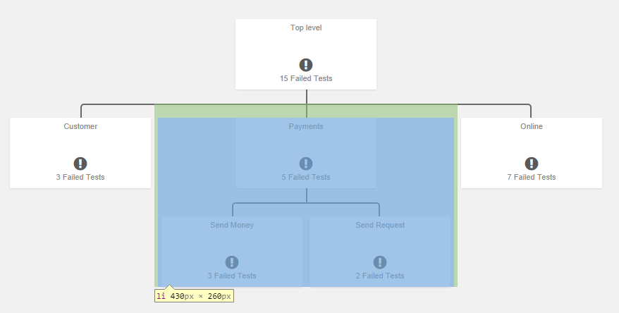
I suspect the solution might involve readjusting the size of each element (-tag) in the 3rd level and down, once the screen size gets too small. The problem is I dont know to target only the 3rd level -tags, as I want the top level elements to stay the same size. Also just want general tips / suggestions to approaches I can try. I am open to change all of it up, or use any already existing responsive org chart free for commercial use. Maybe there is even a solution where I can incorporate som bootstrap elements into the org chart to meet my requirements?
Appreciate any time and effort. Even just some hints to nudge me in the right direction would help a lot!
HTML CODE:
<!--
ORG CHART
=========================================-->

<div class="container-fluid" style="margin-top:20px">
    <div class="row">
        <div class="col-md-12">
            <div class="tree">
                <ul>
                    <li>
                        <a href="#">

                            <div class="container-fluid">
                                <div class="row">
                                    Top level
                                </div>
                                <div class="row" style="margin-top: 35px;">
                                    <i class="fa fa-exclamation-circle fa-2x"></i>
                                </div>
                                <div class="row">
                                    15 Failed Tests
                                </div>
                            </div>

                        </a>
                        <ul>
                            <li>
                                <a href="#">

                                    <div class="container-fluid">
                                        <div class="row">
                                            Customer
                                        </div>
                                        <div class="row" style="margin-top: 35px;">
                                            <i class="fa fa-exclamation-circle fa-2x"></i>
                                        </div>
                                        <div class="row">
                                            3 Failed Tests
                                        </div>
                                    </div>

                                </a>
                            </li>
                            <li>
                                <a href="#">

                                    <div class="container-fluid">
                                        <div class="row">
                                            Payments
                                        </div>
                                        <div class="row" style="margin-top: 35px;">
                                            <i class="fa fa-exclamation-circle fa-2x"></i>
                                        </div>
                                        <div class="row">
                                            5 Failed Tests
                                        </div>
                                    </div>

                                </a>
                                <ul>
                                    <li>
                                        <a href="#">

                                            <div class="container-fluid">
                                                <div class="row">
                                                    Send Money
                                                </div>
                                                <div class="row" style="margin-top: 35px;">
                                                    <i class="fa fa-exclamation-circle fa-2x"></i>
                                                </div>
                                                <div class="row">
                                                    3 Failed Tests
                                                </div>
                                            </div>

                                        </a>
                                    </li>
                                    <li>
                                        <a href="#">

                                            <div class="container-fluid">
                                                <div class="row">
                                                    Send Request
                                                </div>
                                                <div class="row" style="margin-top: 35px;">
                                                    <i class="fa fa-exclamation-circle fa-2x"></i>
                                                </div>
                                                <div class="row">
                                                    2 Failed Tests
                                                </div>
                                            </div>

                                        </a>
                                    </li>
                                </ul>
                            </li>
                            <li>
                                <a href="#">

                                    <div class="container-fluid">
                                        <div class="row">
                                            Online
                                        </div>
                                        <div class="row" style="margin-top: 35px;">
                                            <i class="fa fa-exclamation-circle fa-inv fa-2x"></i>
                                        </div>
                                        <div class="row">
                                            7 Failed Tests
                                        </div>
                                    </div>

                                </a>
                            </li>
                        </ul>
                    </li>
                </ul>
            </div>
        </div>
    </div>
</div>
CSS STYLES:
/*#region Organizational Chart*/
.tree * {
    margin: 0; padding: 0;
}

.tree ul {
    padding-top: 20px; position: relative;

    -transition: all 0.5s;
    -webkit-transition: all 0.5s;
    -moz-transition: all 0.5s;
}

.tree li {
    float: left; text-align: center;
    list-style-type: none;
    position: relative;
    padding: 20px 5px 0 5px;

    -transition: all 0.5s;
    -webkit-transition: all 0.5s;
    -moz-transition: all 0.5s;
}

/*We will use ::before and ::after to draw the connectors*/

.tree li::before, .tree li::after{
    content: '';
    position: absolute; top: 0; right: 50%;
    border-top: 2px solid #696969;
    width: 50%; height: 20px;
}
.tree li::after{
    right: auto; left: 50%;
    border-left: 2px solid #696969;
}

/*We need to remove left-right connectors from elements without
any siblings*/
.tree li:only-child::after, .tree li:only-child::before {
    display: none;
}

/*Remove space from the top of single children*/
.tree li:only-child{ padding-top: 0;}

/*Remove left connector from first child and
right connector from last child*/
.tree li:first-child::before, .tree li:last-child::after{
    border: 0 none;
}
/*Adding back the vertical connector to the last nodes*/
.tree li:last-child::before{
    border-right: 2px solid #696969;
    border-radius: 0 5px 0 0;
    -webkit-border-radius: 0 5px 0 0;
    -moz-border-radius: 0 5px 0 0;
}
.tree li:first-child::after{
    border-radius: 5px 0 0 0;
    -webkit-border-radius: 5px 0 0 0;
    -moz-border-radius: 5px 0 0 0;
}

/*Time to add downward connectors from parents*/
.tree ul ul::before{
    content: '';
    position: absolute; top: 0; left: 50%;
    border-left: 2px solid #696969;
    width: 0; height: 20px;
}

.tree li a{
    height: 100px;
    width: 200px;
    padding: 5px 10px;
    text-decoration: none;
    background-color: white;
    color: #8b8b8b;
    font-family: arial, verdana, tahoma;
    font-size: 11px;
    display: inline-block;
    box-shadow: 0 1px 2px rgba(0,0,0,0.1);

    -transition: all 0.5s;
    -webkit-transition: all 0.5s;
    -moz-transition: all 0.5s;
}

/*Time for some hover effects*/
/*We will apply the hover effect the the lineage of the element also*/
.tree li a:hover, .tree li a:hover+ul li a {
    background: #cbcbcb; color: #000;
}
/*Connector styles on hover*/
.tree li a:hover+ul li::after,
.tree li a:hover+ul li::before,
.tree li a:hover+ul::before,
.tree li a:hover+ul ul::before{
    border-color:  #94a0b4;
}
/*#endregion*/