Material design button with border
Solution 1
You can also use the Material Components for Android.
Add the dependency to your build.gradle:
dependencies { implementation 'com.google.android.material:material:1.3.0' }
In this case you can use the MaterialButton in your layout file:
<com.google.android.material.button.MaterialButton
   ....
   style="@style/Widget.MaterialComponents.Button.OutlinedButton"
   app:cornerRadius=".."
   app:strokeColor="@color/colorPrimary"/>
Apply the style @style/Widget.MaterialComponents.Button.OutlinedButton.
In your case use the app:cornerRadius attribute to change the size of corner radius. This will round off the corners with specified dimensions.
Use te attribute app:strokeColor and app:strokeWidth to change the color and the width of the border.

You can also customize the corners using ShapeApperance (it requires version 1.1.0)
<style name="MyButton" parent="Widget.MaterialComponents.Button.OutlinedButton">
    <item name="shapeAppearanceOverlay">@style/MyShapeAppearance</item>
</style>
<style name="MyShapeAppearance" parent="">
    <item name="cornerFamilyTopLeft">rounded</item>
    <item name="cornerFamilyBottomLeft">rounded</item>
    <item name="cornerFamilyTopRight">cut</item>
    <item name="cornerFamilyBottomRight">cut</item>
    <item name="cornerSize">8dp</item>
</style>
The official doc is here and all the android specs here.
With jetpack compose 1.0.x you can use the OutlinedButton and the border attribute:
    OutlinedButton(
        onClick = { },
        border = BorderStroke(1.dp, Color.Blue),
        shape = RoundedCornerShape(8.dp)
    ) {
        Text(text = "Save")
    }

OLD (support library)
With the new Support Library 28.0.0, the Design Library now contains the Material Button.
You can add this button to our layout file with:
<android.support.design.button.MaterialButton
    android:layout_width="wrap_content"
    android:layout_height="wrap_content"
    android:text="XXXX"
    android:textSize="18sp"
    app:icon="@drawable/ic_android_white_24dp" />
You can customize the button with these attributes:
-
app:backgroundTint: Used to apply a tint to the background of the button. If you wish to change the background color of the button, use this attribute instead of background. -
app:strokeColor: The color to be used for the button stroke -
app:strokeWidth: The width to be used for the button stroke
Also
Solution 2
Here's how to do it correctly.
What you need to do is
1 - Create shape drawable with stroke
2 - Create ripple drawable
3 - Create selector drawable for less than v21
4 - Create a new style for button with border
5 - Apply style on button
1 - Create shape with stroke
btn_outline.xml
<?xml version="1.0" encoding="utf-8"?>
<shape
    xmlns:android="http://schemas.android.com/apk/res/android"
    android:shape="rectangle">

    <stroke
        android:width="2dp"
        android:color="@color/colorAccent">
    </stroke>
    <solid android:color="@color/colorTransparent"/>
    <corners
        android:radius="5dp">
    </corners>

</shape>
2 - Create ripple drawable
drawable-v21/bg_btn_outline.xml
<?xml version="1.0" encoding="utf-8"?>
<ripple xmlns:android="http://schemas.android.com/apk/res/android"
        android:color="@color/colorOverlay">
    <item>
        <shape>
            <stroke
                android:width="2dp"
                android:color="@color/colorAccent"/>
            <corners android:radius="5dp"/>
        </shape>
    </item>
    <item android:id="@android:id/mask">
        <shape>
            <stroke
                android:width="2dp"
                android:color="@color/colorAccent"/>
            <solid android:color="@android:color/white"/>
            <corners android:radius="5dp"/>
        </shape>
    </item>

</ripple>
android:id="@android:id/mask" is required to have ripple touch feedback on the button. The layer that is marked as mask is not visible on screen, its just for touch feedback.
3 - Create selector drawable for less than v21
drawable/bg_btn_outline.xml
<?xml version="1.0" encoding="utf-8"?>
<selector xmlns:android="http://schemas.android.com/apk/res/android">
    <item android:drawable="@drawable/btn_outline" android:state_pressed="true">
        <shape android:shape="rectangle">
            <solid android:color="@color/colorOverlay"/>
        </shape>
    </item>
    <item android:drawable="@drawable/btn_outline" android:state_focused="true">
        <shape android:shape="rectangle">
            <solid android:color="@color/colorOverlay"/>
        </shape>
    </item>

    <item android:drawable="@drawable/btn_outline"/>

</selector>
4 - Create a new style for button with border All resources that that are needed to create the style are given above, that's how your style should look like
<style name="ButtonBorder" parent="Widget.AppCompat.Button.Colored"/>

<style name="ButtonBorder.Accent">
        <item name="android:background">@drawable/bg_btn_outline</item>
        <item name="android:textColor">@color/colorAccent</item>
        <item name="android:textAllCaps">false</item>
        <item name="android:textSize">16sp</item>
        <item name="android:singleLine">true</item>
    </style>
4 - Apply style on button
<Button
   style="@style/ButtonBorder.Accent"
   android:layout_width="wrap_content"
   android:layout_height="wrap_content"/>
That's pretty much it. Here's a sample of how the buttons looks now.
Solution 3
You could do this pretty easily by setting Material Design Button's style attribute to @style/Widget.MaterialComponents.Button.OutlinedButton and setting app:strokeColor attribute value to your preferred color.
example:
<com.google.android.material.button.MaterialButton
                android:text="Rounded outlined button"
                android:layout_height="wrap_content"
                android:layout_width="wrap_content"
                android:id="@+id/btnRound"
                style="@style/Widget.MaterialComponents.Button.OutlinedButton"
                app:strokeColor="@color/colorPrimaryDark"/>
References:
- https://material.io/develop/android/docs/getting-started/
- https://material.io/develop/android/components/material-button/
Solution 4
Credits to @NomanRafique for the detailed answer! However, because of the custom background, we've lost a few important things:
- Button's height is bigger than the default
Widget.AppCompat.Button - Paddings
- Enable/Disable states
In case you're wondering, here is how the default background looks like: https://android.googlesource.com/platform/frameworks/support/+/a7487e7/v7/appcompat/res/drawable-v21/abc_btn_colored_material.xml
By reusing original insets, paddings and color selectors, in a simple case we can come up with something like this (all the values are default and come from android support/material library) :
drawable-v21/bg_btn_outlined.xml
<inset xmlns:android="http://schemas.android.com/apk/res/android"
       android:insetLeft="@dimen/abc_button_inset_horizontal_material"
       android:insetTop="@dimen/abc_button_inset_vertical_material"
       android:insetRight="@dimen/abc_button_inset_horizontal_material"
       android:insetBottom="@dimen/abc_button_inset_vertical_material">
    <ripple xmlns:android="http://schemas.android.com/apk/res/android"
            android:color="?attr/colorControlHighlight">
        <item>
            <shape>
                <stroke
                    android:width="2dp"
                    android:color="@color/abc_btn_colored_borderless_text_material"/>
                <corners android:radius="@dimen/abc_control_corner_material"/>
                <padding
                    android:bottom="@dimen/abc_button_padding_vertical_material"
                    android:left="@dimen/abc_button_padding_horizontal_material"
                    android:right="@dimen/abc_button_padding_horizontal_material"
                    android:top="@dimen/abc_button_padding_vertical_material"/>
            </shape>
        </item>
        <item android:id="@android:id/mask">
            <shape>
                <stroke
                    android:width="2dp"
                    android:color="@color/abc_btn_colored_borderless_text_material"/>
                <solid android:color="@android:color/white"/>
                <corners android:radius="@dimen/abc_control_corner_material"/>
            </shape>
        </item>
    </ripple>
</inset>
styles.xml
<style name="Button.Outlined" parent="Widget.AppCompat.Button.Borderless.Colored">
    <item name="android:background">@drawable/bg_btn_outlined</item>
</style>
At this point, we should have an outlined button that responds to touches, respects the enabled="false" state and of the same height as the default Widget.AppCompat.Button:
Now, from here you can start customizing colors by providing your own implementation of the @color/abc_btn_colored_borderless_text_material color selector.
Solution 5
In your XML use this,
            <com.google.android.material.button.MaterialButton
                android:layout_width="wrap_content"
                android:layout_height="wrap_content"
                android:text="Its a button"
                android:textColor="@android:color/white"
                android:textSize="@dimen/_12ssp"
                app:backgroundTint="@android:color/transparent"
                app:strokeColor="@android:color/white"
                app:strokeWidth="@dimen/_1sdp" />
where
- app:backgroundTint is used for background color
- app:strokeColor is border color
- app:strokeWidth is border width
jclova
Senior Android developer at DEEP Inc. and CEO at EllevSoft. DEEP Inc. http://deep-inc.com/ EllevSoft https://play.google.com/store/apps/developer?id=EllevSoft
Updated on December 23, 2021Comments
-
jclova over 2 years
I know how to make Material Design button with color fill:
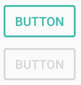
style="@style/Widget.AppCompat.Button.Colored"And no-bordered transparent button:
style="@style/Widget.AppCompat.Button.Borderless.Colored"However, is there a way to make Material design bordered (transparent inside) button? Something like below?
