Material Design not styling alert dialogs
Solution 1
UPDATED ON Aug 2019 WITH The Material components for android library:
With the new Material components for Android library you can use the new com.google.android.material.dialog.MaterialAlertDialogBuilder class, which extends from the existing androidx.appcompat.AlertDialog.Builder class and provides support for the latest Material Design specifications.
Just use something like this:
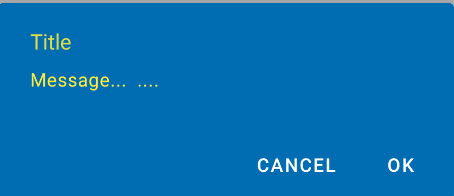
new MaterialAlertDialogBuilder(context)
            .setTitle("Dialog")
            .setMessage("Lorem ipsum dolor ....")
            .setPositiveButton("Ok", /* listener = */ null)
            .setNegativeButton("Cancel", /* listener = */ null)
            .show();
You can customize the colors extending the ThemeOverlay.MaterialComponents.MaterialAlertDialog style:
  <style name="CustomMaterialDialog" parent="@style/ThemeOverlay.MaterialComponents.MaterialAlertDialog">
     <!-- Background Color-->
     <item name="android:background">#006db3</item>
     <!-- Text Color for title and message -->
     <item name="colorOnSurface">@color/secondaryColor</item>
     <!-- Text Color for buttons -->
     <item name="colorPrimary">@color/white</item>
     ....
  </style>
To apply your custom style just use the constructor:
new MaterialAlertDialogBuilder(context, R.style.CustomMaterialDialog)
To customize the buttons, the title and the body text check this post for more details.
You can also change globally the style in your app theme:
 <!-- Base application theme. -->
 <style name="AppTheme" parent="Theme.MaterialComponents.Light">
    ...
    <item name="materialAlertDialogTheme">@style/CustomMaterialDialog</item>
 </style>
WITH SUPPORT LIBRARY and APPCOMPAT THEME:
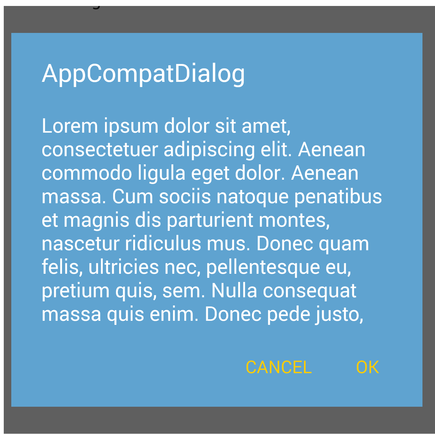
With the new AppCompat v22.1 you can use the new android.support.v7.app.AlertDialog.
Just use a code like this:
import android.support.v7.app.AlertDialog

AlertDialog.Builder builder =
       new AlertDialog.Builder(this, R.style.AppCompatAlertDialogStyle);
builder.setTitle("Dialog");
builder.setMessage("Lorem ipsum dolor ....");
builder.setPositiveButton("OK", null);
builder.setNegativeButton("Cancel", null);
builder.show();
And use a style like this:
<style name="AppCompatAlertDialogStyle" parent="Theme.AppCompat.Light.Dialog.Alert">
        <item name="colorAccent">#FFCC00</item>
        <item name="android:textColorPrimary">#FFFFFF</item>
        <item name="android:background">#5fa3d0</item>
    </style>
Otherwise you can define in your current theme:
<style name="AppTheme" parent="Theme.AppCompat.Light">
    <!-- your style -->
    <item name="alertDialogTheme">@style/AppCompatAlertDialogStyle</item>
</style>
and then in your code:
 import android.support.v7.app.AlertDialog

    AlertDialog.Builder builder =
           new AlertDialog.Builder(this);
Here the AlertDialog on Kitkat:
Solution 2
when initializing dialog builder, pass second parameter as the theme. It will automatically show material design with API level 21.
AlertDialog.Builder builder = new AlertDialog.Builder(this, AlertDialog.THEME_DEVICE_DEFAULT_DARK);
or,
AlertDialog.Builder builder = new AlertDialog.Builder(this, AlertDialog.THEME_DEVICE_DEFAULT_LIGHT);
Solution 3
AppCompat doesn't do that for dialogs (not yet at least)
EDIT: it does now. make sure to use android.support.v7.app.AlertDialog
Solution 4
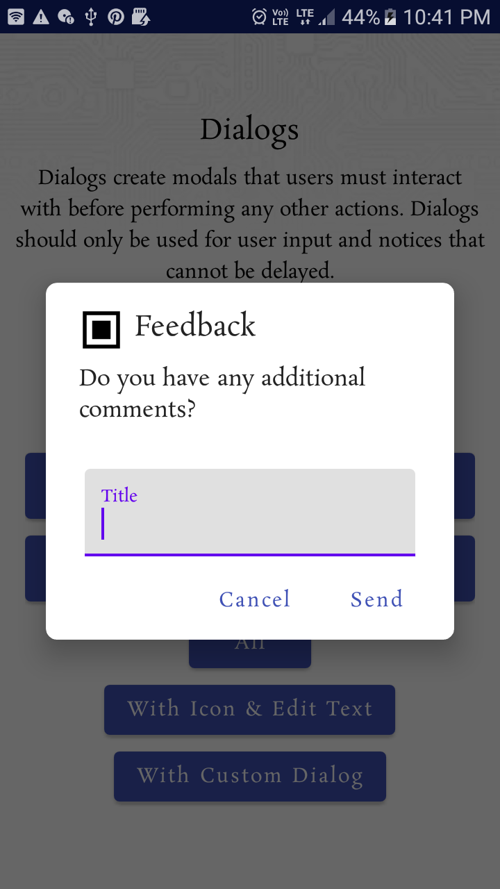
Material Design styling alert dialogs: Custom Font, Button, Color & shape,..
 MaterialAlertDialogBuilder(requireContext(),
                R.style.MyAlertDialogTheme
            )
                .setIcon(R.drawable.ic_dialogs_24px)
                .setTitle("Feedback")
                //.setView(R.layout.edit_text)
                .setMessage("Do you have any additional comments?")
                .setPositiveButton("Send") { dialog, _ ->

                    val input =
                        (dialog as AlertDialog).findViewById<TextView>(
                            android.R.id.text1
                        )
                    Toast.makeText(context, input!!.text, Toast.LENGTH_LONG).show()

                }
                .setNegativeButton("Cancel") { _, _ ->
                    Toast.makeText(requireContext(), "Clicked cancel", Toast.LENGTH_SHORT).show()
                }
                .show()
Style:
  <style name="MyAlertDialogTheme" parent="Theme.MaterialComponents.DayNight.Dialog.Alert">

        <item name="android:textAppearanceSmall">@style/MyTextAppearance</item>
        <item name="android:textAppearanceMedium">@style/MyTextAppearance</item>
        <item name="android:textAppearanceLarge">@style/MyTextAppearance</item>

        <item name="buttonBarPositiveButtonStyle">@style/Alert.Button.Positive</item>
        <item name="buttonBarNegativeButtonStyle">@style/Alert.Button.Neutral</item>
        <item name="buttonBarNeutralButtonStyle">@style/Alert.Button.Neutral</item>

        <item name="android:backgroundDimEnabled">true</item>

        <item name="shapeAppearanceOverlay">@style/ShapeAppearanceOverlay.MyApp.Dialog.Rounded
        </item>

    </style>


    <style name="MyTextAppearance" parent="TextAppearance.AppCompat">
        <item name="android:fontFamily">@font/rosarivo</item>
    </style>


        <style name="Alert.Button.Positive" parent="Widget.MaterialComponents.Button.TextButton">
   <!--     <item name="backgroundTint">@color/colorPrimaryDark</item>-->
        <item name="backgroundTint">@android:color/transparent</item>
        <item name="rippleColor">@color/colorAccent</item>
        <item name="android:textColor">@color/colorPrimary</item>
       <!-- <item name="android:textColor">@android:color/white</item>-->
        <item name="android:textSize">14sp</item>
        <item name="android:textAllCaps">false</item>
    </style>


    <style name="Alert.Button.Neutral" parent="Widget.MaterialComponents.Button.TextButton">
        <item name="backgroundTint">@android:color/transparent</item>
        <item name="rippleColor">@color/colorAccent</item>
        <item name="android:textColor">@color/colorPrimary</item>
        <!--<item name="android:textColor">@android:color/darker_gray</item>-->
        <item name="android:textSize">14sp</item>
        <item name="android:textAllCaps">false</item>
    </style>


  <style name="ShapeAppearanceOverlay.MyApp.Dialog.Rounded" parent="">
        <item name="cornerFamily">rounded</item>
        <item name="cornerSize">8dp</item>
    </style>
Output:
Solution 5
You can consider this project: https://github.com/fengdai/AlertDialogPro
It can provide you material theme alert dialogs almost the same as lollipop's. Compatible with Android 2.1.
Related videos on Youtube
 19 : 12
 08 : 26
 25 : 19
 15 : 39
 18 : 06
 14 : 44
 03 : 45
 01 : 34
 01 : 32
Matthew
I work for Instructure working on Canvas for Android! Here are some of my apps: Google Play Store Google Play Store
Updated on July 08, 2022Comments
-
Matthew almost 2 years
I've added the appCompat material design to my app and it seems that the alert dialogs are not using my primary, primaryDark, or accent colors.
Here is my base style:
<style name="MaterialNavyTheme" parent="@style/Theme.AppCompat.Light.DarkActionBar">
    <item name="colorPrimary">@color/apptheme_color</item>
    <item name="colorPrimaryDark">@color/apptheme_color_dark</item>
    <item name="colorAccent">@color/apptheme_color</item>
    <item name="android:textColorPrimary">@color/action_bar_gray</item>
</style>
Based on my understanding the dialogs button text should also use these colors. Am I wrong on my understanding or is there something more I need to do?
Solution:
The marked answer got me on the right track.
<style name="MaterialNavyTheme" parent="@style/Theme.AppCompat.Light.DarkActionBar"> <item name="colorPrimary">@color/apptheme_color</item> <item name="colorPrimaryDark">@color/apptheme_color_dark</item> <item name="colorAccent">@color/apptheme_color</item> <item name="android:actionModeBackground">@color/apptheme_color_dark</item> <item name="android:textColorPrimary">@color/action_bar_gray</item> <item name="sdlDialogStyle">@style/DialogStyleLight</item> <item name="android:seekBarStyle">@style/SeekBarNavyTheme</item> </style> <style name="StyledDialog" parent="Theme.AppCompat.Light.Dialog"> <item name="colorPrimary">@color/apptheme_color</item> <item name="colorPrimaryDark">@color/apptheme_color_dark</item> <item name="colorAccent">@color/apptheme_color</item> </style> -
Matthew over 9 yearsLooks like you can do some modifications to the dialogs styles with AppCompat
-
 rekire about 9 yearsJust a note: This answer is older, then the accepted one.
 -
Glorifind over 8 yearsmy Android Studio by default gave me
import app.AlertDialognot the appCompat one. I tried to figure out what is wrong for about 40 minutes before I actually check it... Damn you google! -
Jon Adams over 8 years@AAverin RE Material design guidelines: Dividers are only supposed to be present in certain circumstances. The more common alert dialog usage scenarios won't use them, so right now it assumes the simpler style. If you fall under the less common scenario where you need dividers, you'll have to upgrade to a custom dialog layout instead of the simple dialog builder. Sorry.
-
 afollestad over 8 yearsMy library is much more capable. And you can always wrap a Dialog with a DialogFragment. 😛
 -
 Pranav P over 8 years+1 for superb answer but How can i achieve same UI for Android Version Below Lollypop...because with this in below device UI looks so weird.
 -
Gabriele Mariotti over 8 years@PranavPatel using the AppCompat theme you can have the same ui on all devices with API < 21
-
 Syed Arsalan Kazmi over 8 yearshow can i have rounded corners?
 -
 Admin about 8 yearsUsing the builder constructor that just takes a
Contextdidn't work for me. I had to use the constructor that takes the style resource too. -
 Maksim Dmitriev about 8 yearsYou don't have to specify the style
R.style.AppCompatAlertDialogStylein yourAlertDialog.Builderconstructor. Just make sure the activity, you are running your dialog from, usesAppThemeas a theme -
Gabriele Mariotti about 8 years@MaksimDmitriev It depends if you want a particular style for your dialog
-
Gabor about 8 yearsThe button's text color will not change to yellow for me, it is in light green whatever I do.
-
 FlipNovid about 8 yearsadd import android.support.v7.app.AlertDialog works
 -
hitesh141 over 7 yearshow to add listener in it?
-
 Big McLargeHuge over 5 yearsAnother user mentioned having prepend
android:toalertDialogThemebut this has the opposite effect for me. No idea why. Different import for AlertDialog, maybe? Make sure you're using android.support.v7.app.AlertDialog. -
Phantom Lord almost 3 yearsHowever yet in 2021, android themeing and styling it's all a mess. A consolidation is required.