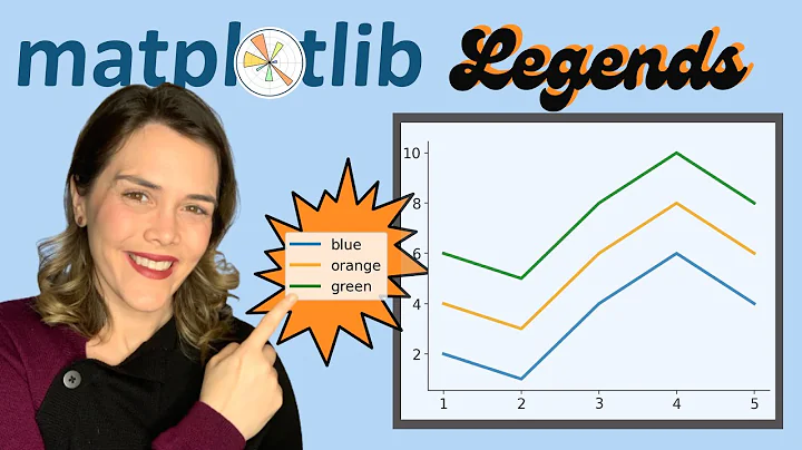
matplotlib scatter plot with color label and legend specified by c option
Solution 1
As in the example you mentioned, call plt.scatter for each group:
import numpy as np
from matplotlib import pyplot as plt

scatter_x = np.array([1,2,3,4,5])
scatter_y = np.array([5,4,3,2,1])
group = np.array([1,3,2,1,3])
cdict = {1: 'red', 2: 'blue', 3: 'green'}

fig, ax = plt.subplots()
for g in np.unique(group):
    ix = np.where(group == g)
    ax.scatter(scatter_x[ix], scatter_y[ix], c = cdict[g], label = g, s = 100)
ax.legend()
plt.show()
Solution 2
check this out:
import matplotlib.pyplot as plt
import numpy as  np

fig, ax = plt.subplots()
scatter_x = np.array([1,2,3,4,5])
scatter_y = np.array([5,4,3,2,1])
group = np.array([1,3,2,1,3])
for g in np.unique(group):
    i = np.where(group == g)
    ax.scatter(scatter_x[i], scatter_y[i], label=g)
ax.legend()
plt.show()
Related videos on Youtube
Light Yagmi
I am a researcher in the interdisciplinary area of physics and computer science, although my previous interests were focused on machine learning and Bayesian inference. I've recently been promoted to associate professor, but I don't like to do menial tasks, so I'll probably have to move to some other position to have enough time to my research :P
Updated on August 02, 2022Comments
-
 Light Yagmi almost 2 years
I'd like to make this kind of scatter plot where the points have colors specified by the "c" option and the legend shows the color's meanings.
The data source of mine is like following:
scatter_x = [1,2,3,4,5]
scatter_y = [5,4,3,2,1]
group = [1,3,2,1,3] # each (x,y) belongs to the group 1, 2, or 3.
I tried this:
plt.scatter(scatter_x, scatter_y, c=group, label=group)
plt.legend()
Unfortunately, I did not get the legend as expected. How to show the legend properly? I expected there are five rows and each row shows the color and group correspondences.
-
DavidG over 6 yearsYou could use
ax.legend()to be consistent :) -
p-robot over 6 yearsEdited - thanks. Also updated the figure for Python 3.6.1.
-
WestCoastProjects about 4 yearsthe
np.unique()/np.where(group==g)works and is the only way to do this in nativenumpywithout helper libs. It is amazingly convoluted way to do agroup_by() -
 Sos almost 4 yearsIs there a way to do this without having to use a loop? Something like
ax.scatter(..., label = list_of_group_labels)? -
 thorr18 about 3 years@Sos I imagine that as a separate question but the answer is seaborn.scatterplot


![[DS] Học Matplotlib (Scatter Plots)](https://i.ytimg.com/vi/NY0NfAlDrlc/hq720.jpg?sqp=-oaymwEcCNAFEJQDSFXyq4qpAw4IARUAAIhCGAFwAcABBg==&rs=AOn4CLAXSKgL43tR6oR998Yd1BKvOCXNSA)


