@Media min-width & max-width
Solution 1
I've found the best method is to write your default CSS for the older browsers, as older browsers (including IE 5.5, 6, 7 and 8) can't read @media. When I use @media, I use it like this:
<style type="text/css">
/* default styles here for older browsers.
I tend to go for a 600px - 960px width max but using percentages
*/
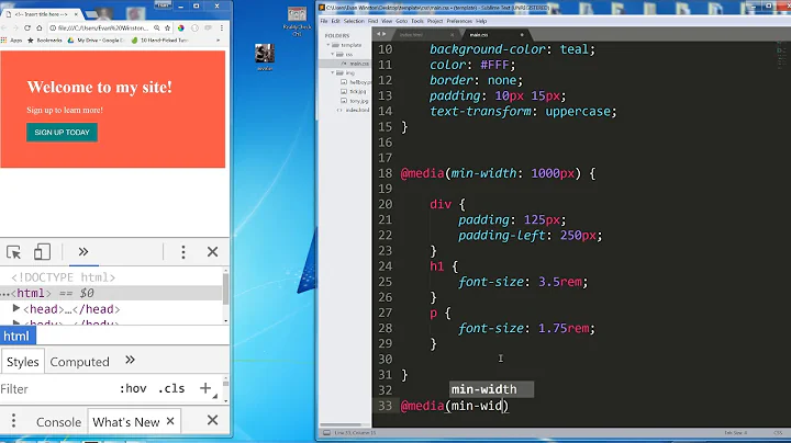
@media only screen and (min-width: 960px) {
/* styles for browsers larger than 960px; */
}
@media only screen and (min-width: 1440px) {
/* styles for browsers larger than 1440px; */
}
@media only screen and (min-width: 2000px) {
/* for sumo sized (mac) screens */
}
@media only screen and (max-device-width: 480px) {
/* styles for mobile browsers smaller than 480px; (iPhone) */
}
@media only screen and (device-width: 768px) {
/* default iPad screens */
}
/* different techniques for iPad screening */
@media only screen and (min-device-width: 481px) and (max-device-width: 1024px) and (orientation:portrait) {
/* For portrait layouts only */
}
@media only screen and (min-device-width: 481px) and (max-device-width: 1024px) and (orientation:landscape) {
/* For landscape layouts only */
}
</style>
But you can do whatever you like with your @media. This is just an example of what I've found best for me when building styles for all browsers.
Also! If you're looking for printability you can use @media print{}.
Solution 2
The underlying issue is using max-device-width vs plain old max-width.
Using the "device" keyword targets physical dimension of the screen, not the width of the browser window.
For example:
@media only screen and (max-device-width: 480px) {
    /* STYLES HERE for DEVICES with physical max-screen width of 480px */
}
Versus
@media only screen and (max-width: 480px) {
    /* STYLES HERE for BROWSER WINDOWS with a max-width of 480px.
       This will work on desktops when the window is narrowed.  */
}
Solution 3
If website on small devices behavior like desktop screen then you have to put this meta tag into header before
<meta name="viewport" content="width=device-width, initial-scale=1">
For media queries you can set this as
this will cover your all mobile/cellphone widths
 @media only screen and (min-width: 200px) and (max-width: 767px)  {
    //Put your CSS here for 200px to 767px width devices (cover all width between 200px to 767px //

    }
For iPad and iPad pro you have to use
  @media only screen and (min-width: 768px) and (max-width: 1024px)  {
        //Put your CSS here for 768px to 1024px width devices(covers all width between 768px to 1024px //
  }
If you want to add css for Landscape mode you can add this
and (orientation : landscape)
  @media only screen and (min-width: 200px) and (max-width: 767px) and (orientation : portrait) {
        //Put your CSS here for 200px to 767px width devices (cover all mobile portrait width //
  }
Solution 4
The correct value for the content attribute should include initial-scale instead:
<meta name="viewport" content="width=device-width, initial-scale=1">
                                                   ^^^^^^^^^^^^^^^
Solution 5
If you want to include both min and max width for responsiveness in the browser, then you can use the following:
 @media (min-width: 768px) and (max-width: 992px){...}
 @media (min-width: 480px) and (max-width: 767px) {...}
Related videos on Youtube
 07 : 11
 06 : 46
 11 : 37
 05 : 11
 18 : 01
 14 : 17
 08 : 10
rallybilen
Updated on July 08, 2022Comments
-
rallybilen almost 2 years
I have this
@mediasetup:HTML:
<head> <meta name="viewport" content="width=device-width, user-scalable=no" /> </head>CSS:
@media screen and (min-width: 769px) {
    /* STYLES HERE */
}

@media screen and (min-device-width: 481px) and (max-device-width: 768px) {
    /* STYLES HERE */
}

@media only screen and (max-device-width: 480px) {
    /* STYLES HERE */
}
With this setup it works on the iPhone but it does not work in the browser.
Is it because I already have
devicein the meta, and maybe havemax-width:480pxinstead?-
 Gurpreet Singh over 11 yearsWHat's the issue - Default styles will be applicable to screens wider than 769 px.
 -
Zoltan Toth over 11 yearsjust remove the
@media screen and (min-width:769px){around your normal browser styles -
rallybilen over 11 yearsWhat do you mean Zoltan? And I think I might solved it. First, the issue was when my I resized my browser with max-device-with it worked on the phone but not in the broswer, without "device" it works in both.
-
rallybilen over 11 yearsSo basiclly with out the "device" it works in both mobile/browser but when I add device I can not see it in the browser\
-
Medeno over 10 years960px is better, I remember reading that you should save 20px for the vertical scroll bar on some browsers that don't play well.
-
 Craig Moore about 10 yearsPlus it divides into 12 a little nicer (80px instead of 81px)
 -
 Robert almost 8 yearsDo not use the
devicekeyword as it will be removed an your site might break. developer.mozilla.org/en-US/docs/Web/CSS/Media_Queries/… -
Scott Romack over 6 yearsJust a note, 'screen and' is optional.
-
-
Luke over 10 yearsWhy have you put 'mac' screens? It's not only "amazing" Macs that can have large high resolution screens!
-
Michael Benjamin over 7 yearsIf you could explain why and add references, that would make this answer more useful.
-
 Datacrawler almost 7 years@Michael_B The initial was 'user-scalable=no'. That says it all I think.