Navigation rail with flutter
Solution 1
The latest version of Flutter 1.17 includes a built in NavigationRail component.
What is Navigation rail?
The rail is a side navigation component that displays three to seven app destinations and, optionally, a Floating Action Button. Each destination is represented by an icon and a text label. The rail can function on its own at larger screen sizes, such as desktop and tablet. When users transition between screen sizes and devices, the rail can also complement other navigation components, such as bottom navigation.
Example
import 'package:flutter/material.dart';

void main() => runApp(MyApp());

/// This Widget is the main application widget.
class MyApp extends StatelessWidget {
  static const String _title = 'Flutter Code Sample';

  @override
  Widget build(BuildContext context) {
    return MaterialApp(
      title: _title,
      home: MyStatefulWidget(),
    );
  }
}

class MyStatefulWidget extends StatefulWidget {
  MyStatefulWidget({Key key}) : super(key: key);

  @override
  _MyStatefulWidgetState createState() => _MyStatefulWidgetState();
}

class _MyStatefulWidgetState extends State<MyStatefulWidget> {
  int _selectedIndex = 0;

  @override
  Widget build(BuildContext context) {
    return Scaffold(
      body: Row(
        children: <Widget>[
          NavigationRail(
            selectedIndex: _selectedIndex,
            onDestinationSelected: (int index) {
              setState(() {
                _selectedIndex = index;
              });
            },
            labelType: NavigationRailLabelType.selected,
            destinations: [
              NavigationRailDestination(
                icon: Icon(Icons.favorite_border),
                selectedIcon: Icon(Icons.favorite),
                label: Text('First'),
              ),
              NavigationRailDestination(
                icon: Icon(Icons.bookmark_border),
                selectedIcon: Icon(Icons.book),
                label: Text('Second'),
              ),
              NavigationRailDestination(
                icon: Icon(Icons.star_border),
                selectedIcon: Icon(Icons.star),
                label: Text('Third'),
              ),
            ],
          ),
          VerticalDivider(thickness: 1, width: 1),
          // This is the main content.
          Expanded(
            child: Center(
              child: Text('selectedIndex: $_selectedIndex'),
            ),
          )
        ],
      ),
    );
  }
}
Find a live demo here.
Here is the official documentation.
Solution 2
NavigationRail
- A material widget that is meant to be displayed at the left or right of an app to navigate between a small number of views, typically between three and five.
SAMPLE CODE
import 'package:flutter/material.dart';

void main() => runApp(MyApp());

class MyApp extends StatelessWidget {
  static const String _title = 'Flutter Code Sample';

  @override
  Widget build(BuildContext context) {
    return MaterialApp(
      title: _title,
      debugShowCheckedModeBanner: false,
      home: HomeWidget(),
    );
  }
}

class HomeWidget extends StatefulWidget {
  HomeWidget({Key key}) : super(key: key);

  @override
  _HomeWidgetState createState() => _HomeWidgetState();
}

class _HomeWidgetState extends State<HomeWidget> {
  int _selectedIndex = 0;
  bool showNavigationBar = false;

  var list = [
    HomePage(),
    WalkPage(),
    LocationPage(),
    NotificationPage(),
    SettingsPage(),
    SearchPage()
  ];

  var title = [
    "HomePage",
    'WalkPage',
    'LocationPage',
    'NotificationPage',
    'SettingsPage',
    'SearchPage'
  ];

  @override
  Widget build(BuildContext context) {
    return Scaffold(
      appBar: AppBar(
        title: Text(title[_selectedIndex]),
        centerTitle: false,
        leading: IconButton(
            icon: Icon(
              Icons.menu,
              color: Colors.white,
            ),
            onPressed: () {
              setState(() {
                showNavigationBar = !showNavigationBar;
              });
            }),
      ),
      body: Container(
        child: SafeArea(
            child: Stack(
          children: <Widget>[
            list[_selectedIndex],
            Positioned(
              top: 0,
              left: 0,
              child: Visibility(
                visible: showNavigationBar,
                child: Container(
                  height: MediaQuery.of(context).size.height,
                  child: NavigationRail(
                    selectedIndex: _selectedIndex,
                    elevation: 10,
                    backgroundColor: Colors.white,
                    leading: Container(
                      child: Center(child: Text('leading')),
                    ),
                    trailing: Container(
                      child: Center(child: Text('trailing')),
                    ),
                    selectedIconTheme: IconThemeData(color: Colors.purple, size: 30),
                    unselectedIconTheme: IconThemeData(color: Colors.grey, size: 20),
                    selectedLabelTextStyle:
                        TextStyle(color: Colors.purple, fontWeight: FontWeight.bold),
                    unselectedLabelTextStyle:
                        TextStyle(color: Colors.grey, fontWeight: FontWeight.normal),
                    onDestinationSelected: (int index) {
                      setState(() {
                        _selectedIndex = index;
                        showNavigationBar = !showNavigationBar;
                      });
                    },
                    labelType: NavigationRailLabelType.none,
                    destinations: [
                      NavigationRailDestination(
                        icon: Icon(Icons.home),
                        selectedIcon: Icon(Icons.home),
                        label: Text('Home'),
                      ),
                      NavigationRailDestination(
                        icon: Icon(Icons.directions_walk),
                        selectedIcon: Icon(Icons.directions_walk),
                        label: Text('Walk'),
                      ),
                      NavigationRailDestination(
                        icon: Icon(Icons.location_on),
                        selectedIcon: Icon(Icons.location_on),
                        label: Text('Location'),
                      ),
                      NavigationRailDestination(
                        icon: Icon(Icons.notifications),
                        selectedIcon: Icon(Icons.notifications),
                        label: Text('Notifications'),
                      ),
                      NavigationRailDestination(
                        icon: Icon(Icons.settings),
                        selectedIcon: Icon(Icons.settings),
                        label: Text('Settings'),
                      ),
                      NavigationRailDestination(
                        icon: Icon(Icons.search),
                        selectedIcon: Icon(Icons.search),
                        label: Text('Search'),
                      ),
                    ],
                  ),
                ),
              ),
            ),
          ],
        )),
      ),
    );
  }
}

class HomePage extends StatelessWidget {
  @override
  Widget build(BuildContext context) {
    return Container(
      color: Colors.red,
      child: Center(
          child: Text('Home Page',
              style: TextStyle(color: Colors.white, fontWeight: FontWeight.bold, fontSize: 20.0))),
    );
  }
}

class WalkPage extends StatelessWidget {
  @override
  Widget build(BuildContext context) {
    return Container(
      color: Colors.blue,
      child: Center(
          child: Text('Walk Page',
              style: TextStyle(color: Colors.white, fontWeight: FontWeight.bold, fontSize: 20.0))),
    );
  }
}

class LocationPage extends StatelessWidget {
  @override
  Widget build(BuildContext context) {
    return Container(
      color: Colors.orange,
      child: Center(
          child: Text('Location Page',
              style: TextStyle(color: Colors.white, fontWeight: FontWeight.bold, fontSize: 20.0))),
    );
  }
}

class NotificationPage extends StatelessWidget {
  @override
  Widget build(BuildContext context) {
    return Container(
      color: Colors.green,
      child: Center(
          child: Text('Notification Page',
              style: TextStyle(color: Colors.white, fontWeight: FontWeight.bold, fontSize: 20.0))),
    );
  }
}

class SettingsPage extends StatelessWidget {
  @override
  Widget build(BuildContext context) {
    return Container(
      color: Colors.amber,
      child: Center(
          child: Text('Settings Page',
              style: TextStyle(color: Colors.white, fontWeight: FontWeight.bold, fontSize: 20.0))),
    );
  }
}

class SearchPage extends StatelessWidget {
  @override
  Widget build(BuildContext context) {
    return Container(
      color: Colors.teal,
      child: Center(
          child: Text('Search Page',
              style: TextStyle(color: Colors.white, fontWeight: FontWeight.bold, fontSize: 20.0))),
    );
  }
}
Let us understand some of its important properties
selectedIndex- The index into destinations for the current selected NavigationRailDestination.
selectedIconTheme- The visual properties of the icon in the selected destination.
unselectedIconTheme- The visual properties of the icon in the unselected destination.
selectedLabelTextStyle- The TextStyle of a destination's label when it is selected.
unselectedLabelTextStyle- The TextStyle of a destination's label when it is unselected.
backgroundColor- Sets the color of the container that holds all of the NavigationRail's contents.
leading- The leading widget in the rail that is placed above the destinations
trailing- The trailing widget in the rail that is placed below the destinations.
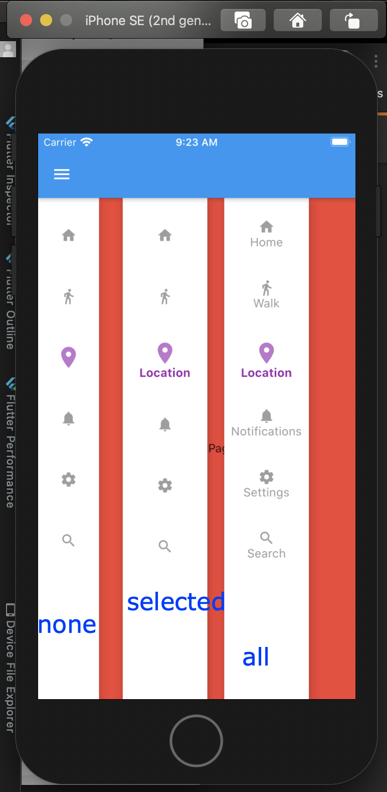
labelType
labelType: NavigationRailLabelType.all,labelType: NavigationRailLabelType.selected,labelType: NavigationRailLabelType.none,
OUTPUT
For more information please read the documentation of NavigationRail
You can test live demo here on NavigationRail demo
Solution 3
It was released on the 7th of May, 2020 with the Flutter 1.17 release. A quick search for "navigation rail flutter" would have done the trick.
The documentation includes a live demo and example code.
int _selectedIndex = 0;

 @override
 Widget build(BuildContext context) {
   return Scaffold(
     body: Row(
       children: <Widget>[
         NavigationRail(
           selectedIndex: _selectedIndex,
           onDestinationSelected: (int index) {
             setState(() {
               _selectedIndex = index;
             });
           },
           labelType: NavigationRailLabelType.selected,
           destinations: [
             NavigationRailDestination(
               icon: Icon(Icons.favorite_border),
               selectedIcon: Icon(Icons.favorite),
               label: Text('First'),
             ),
             NavigationRailDestination(
               icon: Icon(Icons.bookmark_border),
               selectedIcon: Icon(Icons.book),
               label: Text('Second'),
             ),
             NavigationRailDestination(
               icon: Icon(Icons.star_border),
               selectedIcon: Icon(Icons.star),
               label: Text('Third'),
             ),
           ],
         ),
         VerticalDivider(thickness: 1, width: 1),
         // This is the main content.
         Expanded(
           child: Center(
             child: Text('selectedIndex: $_selectedIndex'),
           ),
         )
       ],
     ),
   );
 }
To upgrade, run flutter upgrade, which will download the latest version from github.
Comments
-
Darish over 1 year
The material design guidelines includes a component called Navigation rail.
How to create Navigation rail with flutter?