Negative values in pie charts
Solution 1
Use shades of green for positive values.
Use the absolute value of your negative values to then display different negative values in shades of red.
Solution 2
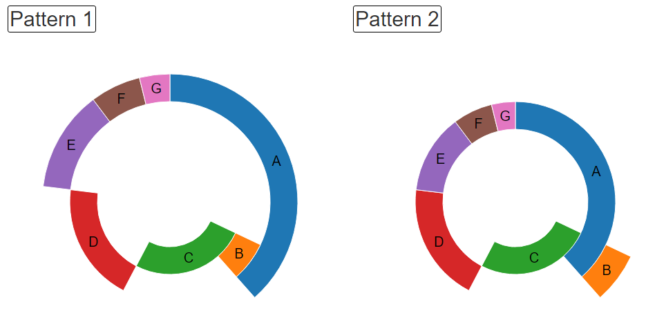
Recently I thought about the same problem, and made rough sample like this.
Please assume that item B has negative value.
'arc' and 'pie' function of d3.js are very convenient to use.
Working sample is here.
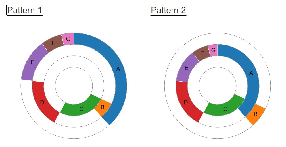
I also added concentric circles, like this.
Solution 3
You could use a donut chart around the pie, using one to represent positive values and the other negative values. The key here being the value that represents 100% is the same for both positive and negative. The result is a visual representation of what is positive, negative, and how positive or negative overall the set is.
http://www.highcharts.com/demo/pie-donut
MrDerp
Updated on July 09, 2022Comments
-
 MrDerp 6 months
My application visualizes data using a variety of chart types. Some data visualized by a pie chart includes negative values. Pie charts aren't designed to display negatives.
- Excel outputs the absolute value of all values. So, -20 is output in the pie chart as a slice with 20% of the pie's circumference. The only way to tell the number is negative is to reference the legend.
- Highcharts, which is the charting engine we use, leaves the positive slices intact, but renders the negatives in a very odd and confusing way (Example on JS Lint). Props to them for trying to render negatives, but our users are confused.
- Others have suggested filtering out the negatives altogether, since they don't make sense on a pie chart. This strips data and doesn't wholly represent the data set, so it probably won't work for us.
- And, others have suggested using a more appropriate chart type, such as a bar chart.
Any other options for solving this? How have you done it?