Owl carousel multiple rows
Solution 1
A simple idea using flex
$('.owl-carousel').owlCarousel({
    loop:true,
    margin:10,
    items:1,
    nav: true
})
.owl-carousel .item {
background: #4DC7A0;
padding: 1rem;
}
body{
padding: 10px;
}.flex-container {
display: flex;
flex-wrap: nowrap;
background-color: DodgerBlue;
}
.flex-container > div {
background-color: #f1f1f1;
width: 100px;
margin: 10px;
text-align: center;
line-height: 75px;
font-size: 30px;
}<link href="https://cdnjs.cloudflare.com/ajax/libs/OwlCarousel2/2.2.1/assets/owl.carousel.min.css" rel="stylesheet"/>
<script src="https://cdnjs.cloudflare.com/ajax/libs/jquery/3.3.1/jquery.min.js"></script><script src="https://cdnjs.cloudflare.com/ajax/libs/OwlCarousel2/2.2.1/owl.carousel.min.js"></script>
<div class="owl-carousel owl-theme">
<div class="item">
<div class="flex-container">
<div>1</div>
<div>2</div>
<div>3</div>
<div>4</div>
<div>5</div>
<div>6</div>
<div>7</div>
<div>8</div>
</div>
<div class="flex-container">
<div>1</div>
<div>2</div>
<div>3</div>
<div>4</div>
<div>5</div>
<div>6</div>
<div>7</div>
<div>8</div>
</div>
</div>
</div>Solution 2
As I needed a true responsive multiple rows owl carousel (meaning it keeps slides ordered for all window sizes) for a project, I stumbled upon this question during my initial search, but found no real helpful or complete answers to it.
So I implemented it myself, and figured it could still help you, or someone(s) else in the future, so I have set up a codepen: https://codepen.io/Tolc/pen/OJXyKpo
What it achieves is basically this kind of responsive carousel:
desktop                   tablet                    mobile
cols: 3, rows: 2          cols: 2, rows: 3          cols: 1, rows: 2
1 2 3 -> 7 8 9            1 2 -> 7 8                1 -> 3 -> ...
4 5 6    10...            3 4    9 10               2    4
                          5 6    ...
This is just an example, the code works with any number of columns and rows and any breakpoint.
The basic principle is the same as the other answers: injecting wrapper divs that act as columns. But my implementation handles responsiveness so you don't lose any of Owl Carousel's features.
Html looks like this (only important part are the data-slide-index attributes):
<div class="owl-carousel owl-theme">
    <div class="slide" data-slide-index="0">1</div>
    <div class="slide" data-slide-index="1">2</div>
    <div class="slide" data-slide-index="2">3</div>
    ...
</div>
The whole js is a bit long but here it is (I tried to comment the interesting parts):
$(document).ready(function() {
  var el = $('.owl-carousel');

  var carousel;
  var carouselOptions = {
    margin: 20,
    nav: true,
    dots: true,
    slideBy: 'page',
    responsive: {
      0: {
        items: 1,
        rows: 2 //custom option not used by Owl Carousel, but used by the algorithm below
      },
      768: {
        items: 2,
        rows: 3 //custom option not used by Owl Carousel, but used by the algorithm below
      },
      991: {
        items: 3,
        rows: 2 //custom option not used by Owl Carousel, but used by the algorithm below
      }
    }
  };

  //Taken from Owl Carousel so we calculate width the same way
  var viewport = function() {
    var width;
    if (carouselOptions.responsiveBaseElement && carouselOptions.responsiveBaseElement !== window) {
      width = $(carouselOptions.responsiveBaseElement).width();
    } else if (window.innerWidth) {
      width = window.innerWidth;
    } else if (document.documentElement && document.documentElement.clientWidth) {
      width = document.documentElement.clientWidth;
    } else {
      console.warn('Can not detect viewport width.');
    }
    return width;
  };

  var severalRows = false;
  var orderedBreakpoints = [];
  for (var breakpoint in carouselOptions.responsive) {
    if (carouselOptions.responsive[breakpoint].rows > 1) {
      severalRows = true;
    }
    orderedBreakpoints.push(parseInt(breakpoint));
  }

  //Custom logic is active if carousel is set up to have more than one row for some given window width
  if (severalRows) {
    orderedBreakpoints.sort(function (a, b) {
      return b - a;
    });
    var slides = el.find('[data-slide-index]');
    var slidesNb = slides.length;
    if (slidesNb > 0) {
      var rowsNb;
      var previousRowsNb = undefined;
      var colsNb;
      var previousColsNb = undefined;

      //Calculates number of rows and cols based on current window width
      var updateRowsColsNb = function () {
        var width =  viewport();
        for (var i = 0; i < orderedBreakpoints.length; i++) {
          var breakpoint = orderedBreakpoints[i];
          if (width >= breakpoint || i == (orderedBreakpoints.length - 1)) {
            var breakpointSettings = carouselOptions.responsive['' + breakpoint];
            rowsNb = breakpointSettings.rows;
            colsNb = breakpointSettings.items;
            break;
          }
        }
      };

      var updateCarousel = function () {
        updateRowsColsNb();

        //Carousel is recalculated if and only if a change in number of columns/rows is requested
        if (rowsNb != previousRowsNb || colsNb != previousColsNb) {
          var reInit = false;
          if (carousel) {
            //Destroy existing carousel if any, and set html markup back to its initial state
            carousel.trigger('destroy.owl.carousel');
            carousel = undefined;
            slides = el.find('[data-slide-index]').detach().appendTo(el);
            el.find('.fake-col-wrapper').remove();
            reInit = true;
          }


          //This is the only real 'smart' part of the algorithm

          //First calculate the number of needed columns for the whole carousel
          var perPage = rowsNb * colsNb;
          var pageIndex = Math.floor(slidesNb / perPage);
          var fakeColsNb = pageIndex * colsNb + (slidesNb >= (pageIndex * perPage + colsNb) ? colsNb : (slidesNb % colsNb));

          //Then populate with needed html markup
          var count = 0;
          for (var i = 0; i < fakeColsNb; i++) {
            //For each column, create a new wrapper div
            var fakeCol = $('<div class="fake-col-wrapper"></div>').appendTo(el);
            for (var j = 0; j < rowsNb; j++) {
              //For each row in said column, calculate which slide should be present
              var index = Math.floor(count / perPage) * perPage + (i % colsNb) + j * colsNb;
              if (index < slidesNb) {
                //If said slide exists, move it under wrapper div
                slides.filter('[data-slide-index=' + index + ']').detach().appendTo(fakeCol);
              }
              count++;
            }
          }
          //end of 'smart' part

          previousRowsNb = rowsNb;
          previousColsNb = colsNb;

          if (reInit) {
            //re-init carousel with new markup
            carousel = el.owlCarousel(carouselOptions);
          }
        }
      };

      //Trigger possible update when window size changes
      $(window).on('resize', updateCarousel);

      //We need to execute the algorithm once before first init in any case
      updateCarousel();
    }
  }

  //init
  carousel = el.owlCarousel(carouselOptions);
});
Full codepen to see it in action: https://codepen.io/Tolc/pen/OJXyKpo
Solution 3
You can add several objects in one item and adapt the css to make them longer:
<div class="owl-carousel owl-theme">
  <div class="item"><h4>1</h4><h4>2</h4></div>
  <div class="item"><h4>3</h4><h4>4</h4></div>
  <div class="item"><h4>5</h4><h4>6</h4></div>
  <div class="item"><h4>7</h4><h4>8</h4></div>
  <div class="item"><h4>9</h4><h4>10</h4></div>
</div>
https://jsfiddle.net/yL8q6p3c/
Solution 4
As long as you create your grid and place it inside video-item, it should be fine.
This is how I made a video carousel of 2 rows.
<div class="video-carousel-container container">
<div class="row slider-carousel-video owl-carousel">
  @foreach ($videos as $item)
    <div class="video-item col-lg-4 col-md-4 col-xs-1">
      <iframe width="320" height="185" src="https://www.youtube.com/embed/{{$item->video}}" frameborder="0"
      allow="accelerometer; autoplay; encrypted-media; gyroscope; picture-in-picture" allowfullscreen>
      </iframe>
      <iframe width="320" height="185" src="https://www.youtube.com/embed/{{$item->video}}" frameborder="0"
        allow="accelerometer; autoplay; encrypted-media; gyroscope; picture-in-picture" allowfullscreen>
        </iframe>
    </div>
  @endforeach
</div>
Comments
-
Janath almost 2 years
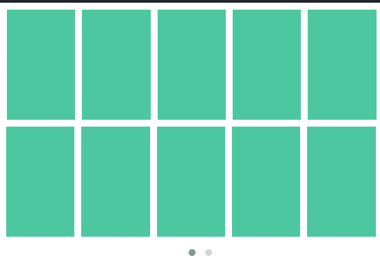
I just want to show multiple rows and with owl dots. Like this way.
But it seems there are no nay inbuilt option for this. So I tried to give
.owl-item {
width: 20%;
}
so it will be in 5 items in row. But it didn't work at all. I think plugin styles will be applied.
Here is the fiddle. https://jsfiddle.net/7mt5aL2x/
Any solutions?
-
Čamo over 3 yearsThanks a lot. You saved my day.
-
RMH over 3 yearsThis should definitely be considered as the correct answer. It provides the requested functionality while also maintaining the responsive options that go along with it.
-
 FilT about 3 yearsWorked like a charm! Thank you
 -
FilT about 3 yearsEven better response for responsiveness purposes
-
 Admin over 2 years+1 ! I dont know why anyone would not simply do this example. The slider is for the amount of slides required. Just place multiple items in one slide!
 -
 Mohadeseh over 2 yearsi have a problem with this.i used <html dir="rtl"> but carousel not working.my mean carousel not showing.
 -
 Awais over 2 years@Mohadeseh plz try this solution stackoverflow.com/questions/38939739/…
 -
Mohadeseh over 2 yearsthanks @Awais. but i have another problem. i asked thiss link:stackoverflow.com/questions/70752128/…