Prevent flex item from exceeding parent height and make scroll bar work
Solution 1
Short Answer
Instead of flex: 1, use flex: 1 1 1px.
Make these two adjustments in your code:
#messagelist {
        /* flex:1; */
        flex: 1 1 1px; /* new */
    }

#messagecontents {
        /* flex:1; */
        flex: 1 1 1px; /* new */
    }
Explanation
In most cases, as you have noted, adding min-height: 0 to flex items in a column-direction container is enough to correct the problem.
In this case, however, there's an additional obstacle: flex-basis.
You're applying the following rule to flex items #messagelist and #messagecontents: flex: 1.
This is a shorthand rule that breaks down to:
flex-grow: 1flex-shrink: 1flex-basis: 0
(source: https://www.w3.org/TR/css-flexbox-1/#flex-common)
2019 UPDATE: Since the posting of this answer in 2018, it appears that Chrome's behavior has changed and is now uniform with Firefox and Edge. Please keep that in mind as you read the rest of this answer.
In Chrome, flex-basis: 0 is enough to trigger an overflow, which generates the scrollbars. (2019 update: This may no longer be the case.)
In Firefox and Edge, however, a zero flex-basis is insufficient. This is probably the more correct behavior in terms of standards compliance as MDN states:
In order for
overflowto have an effect, the block-level container must have either a set height (heightormax-height) orwhite-spaceset tonowrap.
Well, flex-basis: 0 meets none of those conditions, so an overflow condition should not occur. Chrome has probably engaged in an intervention (as they often do).
An intervention is when a user agent decides to deviate slightly from a standardized behavior in order to provide a greatly enhanced user experience.
To meet the "standardized behavior", which would enable an overflow to occur in Firefox and Edge, give flex-basis a fixed height (even if it's just 1px).
Solution 2
I am marking Michael_B's answer as the correct one, since it is a valid solution along with an explanation. In addition here is another solution I came up with, which does not require modifying the flex-basis:
#messagescontainerrow {
        flex: 1;

        min-height: 0;   /* ADDED THIS. */

        border: 5px double black;
    }

#leftdiv {
        display:flex;
        flex-direction:column;

        max-height: 100%; /* ADDED THIS */

        border: 1px solid green;
    }

#rightdiv {
        display:flex;
        flex-direction:column;

        max-height: 100%; /* ADDED THIS */

        border: 1px solid blue;
    }
Explanation:
As per the current Flexbox specification https://www.w3.org/TR/css-flexbox-1/#min-size-auto
In general, the automatic minimum size of a flex item is the smaller of its content size and its specified size. However, if the box has an aspect ratio and no specified size, its automatic minimum size is the smaller of its content size and its transferred size. If the box has neither a specified size nor an aspect ratio, its automatic minimum size is the content size.
So, by default #messagescontainerrow was taking on a minimum height based on its contents, rather than respecting the height of its parent flexbox. This behavior can be overridden by setting min-height:0.
By making this change one sees what is displayed in the following image; note that @messagescontainerrow - the one with the double line border - is now the same height as its parent - the one with the purple dashed border.

(Note that the more recent draft specification, found here - https://drafts.csswg.org/css-flexbox/#min-size-auto - says "for scroll containers the automatic minimum size is zero". So in future we might not need to do this).
What remains now is the issue of its children, #leftdiv and #rightdiv, overflowing its borders. As Michael_B pointed out, overflow requires a height or max-height property to be present. So the next step is to add max-height: 100% to both #leftdiv and #rightdiv, so that the overflow-y:scroll property of their children gets triggered.
Here is the result:

Related videos on Youtube
 01 : 35 : 32
 01 : 55 : 13
 15 : 33
 06 : 39
 06 : 01
 06 : 39
 03 : 04
 01 : 20
 44 : 53
 01 : 12
 05 : 46
 01 : 16
 01 : 20
 01 : 12
 02 : 29
 01 : 18
 01 : 52
Gary
Updated on July 01, 2022Comments
-
Gary about 2 years
How can I prevent a child div with scrollbars and
flex:1from exceeding the height of its parent flexbox in Firefox? It works correctly in Chrome.CodePen link (if you prefer it to Stack Overflow snippets): https://codepen.io/garyapps/pen/ZMNVJg
Details:
I have a flex container of fixed height. It has a
flex-direction:columnsetting, and it contains multiple childen divs which will get vertically stacked. One of the child divs is given aflex:1property, whereas others are given fixed heights.My expectation is that the child div with the
flex:1property will expand to fill the remaining vertical space. This works as expected.I have also given the child div an
overflow-y:scrollproperty, so that if the content within it exceeds its height, scrollbars appear. This works fine in Chrome. In Firefox however, this child's height increases, exceeding its parent div.In Chrome:
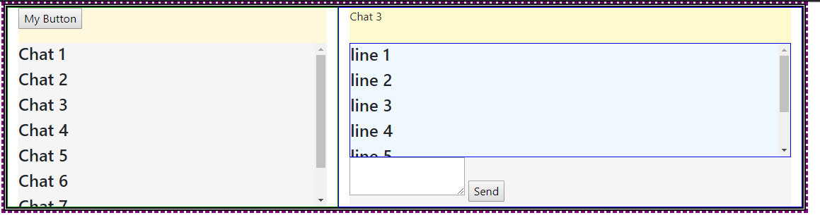
In Firefox:
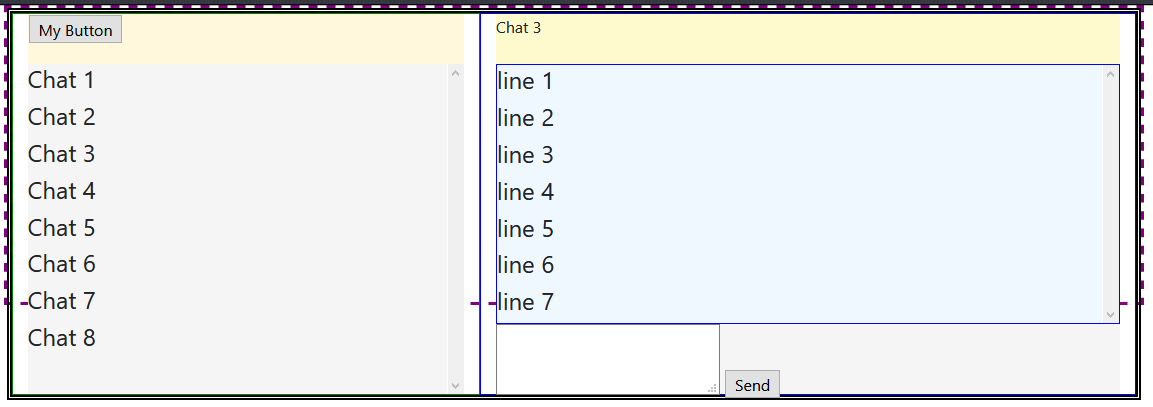
As you see in the screenshot, I have two occurrences of this issue, once in the panel on the left, and the other in the panel on the right. In Chrome, the height of the child div remains constant, scrollbars appear, and the height of the parent does not get exceeded. In Firefox scrollbars do not appear, and the height of the child div increases and exceeds its parent.
I have looked at a few other similar questions on SO, and in many cases setting a
min-height:0property solved the problem in Firefox. However I have tried addingmin-height:0to parents, children, both parents and children, and had no luck.Please run the code snippet below in both Chrome and Firefox to see the difference in the two browsers.
I would appreciate any advice on how to prevent child div from growing.
(Note that Bootstrap 4 is being used. The code snippet references the bootstrap 4 .css file CDN)
Code Snippet:
.body-content {
        height: 300px;
        max-height:100%;
        border: 3px dashed purple;
        display:flex;
        flex-direction: column;
    }


#messagescontainerrow {
        flex: 1;
        border: 5px double black;
    }

#leftdiv {
        display:flex;
        flex-direction:column;
        border: 1px solid green;
    }

#messagetools {
        height: 50px;
        background-color: cornsilk;
    }

#messagelist {
        flex:1;
        overflow-y: scroll;
        background-color:whitesmoke;
    }

#rightdiv {
        display:flex;
        flex-direction:column;
        border: 1px solid blue;
    }

#messagesenderspane {
        width: 100%;
        height: 50px;
        background-color: lemonchiffon
    }

#messagecontents {
        flex: 1;
        overflow-y: scroll;
        width: 100%;
        border: 1px solid blue;
        background-color: aliceblue;
    }

#messagesend {
        width: 100%;
        height: 70px;
        background-color: whitesmoke;
    }
<html> <head> <link href="https://cdnjs.cloudflare.com/ajax/libs/twitter-bootstrap/4.1.2/css/bootstrap.min.css" rel="stylesheet"/> </head> <body> <div class="container body-content"> <div class="row" id="messagescontainerrow"> <div class="col-5" id="leftdiv"> <div id="messagetools"> <input type="button" id="newbutton" value="My Button" /> </div> <div id="messagelist"> <h4>Chat 1</h4> <h4>Chat 2</h4> <h4>Chat 3</h4> <h4>Chat 4</h4> <h4>Chat 5</h4> <h4>Chat 6</h4> <h4>Chat 7</h4> <h4>Chat 8</h4> </div> </div> <div class="col-7" id="rightdiv"> <div id="messagesenderspane"> Chat 3 </div> <div id="messagecontents"> <h4>line 1</h4> <h4>line 2</h4> <h4>line 3</h4> <h4>line 4</h4> <h4>line 5</h4> <h4>line 6</h4> <h4>line 7</h4> </div> <div id="messagesend"> <textarea id="sendbox"></textarea> <input type="button" id="sendbutton" value="Send" /> </div> </div> </div> </div> </body> </html> -
Gary almost 6 yearsYour solution clearly works (thank you), but I don't fully understand it yet. I see what you mean about the spec requiring a block level container to have either a set height (height or max-height) or whitespace set to nowrap. What I don't understand is how flex-basis:0 satisfied that requirement. Is flex-basis considered a valid substitute for height because it would otherwise take precedence over height?
-
Michael Benjamin almost 6 yearsIt's not the
flex-basisthat really matters (it's a valid substitute forheight). It's the0value that you need to focus on.overflowrequires a fixed height. 0 doesn't satisfy that requirement. But Chrome makes it work anyway. -
Gary almost 6 yearsThanks for your help Michael_B. I learned something new about flex boxes (I had no idea what flex-basis is). Marking this as the solution. I also came up with a different solution, which I've added a separate answer.
-
Wand Maker almost 5 yearsThank you for the answer! I have been struggling with this for past 10 hours. At last I googled and found this link.
-
 Frank Nocke over 4 yearsAlso see this related problem / solution. Seems not to matter so much, if it's
0or1pxto "start growing", as long as it is not a "child-oriented" auto... (while working in Chrome-only right now, this reminds me of IE10 bugs, where "min-width: 0" was a standard solution for cross-browser-issues :-) ) -
 Anthony over 3 yearssolved my issue that made me waste alot of hours. thanks