Read-only (visually) CheckBox
Solution 1
You have to draw everything yourself. I think you should use some controls with correct layout to mimic it. Here is the demo code for you, note that it does not support AutoSize correctly. Because the drawn stuff is always wider than the default stuff (which the AutoSize works with), implementing the AutoSize is not easy, If you don't care too much about AutoSize, this would be the great control for you:
public class XCheckBox : CheckBox
{
    public XCheckBox()
    {
        SetStyle(ControlStyles.Opaque, false);
        ReadOnlyCheckedColor = Color.Green;
        ReadOnlyUncheckedColor = Color.Gray;
    }
    public bool ReadOnly { get; set; }
    public bool AlwaysShowCheck { get; set; }
    public Color ReadOnlyCheckedColor { get; set; }
    public Color ReadOnlyUncheckedColor { get; set; }
    protected override void OnPaint(PaintEventArgs pevent)
    {
        if (ReadOnly)
        {
            pevent.Graphics.SmoothingMode = SmoothingMode.HighQuality;
            pevent.Graphics.TextRenderingHint = System.Drawing.Text.TextRenderingHint.AntiAlias;
            if (AlwaysShowCheck || Checked)
            {
                RenderCheck(pevent.Graphics);
            }
            RenderText(pevent.Graphics);
        }
        else base.OnPaint(pevent);
    }
    private void RenderCheck(Graphics g)
    {
        float fontScale = Font.Size / 8.25f;
        Size glyphSize = CheckBoxRenderer.GetGlyphSize(g, System.Windows.Forms.VisualStyles.CheckBoxState.CheckedNormal);
        glyphSize.Width = (int) (glyphSize.Width * fontScale);
        glyphSize.Height = (int)(glyphSize.Height * fontScale);
        string checkAlign = CheckAlign.ToString();
        using (GraphicsPath gp = new GraphicsPath())
        using (Pen pen = new Pen(Checked ? ReadOnlyCheckedColor : ReadOnlyUncheckedColor, 1.5f)
        {
            LineJoin = LineJoin.Round,
            EndCap = LineCap.Round,
            StartCap = LineCap.Round
        })
        {
            gp.AddLine(new Point(3, 7), new Point(5, 10));
            gp.AddLine(new Point(5, 10), new Point(8, 3));
            float dx = checkAlign.EndsWith("Right") ? Math.Max(-4*fontScale, ClientSize.Width - glyphSize.Width - 4 * fontScale) :
                     checkAlign.EndsWith("Center") ? Math.Max(-4*fontScale, (ClientSize.Width - glyphSize.Width) / 2 - 4 * fontScale) : -4;
            float dy = checkAlign.StartsWith("Bottom") ? Math.Max(-4*fontScale, ClientSize.Height - glyphSize.Height - 4*fontScale) :
                     checkAlign.StartsWith("Middle") ? Math.Max(-4*fontScale, (ClientSize.Height - glyphSize.Height) / 2 - 4*fontScale) : 0;

            g.TranslateTransform(dx, dy);
            g.ScaleTransform(1.5f*fontScale, 1.5f*fontScale);
            g.DrawPath(pen, gp);
            g.ResetTransform();
        }
    }
    private void RenderText(Graphics g)
    {
        Size glyphSize = CheckBoxRenderer.GetGlyphSize(g, System.Windows.Forms.VisualStyles.CheckBoxState.CheckedNormal);
        float fontScale = Font.Size / 8.25f;
        glyphSize.Width = (int)(glyphSize.Width * fontScale);
        glyphSize.Height = (int)(glyphSize.Height * fontScale);
        string checkAlign = CheckAlign.ToString();
        using (StringFormat sf = new StringFormat())
        {
            string alignment = TextAlign.ToString();
            sf.LineAlignment = alignment.StartsWith("Top") ? StringAlignment.Near :
                               alignment.StartsWith("Middle") ? StringAlignment.Center : StringAlignment.Far;
            sf.Alignment = alignment.EndsWith("Left") ? StringAlignment.Near :
                           alignment.EndsWith("Center") ? StringAlignment.Center : StringAlignment.Far;
            sf.FormatFlags = StringFormatFlags.NoWrap | StringFormatFlags.NoClip;
            Rectangle textRectangle = ClientRectangle;
            if (checkAlign.EndsWith("Left"))
            {
                textRectangle.Width -= glyphSize.Width;
                textRectangle.Offset(glyphSize.Width, 0);
            }
            else if (checkAlign.EndsWith("Right"))
            {
                textRectangle.Width -= glyphSize.Width;
                textRectangle.X = 0;
            }
            g.DrawString(Text, Font, new SolidBrush(ForeColor), textRectangle, sf);
        }
    }
    bool suppressCheckedChanged;
    protected override void OnClick(EventArgs e)
    {
        if (ReadOnly) {
            suppressCheckedChanged = true;
            Checked = !Checked;
            suppressCheckedChanged = false;
        }
        base.OnClick(e);
    }
    protected override void OnCheckedChanged(EventArgs e)
    {
        if (suppressCheckedChanged) return;
        base.OnCheckedChanged(e);
    }
}
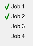
NOTE: The code is not fully implemented, everything is kept as simple as possible. You can change the AlwaysShowCheck property to choose the ReadOnly unchecked state, it can be a gray tick mark or nothing. You can set the ReadOnly to true to make it Read-only visual.
AlwaysShowCheck is set to true (the ReadOnly unchecked state is indicated by a gray tick mark)
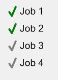
AlwaysShowCheck is set to false (the ReadOnly unchecked state is indicated by nothing)
Solution 2
There is a solution that is combination of the existing answers.
checkBox.ForeColor = Color.Gray; // Read-only appearance
checkBox.AutoCheck = false;      // Read-only behavior

// Tooltip is possible because the checkbox is Enabled
var toolTip = new ToolTip();
toolTip.SetToolTip(checkBox, "This checkbox is read-only.");
The result is a CheckBox that
- appears disabled with gray text
- prevents the
Checkedvalue from changing when clicked - supports a
Tooltip
Solution 3
This is an old post but still can be usefull so here is my solution.
In order to make a read-only behavior:
- Disable highlight when the cursor is over the
CheckBox - Disable reacting (logically or visibly) to a mouse click
- Have tooltips enabled
We can inherit the CheckBox class and disable mouse and keyboard interaction:
public class ReadOnlyCheckBox : CheckBox
{
    [System.ComponentModel.Category("Behavior")]
    [System.ComponentModel.DefaultValue(false)]
    public bool ReadOnly { get; set; } = false;

    protected override void OnMouseEnter(EventArgs e)
    {
        // Disable highlight when the cursor is over the CheckBox
        if (!ReadOnly) base.OnMouseEnter(e);
    }

    protected override void OnMouseDown(MouseEventArgs e)
    {
        // Disable reacting (logically or visibly) to a mouse click
        if (!ReadOnly) base.OnMouseDown(e);
    }

    protected override void OnKeyDown(KeyEventArgs e)
    {
        // Suppress space key to disable checking/unchecking
        if (!ReadOnly || e.KeyData != Keys.Space) base.OnKeyDown(e);
    }
}
In order to make it visually apparent that the CheckBox is read-only, we can change the ForColor according to the ReadOnly property.
Note: changing the ForColor only changes the text color, the colors of the checkmark can only be changed by overriding the OnPaint method and repainting the CheckBox (as far as I know).
Here is an extended version of the previous code that changes the ForColor according to the ReadOnly property:
public class ReadOnlyCheckBox : CheckBox
{
    private bool _readOnly = false;
    private Color _readOnlyForeColor = Color.Gray;
    private Color _normalForeColor = Color.Black;

    [System.ComponentModel.Category("Behavior")]
    [System.ComponentModel.DefaultValue(false)]
    public bool ReadOnly
    {
        get => _readOnly;
        set
        {
            if (_readOnly != value)
            {
                _readOnly = value;
                UpdateForColor();
            }
        }
    }

    [System.ComponentModel.Category("Appearance")]
    [System.ComponentModel.DefaultValue(typeof(Color), "Black")]
    public Color NormalForeColor
    {
        get => _normalForeColor;
        set
        {
            if (_normalForeColor != value)
            {
                _normalForeColor = value;
                UpdateForColor();
            }
        }
    }

    [System.ComponentModel.Category("Appearance")]
    [System.ComponentModel.DefaultValue(typeof(Color), "Gray")]
    public Color ReadOnlyForeColor
    {
        get => _readOnlyForeColor;
        set
        {
            if (_readOnlyForeColor != value)
            {
                _readOnlyForeColor = value;
                UpdateForColor();
            }
        }
    }

    // Hide ForeColor from the editor
    [System.ComponentModel.Browsable(false)]
    [System.ComponentModel.EditorBrowsable(
        System.ComponentModel.EditorBrowsableState.Never)]
    public override Color ForeColor
    {
        get => base.ForeColor;
        set => base.ForeColor = value;
    }

    public ReadOnlyCheckBox()
    {
        UpdateForColor();
    }

    private void UpdateForColor()
    {
        ForeColor = ReadOnly ? ReadOnlyForeColor : NormalForeColor;
    }

    protected override void OnMouseEnter(EventArgs e)
    {
        // Disable highlight when the cursor is over the CheckBox
        if (!ReadOnly) base.OnMouseEnter(e);
    }

    protected override void OnMouseDown(MouseEventArgs e)
    {
        // Disable reacting (logically or visibly) to a mouse click
        if (!ReadOnly) base.OnMouseDown(e);
    }

    protected override void OnKeyDown(KeyEventArgs e)
    {
        // Suppress space key to disable checking/unchecking
        if (!ReadOnly || e.KeyData != Keys.Space) base.OnKeyDown(e);
    }
}
Related videos on Youtube
 05 : 37 : 31
 01 : 00 : 18
 09 : 53
 08 : 02
 10 : 36
 07 : 36
 11 : 58
 07 : 50
 06 : 40
 01 : 00 : 49
 01 : 08 : 30
Comments
-
Sinatr over 1 year
I need to have 2 groups of controls on the screen: inputs and outputs (so they have 2 states: On or Off). Thus
CheckBoxseems to be a good choice. Checking any output will set it.However, when displaying inputs there will be no user interaction with it. User is only allowed to see its value, not to change it.
Question: how to make checkbos visually appears as read-only ?
Could think about possible solutions:
- Make
CheckBoxdisabled. Bad: there will be no tooltip (possible to solve it? by fake panel on top?) and visually disabledCheckBoxis not nice (and I don't want to make user think it is disabled). - Use different control. Which one?
Labeldoesn't have nice placeholder for the On/Off value.RadioButtonlook differently, but they usually means there is a single choice out of many, while values of inputs are independent. - Making own component. Drawing the whole
CheckBoxis a bit overkill (and honestly, I don't know how to do it to have Win7 appearance). Would it be possible to add onlyReadOnlyappearance to the box part easily?
What do you guys think?
- Make
-
Sinatr over 10 years
-
 King King over 10 years@Sinatr in fact it's not my own used component, I've just written it when attempting to answer your question. I want all the future projects of mine will use
WPF, notwinforms, the customization is much easier, however if the team usewinforms, I still have to use it. -
slfan over 9 yearscould you provide a bit more information with your answer?
-
Sinatr over 9 yearsGood catch with
AutoCheck, disabling it for read-onlyCheckBoxis a good idea. -
 Kraang Prime over 7 yearsThis should be the correct and accepted answer. The solution by King King will make it look checked, but the underlying value can change. I believe the OP wanted a checkbox that it's state can not be changed.
 -
Sinatr almost 4 yearsYou are missing 4th point in your list: make it visually telling "I am read only". Solving "disabled Checkbox with tooltip" is worth upvote from other point.
-
 Eliahu Aaron over 3 yearsI edited the answer and added an extended version of the code that makes the
CheckBoxlook read-only by changing the text color to gray.