Responsive design layout CSS menu position overlaps header logo
Solution 1
I think I understand the problem enough to offer a solution.
Absolutely positioned and floating elements can overlap. When clicking on the ☰ the element is given float: right which will also give the element display: block; this means that it takes up 100% of the width and pushes the whole vertical navigation leftwards towards the logo. A further problem arises in that the #logo is rendered over the top of the menu (the z-index here is not working), so the ☰ is no longer sees the click due to another element being rendered over the top.
z-index is not working because positioned elements create a new stacking context - see http://philipwalton.com/articles/what-no-one-told-you-about-z-index/ for more information about this.
The CSS float should not be needed here and could be replaced with inline-block or table-cell display values. I have also removed z-index in my demo.
Finally, I have changed the $(window).resize() calculation to remove the vertical navigation class at the same width as the @media query since there was 100px of width when a previously vertical menu could disappear before changing to a horizontal one.
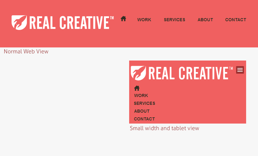
Updated answer (based on requested design)
With the added information, this solution can be much cleaner and I can also remove the display: table-cell from the original answer (left in below).
HTML
<div id="header">
<div id="logo">
<p>LOGO HERE</p>
<span id="menu">☰</span>
</div>
<ul id="nav">
<li id="homeBtn"><a href="index.php"><span id="homeBtnImg"></span></a></li>
<li><a href="#">WORK</a></li>
<li><a href="#">SERVICES</a></li>
<li><a href="#">ABOUT</a></li>
<li><a href="#">CONTACT</a></li>
</ul>
</div>
CSS
#header {
    background-color: #f06060;
    padding: 52px 0px;
}
#logo {
    display:inline-block;
    width: 348px;
    height: 57px;
    border:1px dotted black;
    position:relative;
}
#menu {
    position: absolute;
    right: 0;
    top: 15px;
    display:none;
}
#nav {
    list-style: none;
    padding: 0;
    display: inline-block;
}
#nav.vertical {
    display: block;
    padding-left: 20px;
}
#nav.vertical li {
    display: list-item;
    line-height: 40px;
}
#nav li {
    display:inline-block;
    padding-right: 40px;
}
#nav li:last-child {
    padding-right: 0;
}
@media screen and (max-width: 800px) {
    #menu {
        display: inline-block;
    }
    #nav {
        display: none;
    }
}
JavaScript
Same as original answer below.
Original answer
See this demo or the code below.
HTML
<div id="header">
<div id="wrap">
<div id="logo">
<p>LOGO HERE</p>
</div>
<div id="menu_wrapper">
<div id="menu">☰</div>
<ul id="nav">
<li id="homeBtn"><a href="index.php"><span id="homeBtnImg"></span></a></li>
<li><a href="#">WORK</a></li>
<li><a href="#">SERVICES</a></li>
<li><a href="#">ABOUT</a></li>
<li><a href="#">CONTACT</a></li>
</ul>
</div>
</div>
</div>
CSS
#header {
    background-color: #f06060;
    padding: 52px 0px;
    display:table;
    width:100%;
}
#wrap {
    display:table-row;
}
#logo {
    display:table-cell;
    width: 338px;
    height: 57px;
}
#menu {
    display:none;
}
#menu_wrapper {
    display:table-cell;
    text-align:right;
    padding-right:5px;
}
#nav {
    list-style: none;
    padding: 0;
    text-align: left;
}
#nav.vertical {
    display: block;
}
#nav.vertical li {
    display: list-item;
    line-height: 40px;
}
#nav li {
    display:inline-block;
    padding-right: 40px;
}
#nav li:last-child {
    padding-right: 0;
}
@media screen and (max-width: 800px) {
    #menu {
        display: block;
    }
    #nav {
        display: none;
    }
}
JavaScript
$(window).resize(function(){
    if (window.innerWidth > 800) {
        $("#nav").removeClass('vertical');
    }
});

$("#menu").click(function(){
    $("#nav").toggleClass('vertical');
    return false;
});
Solution 2
You should use media queries. something like this:
#menu_wrapper{
/* menu style */
}
#logo{
/* logo style */
display:none;
}
@media (max-width: 800px) {
  #menu_wrapper { display:none }
  #logo { display:block }
}
Stephen Jackson
Updated on June 08, 2022Comments
-
Stephen Jackson almost 2 years
I want it so when the window is
800pxwide or below it hides the menu<div>and shows the menu icon ☰ and upon clicking the icon I want the menu to appear in a neat layout so that an iPhone can view it at320px,This is my current HTML.
<div id="header">
    <div class="wrap">
        <div id="logo">
            <p>LOGO HERE</p>
        </div><!--logo-->
        <div id="menu_wrapper">
            <ul id="nav">
                <div id="homeBtn"><a href="index.php"><span id="homeBtnImg"></span></a></div>
                <li><a href="#">WORK</a></li>
                <li><a href="#">SERVICES</a></li>
                <li><a href="#">ABOUT</a></li>
                <li id="end"><a href="#">CONTACT</a></li>
            </ul>
        </div>
    </div><!--wrap-->
</div><!--header-->
Also as a demo fiddle