Responsive equal height columns in rows with CSS3/HTML5 Only
Solution 1
A solution with flexboxes and media queries:
http://jsfiddle.net/szxmw7ko/4/
#container{
  display: flex;

  align-items: stretch;
  flex-wrap: wrap;
}


@media (max-width: 480px) {
    #container div {
        max-width: 98%;
    }
}
@media (min-width: 480px) and (max-width: 1080px) {
    #container div {
        max-width: 48%;
    }
}
@media (min-width: 1080px) {
    #container div {
        max-width: 23%;
    }
}
align-items: stretch tells to the flex items to fill the avalaible space along the cross axis. This is what allows to have equals height for all items.
flex-wrap: wrap gives the possibility to make a multiline flex flow. Otherwise, all items are jailed into one line.
max-width: XX% by default a block element will fill all avalaible space. Even if items are child of a flex layout, because of the flex-wrap rule which lifts the constraint of piling all the items on one row, they will stretch over the entire width of the container.
So setting a maximum width, which will necessarily raised, gives the control of how many items you want on a row.
@media (max-width: XX%) finally, you have just to adapt the width of an item to define how many columns you want depending on the size of the viewport.
Flexboxes resources:
https://css-tricks.com/snippets/css/a-guide-to-flexbox/
https://css-tricks.com/almanac/properties/f/flex-wrap/
Solution 2
I agree with hot_barbara, if you need to support any legacy IE browsers then flexbox is unfortunately not an option. There are load of solutions using only css out there, however a lot them assume that you have a single row of elements / grid items.
I've written my own javascript solution in jQuery, full article here: https://www.tenpixelsleft.com/responsive-equal-height-grid-columns/
The idea is that you can pass a the function a selector that targets all of the grid elements in a given collection, it will then keep all of the grid elements the same height based on the tallest in the collection.
/* ==================================================== *
 *  @param elementGroup - a group of dom objects to be iterated over and aligned
 *  @param offset - (int) offset number to be added to the height
 *  @param afterAlignment - callback function
 *  ==================================================== */
setElementGroupHeight = function(elementGroup, offset, afterAlignment) {
    var offset = typeof offset !== 'undefined' ? offset : 0;
    var tallestHeight = 0;
    var elHeight = 0;
    $.each(elementGroup, function() {
        // Since this function is called every time the page is resized, we need to reset the height
        // so each container can return to its natural size before being measured.
        $(this).css('height', 'auto');
        elHeight = $(this).outerHeight() + offset;
        if (elHeight > tallestHeight) {
            tallestHeight = elHeight;
        }
    });
    // Set the height of all elementGroup elements to the tallest height
    elementGroup.css('height', Math.ceil(tallestHeight));
    // Callback
    if (afterAlignment && typeof(afterAlignment) === "function") {
        afterAlignment();
    }
}
Then call it like this:
jQuery(function($) {
    // Initialise on page load
    var postGrid = $('.post-grid .js-align-col');
    if (postGrid.length) {
        setElementGroupHeight(postGrid);
        $(window).on('resize', function(e, resizeEvent) {
            // Realign on resize
            setElementGroupHeight(postGrid);
        });
    }
});
There can be some issues in regards to image and font loading race conditions, that can potentially skew the initial height calculation. The article link above details how to best handle these.
Comments
-
Giacomo Paita almost 2 years
I would like to create a responsive table-layout with the use of the
div, to be displayed for mobile devices only, where the elements has equal height for each rows using only CSS/CSS3 and not JavaScript, nor jQuery or plugin.I found a working example, that uses JS: here is the CODEPEN live example.
I've made a research, but i did not find any working example that make use only of pure CSS/CSS3/HTML5 (flexbox for example).
The best is to have only floating
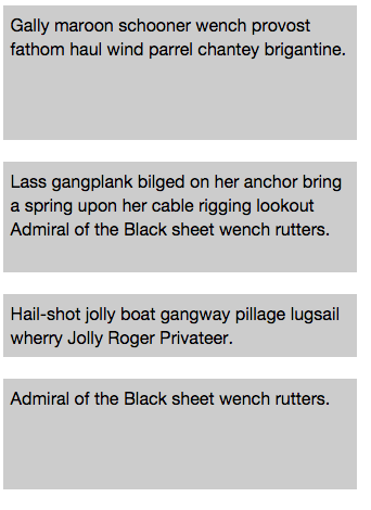
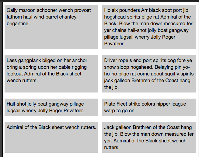
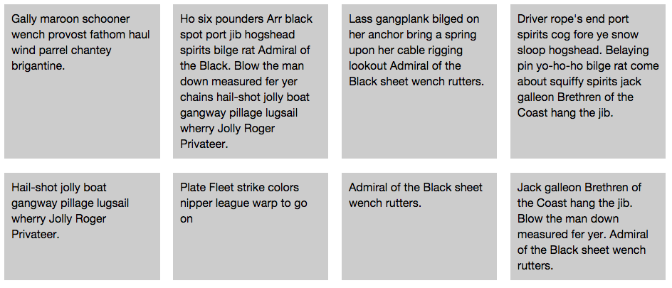
divs, and no hack CSS code: the layout should have different column number, as per different device size, working responsive like the screenshots below:Mobile Layout
Tablet Layout
Desktop Layout
-
hot_barbara over 8 yearsI wouldn't recommend this if you're going to support IE (even IE10 and 11!) as there is only partial support. See here for more details: caniuse.com/#feat=flexbox
-
Yaron over 6 yearsIt's nice but it will set all the cells to the highest cell and not for the cells in a row, for every row. To do that you have to understand how cells are in each row...