Selected tab's color in Bottom Navigation View
Solution 1
While making a selector, always keep the default state at the end, otherwise only default state would be used. You need to reorder the items in your selector as:
<?xml version="1.0" encoding="utf-8"?>
<selector xmlns:android="http://schemas.android.com/apk/res/android">
    <item android:state_checked="true" android:color="@android:color/holo_blue_dark" />
    <item android:color="@android:color/darker_gray"  />
</selector>
And the state to be used with BottomNavigationBar is state_checked not state_selected.
Solution 2
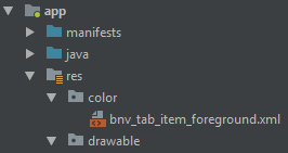
1. Inside res create folder with name color (like drawable)
2. Right click on color folder. Select new-> color resource file-> create color.xml file (bnv_tab_item_foreground) (Figure 1: File Structure)
3. Copy and paste bnv_tab_item_foreground
<android.support.design.widget.BottomNavigationView
            android:id="@+id/navigation"
            android:layout_width="0dp"
            android:layout_height="wrap_content"
            android:layout_marginEnd="0dp"
            android:layout_marginStart="0dp"
            app:itemBackground="@color/appcolor"//diffrent color
            app:itemIconTint="@color/bnv_tab_item_foreground" //inside folder 2 diff colors
            app:itemTextColor="@color/bnv_tab_item_foreground"
            app:layout_constraintBottom_toBottomOf="parent"
            app:layout_constraintLeft_toLeftOf="parent"
            app:layout_constraintRight_toRightOf="parent"
            app:menu="@menu/navigation" />
bnv_tab_item_foreground:
 <?xml version="1.0" encoding="utf-8"?>
    <selector xmlns:android="http://schemas.android.com/apk/res/android">
        <item android:state_checked="true" android:color="@color/white" />
        <item android:color="@android:color/darker_gray"  />
    </selector>
Figure 1: File Structure:
Solution 3
BottomNavigationView uses colorPrimary from the theme applied for the selected tab and it uses android:textColorSecondary for the inactive tab icon tint.
So you can create a style with the prefered primary color and set it as a theme to your BottomNavigationView in an xml layout file.
styles.xml:
 <style name="BottomNavigationTheme" parent="Theme.AppCompat.Light">
        <item name="colorPrimary">@color/active_tab_color</item>
        <item name="android:textColorSecondary">@color/inactive_tab_color</item>
 </style>
your_layout.xml:
<android.support.design.widget.BottomNavigationView
            android:id="@+id/navigation"
            android:layout_width="match_parent"
            android:layout_height="wrap_content"
            android:background="?android:attr/windowBackground"
            android:theme="@style/BottomNavigationTheme"
            app:menu="@menu/navigation" />
Solution 4
If you want to change icon and text colors programmatically:
ColorStateList iconColorStates = new ColorStateList(
     new int[][]{
          new int[]{-android.R.attr.state_checked},
          new int[]{android.R.attr.state_checked}
     },
     new int[]{
          Color.parseColor("#123456"),
          Color.parseColor("#654321")
     });

navigation.setItemIconTintList(iconColorStates);
navigation.setItemTextColor(iconColorStates);
Solution 5
I am using a com.google.android.material.bottomnavigation.BottomNavigationView (not the same as OP's) and I tried a variety of the suggested solutions above, but the only thing that worked was setting app:itemBackground and app:itemIconTint to my selector color worked for me.
        <com.google.android.material.bottomnavigation.BottomNavigationView
            style="@style/BottomNavigationView"
            android:foreground="?attr/selectableItemBackground"
            android:theme="@style/BottomNavigationView"
            app:itemBackground="@color/tab_color"
            app:itemIconTint="@color/tab_color"
            app:itemTextColor="@color/bottom_navigation_text_color"
            app:labelVisibilityMode="labeled"
            app:menu="@menu/bottom_navigation" />
My color/tab_color.xml uses android:state_checked
<?xml version="1.0" encoding="utf-8"?>
<selector xmlns:android="http://schemas.android.com/apk/res/android">
    <item android:color="@color/grassSelected" android:state_checked="true" />
    <item android:color="@color/grassBackground" />
</selector>
and I am also using a selected state color for color/bottom_navigation_text_color.xml

Not totally relevant here but for full transparency, my BottomNavigationView style is as follows:
    <style name="BottomNavigationView" parent="Widget.Design.BottomNavigationView">
        <item name="android:layout_width">match_parent</item>
        <item name="android:layout_height">@dimen/bottom_navigation_height</item>
        <item name="android:layout_gravity">bottom</item>
        <item name="android:textSize">@dimen/bottom_navigation_text_size</item>
    </style>
Related videos on Youtube
 16 : 07
 07 : 53
 18 : 27
 23 : 50
 23 : 20
 06 : 31
 05 : 55
 08 : 50
Javad
I am a software engineer, mainly focused on mobile, striving for high code quality while delivering business and user values. I have leading and mentoring experience, have helped other engineers which has in turn helped me to improve myself along the way. I aim for having meaningful and challenging work for the team to help everyone grow professionally. I strive for maintaining a high automated test coverage (unit, UI, and integration tests) for iOS and Android projects. On both platforms, we have migrated from several legacy technologies (incl. Dagger, AlamoFire, and Retrofit among others) to simpler modern alternatives, using native language features when possible. I keep myself updated on new advancements in the industry and evaluate them in a pragmatic way to tackle real problems.
Updated on July 08, 2022Comments
-
Javad almost 2 years
I'm adding a
BottomNavigationViewto a project, and I would like to have a different text (and icon tint) color for the selected tab (to achieve greying out non-selected tabs effect). Using a different color withandroid:state_selected="true"in a color selector resource file doesn't seem to work. I also tried having additional item entries withandroid:state_focused="true"orandroid:state_enabled="true", no effect unfortunately. Also tried setting thestate_selectedattribute to false (explicitly) for the default (non-selected) color, with no luck.Here is how I add the view to my layout:
<android.support.design.widget.BottomNavigationView
        android:id="@+id/bottom_navigation"
        android:layout_width="match_parent"
        android:layout_height="wrap_content"
        android:layout_alignParentBottom="true"
        app:itemBackground="@color/silver"
        app:itemIconTint="@color/bnv_tab_item_foreground"
        app:itemTextColor="@color/bnv_tab_item_foreground"
        app:menu="@menu/bottom_nav_bar_menu" />
Here is my color selector (
bnv_tab_item_foreground.xml):<?xml version="1.0" encoding="utf-8"?> <selector xmlns:android="http://schemas.android.com/apk/res/android"> <item android:color="@android:color/darker_gray" /> <item android:state_selected="true" android:color="@android:color/holo_blue_dark" /> </selector>And my menu resource (
bottom_nav_bar_menu.xml):<?xml version="1.0" encoding="utf-8"?> <menu xmlns:android="http://schemas.android.com/apk/res/android"> <item android:id="@+id/action_home" android:icon="@drawable/ic_local_taxi_black_24dp" android:title="@string/home" /> <item android:id="@+id/action_rides" android:icon="@drawable/ic_local_airport_black_24dp" android:title="@string/rides"/> <item android:id="@+id/action_cafes" android:icon="@drawable/ic_local_cafe_black_24dp" android:title="@string/cafes"/> <item android:id="@+id/action_hotels" android:icon="@drawable/ic_local_hotel_black_24dp" android:title="@string/hotels"/> </menu>I would appreciate any help.
-
Javad over 7 yearsAs mentioned in the question, I tried state_enabled as well, but that's not the correct state attribute to be used with this specific widget. The issue was what was mentioned in the answer: 1. The ordering was wrong (default state should be the last item in the selector) 2. state_checked is the correct state attribute to be used with BottomNavigationView.
-
 dianakarenms over 7 yearsadd it on <android.support.design.widget.BottomNavigationView app:itemIconTint="@drawable/nav_item_color_state" app:itemTextColor="@drawable/nav_item_color_state" />
 -
 Rafael over 7 yearsIn my case I needed to generate dynamic menu, and this solution didn't work. The only working solution was manually setting menu items stackoverflow.com/a/7106111/2098878
 -
 Anshul Tyagi about 7 yearsWhat about divider in between of items ?
 -
 Piotr Ślesarew about 7 years"state_checked not state_selected". What a time saver:) Thanks!
 -
 TheRealChx101 about 5 yearsOn KitKat, the default selector flashes when selected and creates visual inconsistencies.
 -
Dmitry Smolyaninov about 5 yearsthe order is important!
-
 Mahdi Moqadasi almost 5 years
android:textColorSecondarynot works. should useandroid:colorForegroundinstead -
Anton Makov over 4 yearsadd it on <android.support.design.widget.BottomNavigationView app:itemIconTint="@color/nav_item_color_state" app:itemTextColor="@color/nav_item_color_state" /> instead of @ drawable
-
 Sam Chen over 4 yearsThis is the best answer, the "selector" method uses "darker_gray" as the inactive tab color which is different form the original one. Also
android:textColorSecondaryworks for me. Thanks! -
Tayyab Mazhar about 4 yearsFor anyone who got stuck like me, I had to create a "color" directory in "res" , and put this file in there.
-
ΩlostA over 3 yearsyou made my day :) Works like a charm
-
 lasec0203 over 2 yearsNot sure why I couldn't get this solution to work, but the accepted solution did work. Also anyone looking for the default material styling of
itemIconTintanditemTextColor, check out@color/mtrl_navigation_bar_item_tint -
Kumar Santanu over 2 yearscolor/tab_color.xml? Can you explain.
-
 Sampson over 2 yearsI posted
color/tab_color.xmlin my answer above, it is the color selector file. -
OtienoSamwel about 2 yearsThis saved me a ton of time. Awesome explanation.