Set default filter for Kendo UI Grid
Solution 1
Try to update to latest internal build. Version later than 2012.3.1304 should contain the fix.
Solution 2
When you only have a single option or you are not happy with the layout you can completely customize the filter control using the "ui : func( element ) { }" overload which is present in the later versions of Kendo (e.g. v2013.1.319)
columns : [
    { field: "MyCity", width: 80, title : "City", filterable: customTextFilter },
    { field: "CreatedAt", width: 72, title: "Created", filterable: $scope.customDateFilter }
]
Here is the function that then customizes the look:
var customTextFilter =
    {
        extra : false,
        operators : { string : { contains : "Contains"}},
        ui : function( element )
        {
            var parent = element.parent();
            while( parent.children().length > 1 )
                $(parent.children()[0]).remove( );

            parent.prepend( "<input data-bind=\"value:filters[0].value\" class=\"k-textbox\" type=\"text\">" );
        }
    }
Here is an example of having two date boxes with GTE/LTE format:
var customDateFilter =
    {
        extra : true,
        operators : { },
        ui : function( element )
        {
            var parent = element.parent();
            while( parent.children().length > 1 )
                $(parent.children()[0]).remove( );

            parent.prepend(
                "On or after:<br/><span class=\"k-widget k-datepicker k-header\">" +
                "<span class=\"k-picker-wrap k-state-default\">" +
                "<input data-bind=\"value:filters[0].value\" class=\"k-input\" type=\"text\" data-role=\"datepicker\"" +
                " style=\"width: 100%\" role=\"textbox\" aria-haspopup=\"true\" aria-expanded=\"false\" aria-disabled=\"false\" " +
                " aria-readonly=\"false\" aria-label=\"Choose a date\">" +
                "<span unselectable=\"on\" class=\"k-select\" role=\"button\">" +
                "<span unselectable=\"on\" class=\"k-icon k-i-calendar\">select</span></span></span></span>" +

                "<br/>On or before:<br/>" +
                "<span class=\"k-widget k-datepicker k-header\"><span class=\"k-picker-wrap k-state-default\">" +
                "<input data-bind=\"value: filters[1].value\" class=\"k-input\" type=\"text\" data-role=\"datepicker\"" +
                " style=\"width: 100%\" role=\"textbox\" aria-haspopup=\"true\" aria-expanded=\"false\" " +
                " aria-disabled=\"false\" aria-readonly=\"false\" aria-label=\"Choose a date\">" +
                "<span unselectable=\"on\" class=\"k-select\" role=\"button\">" +
                "<span unselectable=\"on\" class=\"k-icon k-i-calendar\">select</span></span></span></span>"
            );
        }
    };
Obviously you can template out however you like and create different custom filters for Date, Boolean, etc -- note that for the Date version above if you want to set the operators correctly to say "gte" and "lte" for filter[0].operator and filter[1].operator you can just set that on the dataSource.filter attribute like so:
    dataSource: {
        transport :
        {
            read : function( context )
            {
                //note that here context.filter.filters has the array
                //of applied filters -- you can write a custom RESTful call
                //such as angular $http.get( ) or use Kendo native format to
                //send filter options to server.
            }
        },
        //filter settings here initialize filter[0], filter[1], etc.
        filter : [
           { field : "CreatedAt", operator : "gte" },
           { field : "CreatedAt", operator : "lte" }]
   }
Solution 3
The best way to change the default operator for all of the instances:
kendo.ui.FilterMenu.prototype.options.operators =
  $.extend(kendo.ui.FilterMenu.prototype.options.operators, {
  string: {
      contains: "Contains",
      startswith: "Starts with",
      eq: "Is equal to",
      neq: "Is not equal to",
      doesnotcontain: "Does not contain",
      endswith: "Ends with"
  }
});
and the complete script:
kendo.ui.FilterMenu.prototype.options.operators =
  $.extend(kendo.ui.FilterMenu.prototype.options.operators, {

/* FILTER MENU OPERATORS (for each supported data type)
 ****************************************************************************/
  string: {
      contains: "Contains",
      startswith: "Starts with",
      eq: "Is equal to",
      neq: "Is not equal to",
      doesnotcontain: "Does not contain",
      endswith: "Ends with"
  },
  number: {
      eq: "Is equal to",
      neq: "Is not equal to",
      gte: "Is greater than or equal to",
      gt: "Is greater than",
      lte: "Is less than or equal to",
      lt: "Is less than"
  },
  date: {
      eq: "Is equal to",
      neq: "Is not equal to",
      gte: "Is after or equal to",
      gt: "Is after",
      lte: "Is before or equal to",
      lt: "Is before"
  },
  enums: {
      eq: "Is equal to",
      neq: "Is not equal to"
  }
 /***************************************************************************/
});
Solution 4
I had the same problem and I got it, that it needs the .Clear() option!
I am building my Grid with the MVC Wrapper in Razor:
@(Html.Kendo().Grid<LocationViewModel>()
    .Name("locationGrid")
    // other bits of configuration here
    .ColumnMenu()
    .Filterable(f => f.Operators(o => o.ForString(s => s
        .Clear()
        .Contains("Contains")
        .DoesNotContain("Does not contain")
        .EndsWith("Ends with")
    )))
    // other bits of configuration here
)
Summary:
- .Clear() is needed!
- Sorting is necessary! Put
.Contains()first after.Clear()then the default is Contains!
Additional Info: I am using Kendo UI 2013.1.514
Solution 5
filterable: { operators: { number: { gte: "greater than or equal to" } } }
Comments
-
Colin Mackay almost 2 years
I have a Kendo UI grid that is rendered with javaScript. I want the string columns to have a single option ("Contains") and without the second filter. So far so good, I wrote
        $("#MyGrid").kendoGrid({
            // other bits of configuration here
            filterable: {
                extra:false,
                operators: {
                    string:{ contains: "Contains"}
                }
            },
            // more bits of configuration here
        });
As part of the definition of the grid. And the result looks good-ish (I only have one option, so the drop down is redundant).
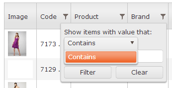
However, regardless of this, the filter still performs the equals operation rather than the contains operation (which is the only one available to it).
I've spent a while trying to figure this out and I keep going around in circles because the code I found either does not work, or doesn't make sense, or both.
Can anyone tell me how to default the filter to "Contains" and not "Is Equal To"?
-
 imperium2335 over 11 years@Petur Subev Downloaded and installed latest version, didn't work for me.
 -
 Michael Brennt almost 10 yearsIn my case it works fine, however "equals" filter is not present no matter in which order I place it
 -
baHI over 8 yearsbe sure to include proper JS scripts before using this scripts, f.e. if you don't include grid specific JS, the script above will generate an error....
-
Ashutosh B Bodake almost 7 yearsI want two filter text boxes for date column and one filter box for string column. How Can I achieve this?