Setting up WPF treeview triggers to show different images on expand
Solution 1
This question might be relevant.
As in my answer to the question I linked I would do the triggering in the image via RelativeSource binding, you can refactor that into a style so you do not have all that redundant code.
Possibly you could work with DynamicResources to provide the two images to every Image-control, or you could sub-class Image or create a UserControl which provides properties.
The DynamicResource method:
<TreeView.Resources>
    <Style x:Key="ExpandingImageStyle" TargetType="{x:Type Image}">
        <Setter Property="Source" Value="{DynamicResource Icon_Closed}"/>
        <Style.Triggers>
            <DataTrigger Binding="{Binding RelativeSource={RelativeSource AncestorType=TreeViewItem}, Path=IsExpanded}" Value="True">
                <Setter Property="Source" Value="{DynamicResource Icon_Open}"/>
            </DataTrigger>
        </Style.Triggers>
    </Style>
</TreeView.Resources>
<!-- Example usage -->
<HierarchicalDataTemplate DataType="{x:Type obj:Employee}">
    <StackPanel Orientation="Horizontal">
        <Image Style="{StaticResource ExpandingImageStyle}">
            <Image.Resources>
                <BitmapImage x:Key="Icon_Closed" UriSource="Images/FolderClosed.ico"/>
                <BitmapImage x:Key="Icon_Open" UriSource="Images/FolderOpen.ico"/>
            </Image.Resources>
        </Image>
        <TextBlock Text="{Binding Name}"/>
    </StackPanel>
</HierarchicalDataTemplate>
Solution 2
For completeness, the original setup with the HierarchicalDataTemplate triggers just needed to use a RelativeSource binding (as indicated by HB's answer), such as:
<HierarchicalDataTemplate DataType="{x:Type svm:SolutionsViewModel}" ItemsSource="{Binding Items, Mode=OneWay}">
    <StackPanel Style="{StaticResource TreeViewItemStackPanelStyle}">
        <Image x:Name="nodeImg" Style="{StaticResource IconImageStyleSmall}" Source="{StaticResource Icon_FolderClosed}" />
        <TextBlock Style="{StaticResource TreeViewItemTextStyle}" />
    </StackPanel>
    <HierarchicalDataTemplate.Triggers>
        <DataTrigger Binding="{Binding RelativeSource={RelativeSource AncestorType=TreeViewItem}, Path=IsExpanded}" Value="True">
            <Setter TargetName="nodeImg" Property="Source" Value="{Binding Source={StaticResource Icon_FolderOpen}, Mode=OneTime}"/>
        </DataTrigger>
    </HierarchicalDataTemplate.Triggers>
</HierarchicalDataTemplate>
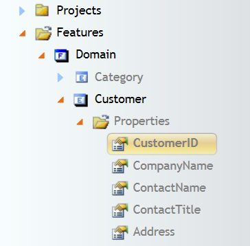
Below is an example image with different images on expand in the TreeView:
Dave Clemmer
I enjoy coding like an excellent beer. My particular passion and experience lies in the realm of modeling and code generation. In the late 80s and early 90s, I was involved in early modeling and code generation tools that reached the marketplace, including a tool that modeled FORTRAN programs and generated FORTRAN for parallel supercomputer architectures, and a tool that managed Shlaer-Mellor models and generated C++ code. Over the years, I have applied Shlaer-Mellor, UML, and custom modeling and various code generation techniques to greatly benefit the development of enterprise applications. My current passion and endeavor is to foster the evolution of model oriented development. In particular, I am passionate about evolving the Mo+ model oriented programming language and related model driven development tools, with as much community input as possible to achieve higher levels in the ability to create and maintain code. The open source site is at moplus.codeplex.com, and the Mo+ membership site is at modelorientedplus.com.
Updated on July 11, 2020Comments
-
Dave Clemmer almost 4 years
I have a wpf tree view that displays nodes of various types with corresponding images such as folder images. Initially, the tree and its nodes with corresponding images display as expected. However when a node is expanded, the expectation is that the image for the expanded node should swap to an expanded image. I'm trying to use
HierarchicalDataTemplatetriggers to set this up.Should the triggers be set up differently?
The tree looks something like:
(Folder Image) Solutions (SolutionsViewModel)
--(Solution Image) Solution 1 (Solution)
--(Solution Image) Solution 2 (Solution)
(Folder Image) Conventions (ConventionsViewModel)
The xaml of the main nodes in the tree view (the theme is empty):
<UserControl.Resources>
    <ResourceDictionary>
        <ResourceDictionary.MergedDictionaries>
            <ResourceDictionary Source="../Theme.xaml" />
        </ResourceDictionary.MergedDictionaries>

        <HierarchicalDataTemplate DataType="{x:Type vm:SolutionsViewModel}" ItemsSource="{Binding Items}">
            <StackPanel Orientation="Horizontal">
                <Image x:Name="nodeImg" Width="16" Height="16" Source="pack://siteOfOrigin:,,,/Resources/FolderClosed.bmp"/>
                <TextBlock Margin="5,0,0,0" Text="{Binding Name}" />
            </StackPanel>
            <HierarchicalDataTemplate.Triggers>
                <DataTrigger Binding="{Binding IsExpanded}" Value="True">
                    <Setter TargetName="nodeImg" Property="Source" Value="pack://siteOfOrigin:,,,/Resources//FolderOpen.bmp"/>
                </DataTrigger>
            </HierarchicalDataTemplate.Triggers>
        </HierarchicalDataTemplate>

        <HierarchicalDataTemplate DataType="{x:Type sol:Solution}" ItemsSource="{Binding Items}">
            <StackPanel Orientation="Horizontal">
                <Image x:Name="treeImg" Width="16" Height="16" Source="pack://siteOfOrigin:,,,/Resources/SolutionClosed.bmp"/>
                <TextBlock Margin="5,0,0,0" Text="{Binding Name}" />
            </StackPanel>
            <HierarchicalDataTemplate.Triggers>
                <DataTrigger Binding="{Binding IsExpanded}" Value="True">
                    <Setter TargetName="treeImg" Property="Source" Value="pack://siteOfOrigin:,,,/Resources//SolutionOpen.bmp"/>
                </DataTrigger>
            </HierarchicalDataTemplate.Triggers>
        </HierarchicalDataTemplate>

        <HierarchicalDataTemplate DataType="{x:Type vm:ConventionsViewModel}" ItemsSource="{Binding Items}">
            <StackPanel Orientation="Horizontal">
                <Image x:Name="nodeImg" Width="16" Height="16" Source="pack://siteOfOrigin:,,,/Resources/FolderClosed.bmp"/>
                <TextBlock Margin="5,0,0,0" Text="{Binding Name}" />
            </StackPanel>
            <HierarchicalDataTemplate.Triggers>
                <DataTrigger Binding="{Binding IsExpanded}" Value="True">
                    <Setter TargetName="nodeImg" Property="Source" Value="pack://siteOfOrigin:,,,/Resources//FolderOpen.bmp"/>
                </DataTrigger>
            </HierarchicalDataTemplate.Triggers>
        </HierarchicalDataTemplate>
    </ResourceDictionary>
</UserControl.Resources>
<UserControl.DataContext>
    <ObjectDataProvider
    ObjectType="{x:Type vm:TreeViewModel}"
    MethodName="CreateDefaultTree"
    />
</UserControl.DataContext>
<ScrollViewer VerticalScrollBarVisibility="Auto" HorizontalScrollBarVisibility="Auto">
    <Grid>
        <TreeView Name="solutionsModel" ItemsSource="{Binding Items}">
            <TreeView.ItemContainerStyle>
                <Style TargetType="{x:Type TreeViewItem}">
                    <Setter Property="IsExpanded" Value="{Binding IsExpanded, Mode=TwoWay}" />
                    <Setter Property="IsSelected" Value="{Binding IsSelected, Mode=TwoWay}" />
                    <Setter Property="FontWeight" Value="Normal" />
                    <Style.Triggers>
                        <Trigger Property="IsSelected" Value="True">
                            <Setter Property="FontWeight" Value="Bold" />
                        </Trigger>
                    </Style.Triggers>
                </Style>
            </TreeView.ItemContainerStyle>
        </TreeView>
    </Grid>
</ScrollViewer>