Slick slider gets wrong width
Solution 1
I also encountered the same issue - slider track width too large upwards of 30,000px wide. After reading Spencer Rysman's answer, I reviewed my markup and realized that I had applied a row class to the div wrapping my slider and since I'm using bootstrap 4 the default display:flex property used with the row class was causing unexpected output with the slide elements.
Adding a col within the wrapping row div fixed the issue for me.
<div class="row">
    <div class="col-12">
       ../slider markup
    </div>
</div>
Although, this may not be directly related to the op's issue, I thought I'd post as other users may encounter a similar problem as I did and find this thread.
Solution 2
I have the same problem only on screens <768px with bootstrap4, slick (and owlCarousel) set width more then 10000px to there container. The issue was that's the bootstrap container (.container) does't have a width property <768px, set it to 100% resolve the problem.
Solution 3
I had this same issue and was also dealing with some inherited bad css from stylesheets that I did not author. In my case I found 2 problems:
- body had a declaration of display: table
- .page (a page wrapper) had display: inline-block
So I would check to make sure that the slick slider is not nested inside of any element that is displayed as table or inline-block
Solution 4
Short Answer:
Make sure that your slick slider is inside of a container which is set as display: block
Solution 5
On initial loading, slick will not take the width, in IOS - in few devides, if the internal content is heavy.
Its fixed for me by adding css max-width to slick-track
Check with following:
$(".slick-track").css("max-width", $(window).width());
Related videos on Youtube
 09 : 02
 29 : 20
 01 : 36
 01 : 55
 13 : 50
 06 : 11
 02 : 06
mrfr
Updated on July 09, 2022Comments
-
mrfr almost 2 years
My slick slider gets wrong width when initialized and when I change screen resolutions.
My js:
$('.slider').slick({
    infinite: false,
    speed: 300,
    initialSlide: 1,
    slidesToShow: 3,
    slidesToScroll: 1,
    dots: false,
    responsive: [{
        breakpoint: 1024,
        settings: {
            slidesToShow: 2
        }
    }, {
        breakpoint: 650,
        settings: {
            initialSlide: 2,
            slidesToShow: 1
        }
    }]
});
My css:
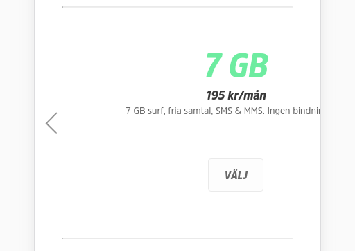
.sub-slider {
    width: 100%;
    display: flex;
    flex-flow: column;

    .slider {
        display: flex;
        flex-flow: row;
        justify-content: center;
        align-content: center;
        align-items: center;
        min-width:500px;

        .sub-box {
            text-align: center;
            padding-top: 45px;
            cursor:pointer;

            .title {
                color: #6deca0;
                font-family: "AmsiProNarw", sans-serif;
                font-size: 48px;
                font-style: italic;
                font-weight: 800;
            }
            .price {
                color: #393939;
                font-family: "AmsiProNarw", sans-serif;
                font-size: 18px;
                font-style: italic;
                font-weight: 800;
            }
            .sub-slider-btn {
                margin: 60px 20px;
                border-color: #eaeaea!important;
                background-color: #fdfdfd!important;
                color: #686868!important;
            }
        }

        .sub-box:hover {
            transition: border .2s;
            border-bottom: 14px solid #6deca0;
            .sub-slider-btn{
                border-color: #6deca0!important;
                background-color: rgba(108,235,159,.2)!important;
                color: #393939!important;
            }
        }
    }

    .sub-slider-confirmation-btn-wrp {
        align-self: center;
        display: none;
        .sub-slider-confirmation-btn {
            cursor:pointer;
            $margin: 20px;
            $height: 45px;
            height: $height;
            width: 80px;
            border: 1px solid #ccc;
            border-radius: 8px;
            margin: $margin $margin $margin $margin;
            text-align: center;
            line-height: $height;
            font-weight: 800;
        }
    }

}
This is how it is loaded, even though I have specified
slidesToShow: 3.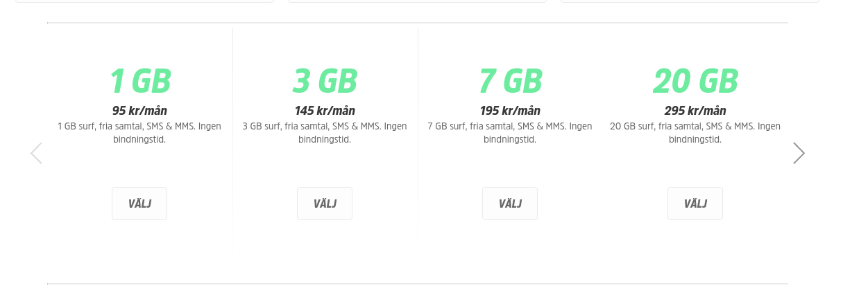
Then when I change to resposive it looks like this:
I am not sure how to fix this. I have read through these, with no fix:
Slick slider wrong width on initialization
Slick carousel loads the wrong width on initialization
https://github.com/kenwheeler/slick/issues/790
https://github.com/kenwheeler/slick/issues/1180
https://github.com/kenwheeler/slick/issues/2167
edit:
I made a fiddle https://jsfiddle.net/simeydotme/fmo50w7n/
It seems to work in the fiddle, but not on my site. Maybe I inherit some bad css? But I've been trying to debug this for 5h now. And I cant find any solution..
-
CBroe over 6 years“My css: ...” - slick comes with its own styesheet that applies the basic styling needed for it to work. Now when I see you overwriting properties for basic classes the slider uses, then I would first of all question if you have not messed this up yourself by adding those.
-
-
drupalfan over 5 yearsThank you very much, your answer helped me (problems with slick slider in Internet Explorer)!
-
 Felipe Bejarano over 4 yearsThanks!! It resolved my issue. I'm working with angular 8 and bootstrap 4.
 -
 Yannic Hamann over 4 yearsFor
bulmayou can use<div class="column is-12"> -
Yannic Hamann over 4 yearsA wrapper element with
display: flexcould also cause the problem. -
 pinksharpii over 4 yearsI also had the same issue. Inherited a site that used display:table; and display:table-cell; Changing them to block and inline-block solved the issue.
 -
Ryan Burney over 4 yearsI noticed that a wrapper with
display: gridcan also create this trouble in Safari. In my case, changinggrid-template-columns: 1fr 1frtogrid-template-columns: 50% 50%fixed the problem. It looks like Safari needs a more specific width. -
Egli Becerra about 4 yearsYou freaking legend!!! bang on the spot! Someone please give this man a raise a beer something!!!
-
 Cobertos over 3 yearsSame, seems like slick just doesn't like being inside of a flex container without a specific width and will grow to infinity. Setting a width: 100% on the top level
.containerfixed it. Thank you. -
decoder over 2 years.slick-track { max-width: 100%; }