Use text as horizontal labels in Excel scatter plot
You need a helper series. Consider the following screenshot:
The blue dots are plotted from the data in the table on the left. The orange dots are plotted from the helper table. Each orange dot then has a data label assigned. Edit each data label individually, type a = character and click the cell that has the corresponding text.
This process can be automated with the free XY Chart Labeler add-in. Excel 2013 and newer has the option to include "Value from cells" in the data label dialog.
Format the data labels to your preferences and hide the original x axis labels.
Jamgreen
Updated on December 02, 2022Comments
-
 Jamgreen 6 months
I am trying to make a scatter plot in Excel with text as horizontal axis labels.
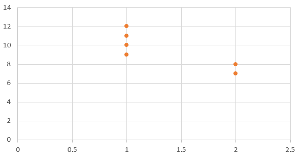
I have the data
and I want a chart like this
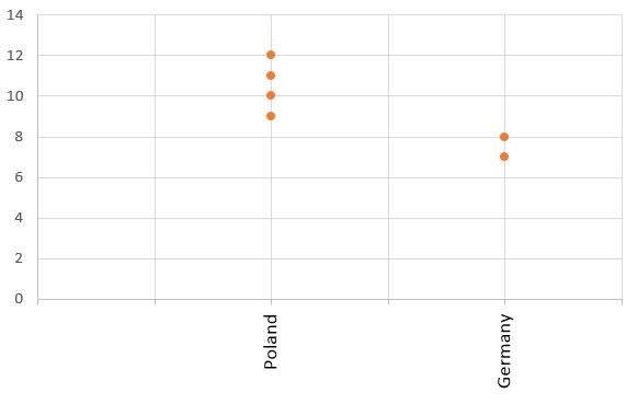
The way I produced this chart was to have a scatter plot with numeric X values and numeric Y values, so instead of Poland I have X=1 and Y=10, Y=11, Y=12, and Y=9. For Germany I chose X=2 and Y=8 and Y=7. I just added some text boxes with the names to hide the numeric X values.
But I want this to be dynamic, so I tried to set the X value labels here:
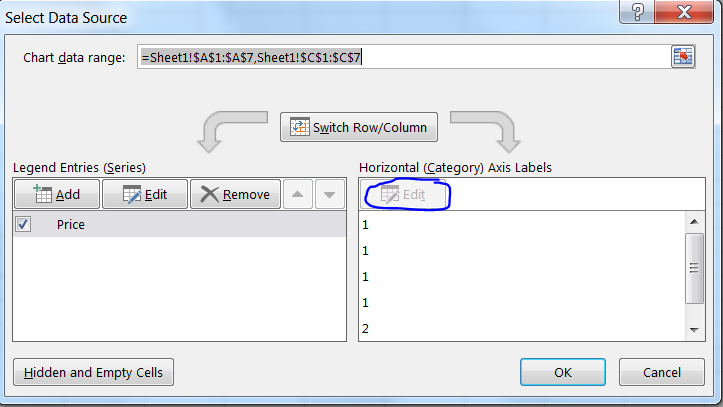
but I am not able to change the horizontal values.
How can I solve this problem?
-
 Tom Sharpe almost 6 yearsIf you only have two or three countries to display, you can use x-values of (say) -1,0 and +1 and a custom format of (say) "Germany";"Poland";"Other" for the x-axis. I haven't offered this as an answer because I don't know a way of extending it to more than 3 x-values. If it is of interest, I can give more details.
 -
Jamgreen almost 6 yearsUnfortunately, I need it for a lot of countries, so I had hoped for a solution where I can add a range of country names to be used at certain X values
-
Tom Sharpe almost 6 yearsI believe you can use custom formatting on the data and then choose 'link to data' for the axis. Will try and work out something more general.
-
Tom Sharpe almost 6 yearsI don't think it's going to work - you can link to manual formats (at least in my version of Excel 2010) but not to conditional formats.
-