Using cm/mm on the CSS of a web app that replicates paper interaction is a good practice?
W3C has a great post on the subject of CSS units. In particular:
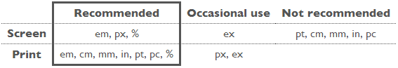
cm: Not recommended for screen / recommended for print
The so-called absolute units (cm, mm, in, pt and pc) mean the same in CSS as everywhere else. A length expressed in any of these will appear as exactly that size (within the precision of the hardware and software). They are not recommended for use on screen, because screen sizes vary so much. A big screen may be 60cm (24in), a small, portable screen is maybe only 8cm. And you don't look at them from the same distance.
The only place where you could use pt (or cm or in) for setting a font size is in style sheets for print, if you need to be sure the printed font is exactly a certain size. But even there using the default font size is usually better.
Rui Carneiro
Software Engineer, computer games enthusiast and geek.
Updated on May 01, 2020Comments
-
Rui Carneiro about 4 years
I am building a web application that interact with documents for later printing. In some points is similar to Google Docs. I am considering using cm/mm on the CSS of my documents pages because it will help me on the document generation. Example:
// A4 size
.page {
   width: 210mm;
   height: 297mm;
   margin: 2cm 5cm;
}
<div class="page"> ... </div>What are the main issues of following this approach?