Vertical align div inside row bootstrap
Solution 1
Just try this and see snippet or Bootply Demo
You have given the class like this class="" insted of className=""
/* CSS used here will be applied after bootstrap.css */
html, body{
  height: 100%;
}

 h1, h2, h3, p{
  margin: 0px;
 }

.container{
  width:90%;
}

.top5 {margin-top: 5%;}
.top7 {margin-top: 7%;}
.top10{margin-top: 10%;}
.top15{margin-top: 15%;}
.top17{margin-top: 17%;}
.top30{margin-top: 30%;}

.vertical-center {
  height:100%;
  width:100%;

  text-align: center;  /* align the inline(-block) elements horizontally */
}

.vertical-center:before {    /* create a full-height inline block pseudo=element */
  content: ' ';
  display: inline-block;
  vertical-align: middle;  /* vertical alignment of the inline element */
  height: 100%;
}

.vertical-center > .container {
  max-width: 100%;
  display: inline-block;
  vertical-align: middle;  /* vertical alignment of the inline element */
  font: 16px/1 "Helvetica Neue", Helvetica, Arial, sans-serif; /* <-- reset the font property */
}

@media (max-width: 768px) {
  .vertical-center:before {
    display: none;
  }
}

.vote-button{
  border: solid 1px black;
  padding: 10px 0px;
}

.vacancy-summary{
  border: 1px solid black;
  padding: 25px 0px;
}
.vertical-center .row {
  align-items: center;
  display: flex;
}
<div class="vertical-center">
<div class="container text-center">
<div class="row">
<div class="col-xs-3 col-sm-3 col-md-3 col-lg-3 vote-button">
<p>Left button</p>
</div>
<div class="col-xs-6 col-sm-6 col-md-6 col-lg-6 vacancy-summary">
<h2>Main page</h2>
</div>
<div class="col-xs-3 col-sm-3 col-md-3 col-lg-3 vote-button">
<p>Right button</p>
</div>
</div>
</div>
</div> Solution 2
First instead of className you should use class. Second there is no way to do this with bootstrap 3 (maybe bootstrap 4) so you can add some custom css or Flexbox in this case to get that vertical-align DEMO
.row > div {
  border: 1px solid black;
}
.vertical-center .row {
  display: flex;
  align-items: center;
}
p {
  margin: 0;
}
If you want to use sm break-point or some other you can also use media queries DEMO
JavascriptDeveloper
Updated on June 04, 2022Comments
-
JavascriptDeveloper almost 2 years
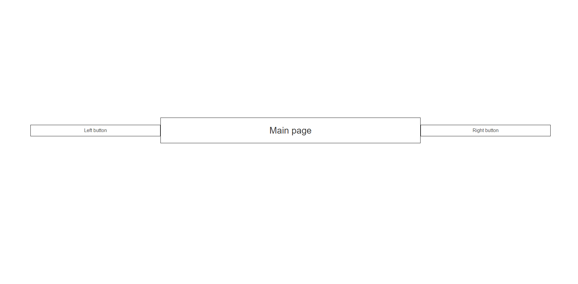
I want to reproduce a "tinder-like" view so that the 2 like/dislike buttons are vertically centered inside the row. I have vertically centered the row itself already:
Figure 1 - how i have it now:

Figure 2 - how i want it:
HTML:
<div className="vertical-center">
      <div className="container text-center">
        <div className="row">
          <div className="col-xs-3 col-sm-3 col-md-3 col-lg-3 vote-button">
            <p>Left button</p>
          </div>
          <div className="col-xs-6 col-sm-6 col-md-6 col-lg-6 vacancy-summary">
            <h2>Main page</h2>
          </div>
          <div className="col-xs-3 col-sm-3 col-md-3 col-lg-3 vote-button">
            <p>Right button</p>
          </div>
        </div>
      </div>
    </div>
CSS:
html, body{
  height: 100%;
}

 h1, h2, h3, p{
  margin: 0px;
 }

.container{
  width:90%;
}

.top5 {margin-top: 5%;}
.top7 {margin-top: 7%;}
.top10{margin-top: 10%;}
.top15{margin-top: 15%;}
.top17{margin-top: 17%;}
.top30{margin-top: 30%;}

.vertical-center {
  height:100%;
  width:100%;

  text-align: center;  /* align the inline(-block) elements horizontally */
}

.vertical-center:before {    /* create a full-height inline block pseudo=element */
  content: ' ';
  display: inline-block;
  vertical-align: middle;  /* vertical alignment of the inline element */
  height: 100%;
}

.vertical-center > .container {
  max-width: 100%;
  display: inline-block;
  vertical-align: middle;  /* vertical alignment of the inline element */
  font: 16px/1 "Helvetica Neue", Helvetica, Arial, sans-serif; /* <-- reset the font property */
}

@media (max-width: 768px) {
  .vertical-center:before {
    display: none;
  }
}

.vote-button{
  border: solid 1px black;
  padding: 10px 0px;
}

.vacancy-summary{
  border: 1px solid black;
  padding: 25px 0px;
}
I tried a lot of things but it messed up the other vertical alignment, so to be very clear:
2 vertical alignments here:
- The whole row needs to be vertically centered (like it is now and it works)
- Inside the row, all columns needs to be aligned aswell
Is it something simple I miss or is this to much outside the scope for bootstrap and if so, how do i make it full custom then?
PS: I'm working with React for this, but i don't think this cause any problems
---------EDIT----------
FYI
I have to use className instead of class in my html because i'm using this in a react class (inside the render function).This because "class" is a reserved word in react.