What are the device-width css viewport sizes of the iPhone6 and iPhone 6 Plus
Solution 1
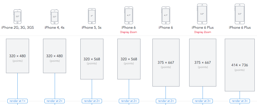
(css) device-width of iPhone 6 is 375px, of iPhone 6 Plus is 414px. Note that iPhone 6 Plus report window.devicePixelRatio = 3 (while not truly at 3 DPR)
Update 1: just to clarify, I believe this is NOT a prediction, but actually tested. See more detailed and reputable reference. If in doubt, you can wait for device to be out.
Update 2: for users with Display Zoom enabled on iPhone 6, css viewport in Mobile Safari fallback to 320px (like iPhone 5); for iPhone 6 Plus, it fallback to 375px (like iPhone 6).
Solution 2
Below is the ios Device Sizes with detailed information
Solution 3
According to CSSpixels
iPhone 6: 1334x750, viewport 667x375
iPhone 6+: 2208x1242 *, viewport 736x414 *
*Virtual resolution is subsampled to fit 1920×1080 screen.
hexalys
"Please don't thank me in advance. Thanking in advance implies you are not interested in any further discussion on the matter, leaving me no choice but to reciprocate." Twitter: http://twitter.com/hexalys
Updated on October 02, 2020Comments
-
hexalys over 3 years
The iPhone 6 and iPhone 6 Plus were just announced. But as usual, phone specs never give the meta viewport
device-widthsizes in CSS Pixels or DPR atwidth=device-width,initial-scale=1.Predictions have been made, speculating on 375/414px viewport width, but that still remains unclear...
NB: Please don't speculate or post answers with the known overall device resolution or specs, it's not what I am looking for. I want the default responsive portrait and landscape viewport-width in pixels.