Why is my table cell width wrong in Chrome?
49,980
Two things you should do:
- On the table element, use
table-layout: fixed; - Insert columns and give them a width
- (You could also assign width to table headers/cells of the first row)
Like this:
<table border="1" style="table-layout: fixed; width: 100%;">
    <colgroup>
        <col style="width: 205px;">
        <col style="width: auto;">
          <!-- Use "width: auto;" to apply the remaining (unused) space -->
        <col style="width: 5px">
    </colgroup>

    <tr>
        <td>1</td>
        <td>2</td>
        <td>3</td>
    </tr>

    <!-- Etc. -->
Author by
Urbycoz
Updated on December 17, 2020Comments
-
Urbycoz over 3 years
I've got a table with two rows. The first row just has three cells. The second row has two cells, with the first cell containing another table that needs to fill the whole cell.
<table border="1" style="border-collapse:collapse;">
    <tr>
        <td style="WIDTH: 205px;">1</td> <!--This width doesn't apply in Chrome-->
        <td style="width:100%;">2</td>
        <td style="WIDTH: 5px;">3</td>
    </tr>

    <tr>
        <td colspan="2">

                <TABLE width="100%" border="1" style="border-collapse:collapse;table-layout: fixed;">
                    <TR>
                        <TD style="width:130px;">
                            A</TD>
                        <TD style="width:90px;">
                            B</TD>
                        <TD style="width:230px;">
                           C</TD>
                    </TR>

                </TABLE>
        </td>
        <td>
            D
        </td>
    </tr>
</table>
Simple enough, really....or so I thought.
It appears as I would expect in IE. But Chrome seems to not apply the width of the first cell correctly. It seems to be affected by the table in the cell below.
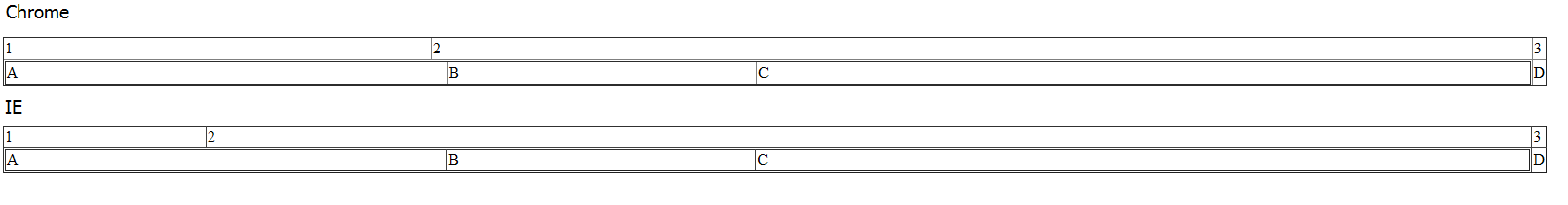
Why is this happening, and how can I get around this?