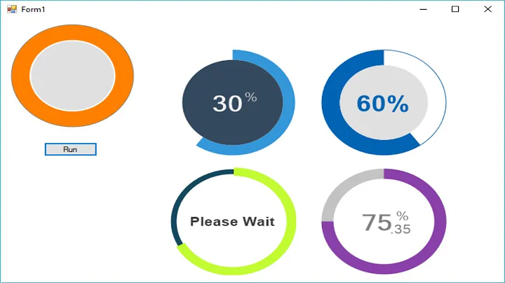
WPF circle progress bar
Solution 1
You probably missed x:Name="userControl" in the UserControl definition:
<UserControl x:Name="userControl" x:Class="DesignInControl.CircularProgressBar"
             xmlns="http://schemas.microsoft.com/winfx/2006/xaml/presentation"
             xmlns:x="http://schemas.microsoft.com/winfx/2006/xaml"
             xmlns:mc="http://schemas.openxmlformats.org/markup-compatibility/2006"
             xmlns:d="http://schemas.microsoft.com/expression/blend/2008">
    <Grid>
        <Path x:Name="pathRoot" Stroke="{Binding SegmentColor, ElementName=userControl}" StrokeThickness="{Binding StrokeThickness, ElementName=userControl}" HorizontalAlignment="Left" VerticalAlignment="Top">
            <Path.Data>
             ...
Solution 2
This demonstrates how to animate the circle.
When AnimateProgressCircle is true, the "busy" circle will be rotating, else it will be invisible.
<!-- "I'm Busy" Animation circle. -->
<StackPanel Height="20" Width="20">
    <Viewbox>
        <!-- All this does is display the circle. -->
        <local:CircularProgressBar HorizontalAlignment="Center" VerticalAlignment="Center"
                                   Percentage="0" SegmentColor="#726873" StrokeThickness="10">
            <!-- All this does is continuously animate circle angle from 0 - 100% in response to "IfAnimateProgressCircle". -->
            <local:CircularProgressBar.Style>
                <Style TargetType="local:CircularProgressBar">
                    <Style.Triggers>
                        <DataTrigger Binding="{Binding IfAnimateProgressCircle}" Value="True">
                            <DataTrigger.EnterActions>
                                <BeginStoryboard>
                                    <Storyboard>
                                        <DoubleAnimation
                                                Storyboard.TargetProperty="Percentage"
                                                From="0"
                                                To="100"
                                                Duration="0:0:1"
                                                AutoReverse="True"
                                                RepeatBehavior = "Forever"
                                                />
                                    </Storyboard>
                                </BeginStoryboard>
                            </DataTrigger.EnterActions>
                            <DataTrigger.ExitActions>
                                <BeginStoryboard>
                                    <Storyboard>
                                        <DoubleAnimation Storyboard.TargetProperty="Percentage" To="0.0" Duration="0:0:0" />
                                    </Storyboard>
                                </BeginStoryboard>
                            </DataTrigger.ExitActions>
                        </DataTrigger>
                    </Style.Triggers>
                </Style>
            </local:CircularProgressBar.Style>
        </local:CircularProgressBar>
    </Viewbox>
</StackPanel>
Advantages
- As it's wrapped in a
<Viewbox>, it will always be perfectly sized to the parent container. - Unlike other simplistic solutions, it does not consume resources when it is not in use because the animation is stopped.
Testing
Tested on:
WPF-
.NET 4.5+.NET 4.6.1 Win7 x64Visual Studio 2015 + Update 2
To test, set DataContext="{Binding RelativeSource={RelativeSource Self}}" in the <Window> tag, then use this code behind.
You should see the circle pause for 2 seconds, then animate for 4 seconds, then stop.
public partial class MainWindow : Window, INotifyPropertyChanged
{
    private bool _ifAnimateProgressCircle;
    public MainWindow()
    {
        InitializeComponent();
        Task.Run(
            async () =>
            {
                // Animates circle for 4 seconds.
                IfAnimateProgressCircle = false;
                await Task.Delay(TimeSpan.FromMilliseconds(2000));
                IfAnimateProgressCircle = true;
                await Task.Delay(TimeSpan.FromMilliseconds(6000));
                IfAnimateProgressCircle = false;
            });
    }
    public bool IfAnimateProgressCircle
    {
        get { return _ifAnimateProgressCircle; }
        set { _ifAnimateProgressCircle = value; OnPropertyChanged(); }
    }
    #region INotifyPropertyChanged
    public event PropertyChangedEventHandler PropertyChanged;
    [NotifyPropertyChangedInvocator]
    protected virtual void OnPropertyChanged([CallerMemberName] string propertyName = null)
    {
        PropertyChanged?.Invoke(this, new PropertyChangedEventArgs(propertyName));
    }
    #endregion
}
Links that helped with this solution
- WPF. How to stop data trigger animation through binding?
- Animate UserControl in WPF?
- Binding objects defined in code-behind
- Triggers collection members must be of type EventTrigger
Related videos on Youtube
 04 : 19
 46 : 10
 05 : 48
 18 : 56
 14 : 43
 11 : 10
Verint Verint
Updated on July 09, 2022Comments
-
Verint Verint 11 months
I want to replace the regular
ProgressBarwith circle one and after shot search here in the forum i found what i want.CircularProgressBar.XAML
<Grid>
    <Path x:Name="pathRoot" Stroke="{Binding SegmentColor, ElementName=userControl}"
          StrokeThickness="{Binding StrokeThickness, ElementName=userControl}" HorizontalAlignment="Left" VerticalAlignment="Top">
        <Path.Data>
            <PathGeometry>
                <PathGeometry.Figures>
                    <PathFigureCollection>
                        <PathFigure x:Name="pathFigure">
                            <PathFigure.Segments>
                                <PathSegmentCollection>
                                    <ArcSegment x:Name="arcSegment" SweepDirection="Clockwise" />
                                </PathSegmentCollection>
                            </PathFigure.Segments>
                        </PathFigure>
                    </PathFigureCollection>
                </PathGeometry.Figures>
            </PathGeometry>
        </Path.Data>
    </Path>
</Grid>
CircularProgressBar.cs:
public partial class CircularProgressBar : UserControl
{
    public CircularProgressBar()
    {
        InitializeComponent();
        Angle = (Percentage * 360) / 100;
        RenderArc();
    }
    public int Radius
    {
        get { return (int)GetValue(RadiusProperty); }
        set { SetValue(RadiusProperty, value); }
    }
    public Brush SegmentColor
    {
        get { return (Brush)GetValue(SegmentColorProperty); }
        set { SetValue(SegmentColorProperty, value); }
    }
    public int StrokeThickness
    {
        get { return (int)GetValue(StrokeThicknessProperty); }
        set { SetValue(StrokeThicknessProperty, value); }
    }
    public double Percentage
    {
        get { return (double)GetValue(PercentageProperty); }
        set { SetValue(PercentageProperty, value); }
    }
    public double Angle
    {
        get { return (double)GetValue(AngleProperty); }
        set { SetValue(AngleProperty, value); }
    }
    // Using a DependencyProperty as the backing store for Percentage.  This enables animation, styling, binding, etc...
    public static readonly DependencyProperty PercentageProperty =
        DependencyProperty.Register("Percentage", typeof(double), typeof(CircularProgressBar), new PropertyMetadata(65d, new PropertyChangedCallback(OnPercentageChanged)));
    // Using a DependencyProperty as the backing store for StrokeThickness.  This enables animation, styling, binding, etc...
    public static readonly DependencyProperty StrokeThicknessProperty =
        DependencyProperty.Register("StrokeThickness", typeof(int), typeof(CircularProgressBar), new PropertyMetadata(5, new PropertyChangedCallback(OnThicknessChanged)));
    // Using a DependencyProperty as the backing store for SegmentColor.  This enables animation, styling, binding, etc...
    public static readonly DependencyProperty SegmentColorProperty =
        DependencyProperty.Register("SegmentColor", typeof(Brush), typeof(CircularProgressBar), new PropertyMetadata(new SolidColorBrush(Colors.Red), new PropertyChangedCallback(OnColorChanged)));
    // Using a DependencyProperty as the backing store for Radius.  This enables animation, styling, binding, etc...
    public static readonly DependencyProperty RadiusProperty =
        DependencyProperty.Register("Radius", typeof(int), typeof(CircularProgressBar), new PropertyMetadata(25, new PropertyChangedCallback(OnPropertyChanged)));
    // Using a DependencyProperty as the backing store for Angle.  This enables animation, styling, binding, etc...
    public static readonly DependencyProperty AngleProperty =
        DependencyProperty.Register("Angle", typeof(double), typeof(CircularProgressBar), new PropertyMetadata(120d, new PropertyChangedCallback(OnPropertyChanged)));
    private static void OnColorChanged(DependencyObject sender, DependencyPropertyChangedEventArgs args)
    {
        CircularProgressBar circle = sender as CircularProgressBar;
        circle.set_Color((SolidColorBrush)args.NewValue);
    }
    private static void OnThicknessChanged(DependencyObject sender, DependencyPropertyChangedEventArgs args)
    {
        CircularProgressBar circle = sender as CircularProgressBar;
        circle.set_tick((int)args.NewValue);
    }
    private static void OnPercentageChanged(DependencyObject sender, DependencyPropertyChangedEventArgs args)
    {
        CircularProgressBar circle = sender as CircularProgressBar;
        if (circle.Percentage > 100) circle.Percentage = 100;
        circle.Angle = (circle.Percentage * 360) / 100;
    }
    private static void OnPropertyChanged(DependencyObject sender, DependencyPropertyChangedEventArgs args)
    {
        CircularProgressBar circle = sender as CircularProgressBar;
        circle.RenderArc();
    }
    public void set_tick(int n)
    {
        pathRoot.StrokeThickness = n;
    }
    public void set_Color(SolidColorBrush n)
    {
        pathRoot.Stroke = n;
    }
    public void RenderArc()
    {
        Point startPoint =  new Point(Radius, 0);
        Point endPoint = ComputeCartesianCoordinate(Angle, Radius);
        endPoint.X += Radius;
        endPoint.Y += Radius;
        pathRoot.Width = Radius * 2 + StrokeThickness;
        pathRoot.Height = Radius * 2 + StrokeThickness;
        pathRoot.Margin = new Thickness(StrokeThickness, StrokeThickness, 0, 0);
        bool largeArc = Angle > 180.0;
        Size outerArcSize = new Size(Radius, Radius);
        pathFigure.StartPoint = startPoint;
        if (startPoint.X == Math.Round(endPoint.X) && startPoint.Y == Math.Round(endPoint.Y))
            endPoint.X -= 0.01;
        arcSegment.Point = endPoint;
        arcSegment.Size = outerArcSize;
        arcSegment.IsLargeArc = largeArc;
    }
    private Point ComputeCartesianCoordinate(double angle, double radius)
    {
        // convert to radians
        double angleRad = (Math.PI / 180.0) * (angle - 90);
        double x = radius * Math.Cos(angleRad);
        double y = radius * Math.Sin(angleRad);
        return new Point(x, y);
    }
}
MainWindow.xaml:
    <Grid.RowDefinitions>
        <RowDefinition Height="*"/>
        <RowDefinition Height="Auto"/>
    </Grid.RowDefinitions>
    <StackPanel Orientation="Horizontal" HorizontalAlignment="Center" VerticalAlignment="Center">
        <Grid HorizontalAlignment="Center" VerticalAlignment="Center">
            <DesignInControl:CircularProgressBar HorizontalAlignment="Center" VerticalAlignment="Center"
              SegmentColor="#FF878889" StrokeThickness="25" Percentage="100" />
            <DesignInControl:CircularProgressBar HorizontalAlignment="Center" VerticalAlignment="Center"
              Percentage="{Binding Value, ElementName=slider}" SegmentColor="#026873" StrokeThickness="25" />
        </Grid>
        <Grid HorizontalAlignment="Center" VerticalAlignment="Center"/>
        <Grid HorizontalAlignment="Center" VerticalAlignment="Center"/>
        <Grid HorizontalAlignment="Center" VerticalAlignment="Center"/>
    </StackPanel>
    <Slider x:Name="slider" Grid.Row="1" Maximum="100" Value="60" />
</Grid>
And the result:
http://s21.postimg.org/xymj8k4pz/image.png
So after copy paste the same code into my solution and running all i can see is only the
Sliderwithou theCircle Bar, this is my code:<StackPanel Orientation="Horizontal" HorizontalAlignment="Center" VerticalAlignment="Center" Margin="530,303,114,303"> <Grid HorizontalAlignment="Center" VerticalAlignment="Center"> <DesignInControl:CircularProgressBar HorizontalAlignment="Center" VerticalAlignment="Center" SegmentColor="#FF878889" StrokeThickness="8" Percentage="100" /> <DesignInControl:CircularProgressBar HorizontalAlignment="Center" VerticalAlignment="Center" Percentage="{Binding Value, ElementName=slider}" SegmentColor="#026873" StrokeThickness="8" /> </Grid> </StackPanel> <Slider x:Name="slider" Maximum="100" Value="20" Width="200" Margin="597,185,227,495" />Am i doing something wrong ?
-
 René over 7 yearsPro tip: If you want the user control to scale with its parent container, put the Grid and Path inside a Viewbox.
-
-
 user230910 over 7 yearsconfirmed, set the x:Name in the UserControl