WPF TreeView: How to style selected items with rounded corners like in Explorer
Solution 1
Adding to @Sheridan's answer
This isn't a 100% accurate but should get you pretty close (it's using the colors from GridView which is pretty close to Windows Explorer)
<TreeView ...>
    <TreeView.Resources>
        <LinearGradientBrush x:Key="{x:Static SystemColors.HighlightBrushKey}" EndPoint="0,1" StartPoint="0,0">
            <GradientStop Color="#FFD9F4FF" Offset="0"/>
            <GradientStop Color="#FF9BDDFB" Offset="1"/>
        </LinearGradientBrush>
        <LinearGradientBrush x:Key="{x:Static SystemColors.ControlBrushKey}" EndPoint="0,1" StartPoint="0,0">
            <GradientStop Color="#FFEEEDED" Offset="0"/>
            <GradientStop Color="#FFDDDDDD" Offset="1"/>
        </LinearGradientBrush>
        <SolidColorBrush x:Key="{x:Static SystemColors.HighlightTextBrushKey}" Color="Black" />
        <SolidColorBrush x:Key="{x:Static SystemColors.ControlTextBrushKey}" Color="Black" />
    </TreeView.Resources>
    <TreeView.ItemContainerStyle>
        <Style TargetType="{x:Type TreeViewItem}">
            <Setter Property="BorderThickness" Value="1.5"/>
            <Style.Triggers>
                <Trigger Property="IsSelected" Value="True">
                    <Setter Property="BorderBrush" Value="#adc6e5"/>
                </Trigger>
                <MultiTrigger>
                    <MultiTrigger.Conditions>
                        <Condition Property="IsSelected" Value="True"/>
                        <Condition Property="IsSelectionActive" Value="False"/>
                    </MultiTrigger.Conditions>
                    <Setter Property="BorderBrush" Value="LightGray"/>
                </MultiTrigger>
            </Style.Triggers>
            <Style.Resources>
                <Style TargetType="Border">
                    <Setter Property="CornerRadius" Value="2"/>
                </Style>
            </Style.Resources>
        </Style>
    </TreeView.ItemContainerStyle>
</TreeView>
Solution 2
Add this into your TreeView.ContainerStyle to remove the default blue background.
<Style.Resources>
    <SolidColorBrush x:Key="{x:Static SystemColors.HighlightBrushKey}" Color="Transparent" />
    <SolidColorBrush x:Key="{x:Static SystemColors.ControlBrushKey}" Color="Transparent" />
    <SolidColorBrush x:Key="{x:Static SystemColors.HighlightTextBrushKey}" Color="Black" />
    <SolidColorBrush x:Key="{x:Static SystemColors.ControlTextBrushKey}" Color="Black" />
</Style.Resources>
You can replace the Black with whatever colour you want your item text and selected item text to be.
To have a grey background when not focused, you could set up a 'non focused' Style with a grey backgorund and use EventTriggers on the TreeViewItem.GotFocus and LostFocus events to switch between the Styles.
EDIT>>>
If you want to be flash, you can use animations to change between the background colours by adding triggers to your ItemBorder Border directly in your HierarchicalDataTemplate like so:
<Border.Triggers>
    <EventTrigger RoutedEvent="Border.GotFocus">
        <EventTrigger.Actions>
            <BeginStoryboard>
                <Storyboard>
                    <ColorAnimation Storyboard.TargetProperty="(Border.Background).(SolidColorBrush.Color)" To="YourColour" Duration="0:0:0.2" />
                </Storyboard>
            </BeginStoryboard>
        </EventTrigger.Actions>
    </EventTrigger>
    <EventTrigger RoutedEvent="Border.LostFocus">
        <EventTrigger.Actions>
            <BeginStoryboard>
                <Storyboard>
                    <ColorAnimation Storyboard.TargetProperty="(Border.Background).(SolidColorBrush.Color)" To="LightGray" Duration="0:0:0.2" />
                </Storyboard>
            </BeginStoryboard>
        </EventTrigger.Actions>
    </EventTrigger>
</Border.Triggers>
Note that this will only work if the ColorAnimation has a From colour. As this code stands, the runtime will look for a SolidColorBrush set on the Border.Background property, so you must set one. You could set the ColorAnimation.From property directly instead.
Solution 3
Windows 10 TreeView (and ListView) Style
I was originally looking for a way to apply the Windows 10 color scheme to a TreeViewItem, including
- IsMouseOver on current item only
- Windows 10 colors which WPF already applies them to ListBox (not Windows Explorer)
If any of you are looking for exactly this, please feel free to take the code below. I used Helge Klein's solution for the IsMouseOver issue and applied the Windows 10 colors to the XAML. Therefore I propose this as an addition to the accepted answer.
Also, see below for a word on ListView and ComboBox as well.
Screenshot
App.xaml
<Style TargetType="{x:Type TreeView}">
    <Style.Resources>
        <SolidColorBrush x:Key="{x:Static SystemColors.HighlightBrushKey}" Color="#CBE8F6" />
        <SolidColorBrush x:Key="{x:Static SystemColors.InactiveSelectionHighlightBrushKey}" Color="#F6F6F6" />
        <SolidColorBrush x:Key="{x:Static SystemColors.HighlightTextBrushKey}" Color="Black" />
        <SolidColorBrush x:Key="{x:Static SystemColors.ControlTextBrushKey}" Color="Black" />
    </Style.Resources>
</Style>
<Style TargetType="{x:Type TreeViewItem}">
    <Setter Property="BorderThickness" Value="1" />
    <Style.Triggers>
        <Trigger Property="IsSelected" Value="True">
            <Setter Property="BorderBrush" Value="#26A0DA" />
        </Trigger>
        <MultiTrigger>
            <MultiTrigger.Conditions>
                <Condition Property="local:TreeViewItemHelper.IsMouseDirectlyOverItem" Value="True" />
                <Condition Property="IsSelected" Value="False" />
            </MultiTrigger.Conditions>
            <Setter Property="Background" Value="#E5F3FB" />
            <Setter Property="BorderBrush" Value="#70C0E7" />
        </MultiTrigger>
        <MultiTrigger>
            <MultiTrigger.Conditions>
                <Condition Property="IsSelected" Value="True" />
                <Condition Property="IsSelectionActive" Value="False" />
            </MultiTrigger.Conditions>
            <Setter Property="BorderBrush" Value="#DADADA" />
        </MultiTrigger>
    </Style.Triggers>
</Style>
TreeViewItemHelper (by Helge Klein, minor changes / simplification)
public static class TreeViewItemHelper
{
    private static TreeViewItem CurrentItem;
    private static readonly RoutedEvent UpdateOverItemEvent = EventManager.RegisterRoutedEvent("UpdateOverItem", RoutingStrategy.Bubble, typeof(RoutedEventHandler), typeof(TreeViewItemHelper));
    private static readonly DependencyPropertyKey IsMouseDirectlyOverItemKey = DependencyProperty.RegisterAttachedReadOnly("IsMouseDirectlyOverItem", typeof(bool), typeof(TreeViewItemHelper), new FrameworkPropertyMetadata(null, new CoerceValueCallback(CalculateIsMouseDirectlyOverItem)));
    public static readonly DependencyProperty IsMouseDirectlyOverItemProperty = IsMouseDirectlyOverItemKey.DependencyProperty;

    static TreeViewItemHelper()
    {
        EventManager.RegisterClassHandler(typeof(TreeViewItem), UIElement.MouseEnterEvent, new MouseEventHandler(OnMouseTransition), true);
        EventManager.RegisterClassHandler(typeof(TreeViewItem), UIElement.MouseLeaveEvent, new MouseEventHandler(OnMouseTransition), true);
        EventManager.RegisterClassHandler(typeof(TreeViewItem), UpdateOverItemEvent, new RoutedEventHandler(OnUpdateOverItem));
    }
    public static bool GetIsMouseDirectlyOverItem(DependencyObject obj)
    {
        return (bool)obj.GetValue(IsMouseDirectlyOverItemProperty);
    }
    private static object CalculateIsMouseDirectlyOverItem(DependencyObject item, object value)
    {
        return item == CurrentItem;
    }
    private static void OnUpdateOverItem(object sender, RoutedEventArgs e)
    {
        CurrentItem = sender as TreeViewItem;
        CurrentItem.InvalidateProperty(IsMouseDirectlyOverItemProperty);
        e.Handled = true;
    }
    private static void OnMouseTransition(object sender, MouseEventArgs e)
    {
        lock (IsMouseDirectlyOverItemProperty)
        {
            if (CurrentItem != null)
            {
                DependencyObject oldItem = CurrentItem;
                CurrentItem = null;
                oldItem.InvalidateProperty(IsMouseDirectlyOverItemProperty);
            }

            Mouse.DirectlyOver?.RaiseEvent(new RoutedEventArgs(UpdateOverItemEvent));
        }
    }
}
ListBox/ListView and ComboBox: In Windows 7 (and 8?), this will cause the design from TreeView to ListBox/ListView and ComboBox to differ. Therefore, if you want to apply this color scheme to these control types as well, too, use this:
<Style TargetType="{x:Type ListBoxItem}">
    <Setter Property="Template">
        <Setter.Value>
            <ControlTemplate TargetType="{x:Type ListBoxItem}">
                <Border Name="Border" BorderThickness="1" Background="Transparent">
                    <ContentPresenter />
                </Border>
                <ControlTemplate.Triggers>
                    <Trigger Property="IsMouseOver" Value="True">
                        <Setter TargetName="Border" Property="Background" Value="#E5F3FB" />
                        <Setter TargetName="Border" Property="BorderBrush" Value="#70C0E7" />
                    </Trigger>
                    <Trigger Property="IsSelected" Value="True">
                        <Setter TargetName="Border" Property="Background" Value="#CBE8F6" />
                        <Setter TargetName="Border" Property="BorderBrush" Value="#26A0DA" />
                    </Trigger>
                    <MultiTrigger>
                        <MultiTrigger.Conditions>
                            <Condition Property="IsSelected" Value="True" />
                            <Condition Property="Selector.IsSelectionActive" Value="False" />
                        </MultiTrigger.Conditions>
                        <Setter TargetName="Border" Property="Background" Value="#F6F6F6" />
                        <Setter TargetName="Border" Property="BorderBrush" Value="#DADADA" />
                    </MultiTrigger>
                </ControlTemplate.Triggers>
            </ControlTemplate>
        </Setter.Value>
    </Setter>
</Style>
<Style TargetType="{x:Type ListViewItem}" BasedOn="{StaticResource {x:Type ListBoxItem}}" />
<Style TargetType="{x:Type ComboBoxItem}">
    <Setter Property="Template">
        <Setter.Value>
            <ControlTemplate TargetType="{x:Type ComboBoxItem}">
                <Border Name="Border" BorderThickness="1" Padding="1" Background="Transparent">
                    <ContentPresenter />
                </Border>
                <ControlTemplate.Triggers>
                    <Trigger Property="IsMouseOver" Value="True">
                        <Setter TargetName="Border" Property="Background" Value="#E5F3FB" />
                        <Setter TargetName="Border" Property="BorderBrush" Value="#70C0E7" />
                    </Trigger>
                    <Trigger Property="IsSelected" Value="True">
                        <Setter TargetName="Border" Property="Background" Value="#CBE8F6" />
                        <Setter TargetName="Border" Property="BorderBrush" Value="#26A0DA" />
                    </Trigger>
                </ControlTemplate.Triggers>
            </ControlTemplate>
        </Setter.Value>
    </Setter>
</Style>
Helge Klein
Author of uberAgent for Splunk (user experience and application performance monitoring), Delprof2 (user profile deletion), SetACL and SetACL Studio (permissions management).
Updated on June 10, 2020Comments
-
Helge Klein almost 4 years
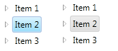
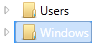
The selected item in a WPF TreeView has a dark blue background with "sharp" corners. That looks a bit dated today:
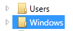
I would like to change the background to look like in Explorer of Windows 7 (with/without focus):

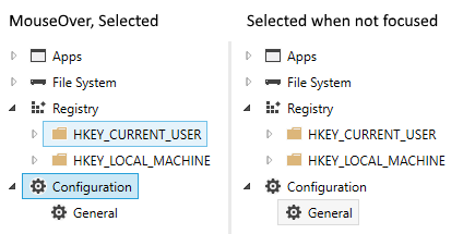
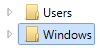
What I tried so far does not remove the original dark blue background but paints a rounded border on top of it so that you see the dark blue color at the edges and at the left side - ugly.
Interestingly, when my version does not have the focus, it looks pretty OK:
I would like to refrain from redefining the control template as shown here or here. I want to set the minimum required properties to make the selected item look like in Explorer.
Alternative: I would also be happy to have the focused selected item look like mine does now when it does not have the focus. When losing the focus, the color should change from blue to grey.
Here is my code:
<TreeView
    x:Name="TreeView"
    ItemsSource="{Binding TopLevelNodes}"
    VirtualizingStackPanel.IsVirtualizing="True"
    VirtualizingStackPanel.VirtualizationMode="Recycling">

    <TreeView.ItemContainerStyle>
        <Style TargetType="{x:Type TreeViewItem}">
            <Setter Property="IsExpanded" Value="{Binding IsExpanded, Mode=TwoWay}" />
            <Setter Property="IsSelected" Value="{Binding IsSelected, Mode=TwoWay}" />

            <Style.Triggers>
                <Trigger Property="IsSelected" Value="True">
                    <Setter Property="BorderBrush" Value="#FF7DA2CE" />
                    <Setter Property="Background" Value="#FFCCE2FC" />
                </Trigger>
            </Style.Triggers>
        </Style>
    </TreeView.ItemContainerStyle>

    <TreeView.Resources>
        <HierarchicalDataTemplate DataType="{x:Type viewmodels:ObjectBaseViewModel}" ItemsSource="{Binding Children}">
            <Border Name="ItemBorder" CornerRadius="2" Background="{Binding Background, RelativeSource={RelativeSource AncestorType=TreeViewItem}}"
                      BorderBrush="{Binding BorderBrush, RelativeSource={RelativeSource AncestorType=TreeViewItem}}" BorderThickness="1">
                <StackPanel Orientation="Horizontal" Margin="2">
                    <Image Name="icon" Source="/ExplorerTreeView/Images/folder.png"/>
                    <TextBlock Text="{Binding Name}"/>
                </StackPanel>
            </Border>
        </HierarchicalDataTemplate>
    </TreeView.Resources>
</TreeView>
Solution
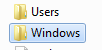
With the excellent answers of Sheridan and Meleak my TreeView now looks like this in code (a result I am very happy with and which is pretty near Explorer's style):
<TreeView
...
    <TreeView.ItemContainerStyle>
        <Style TargetType="{x:Type TreeViewItem}">
            <!-- Style for the selected item -->
            <Setter Property="BorderThickness" Value="1"/>
            <Style.Triggers>
                <!-- Selected and has focus -->
                <Trigger Property="IsSelected" Value="True">
                    <Setter Property="BorderBrush" Value="#7DA2CE"/>
                </Trigger>
                <!-- Mouse over -->
                <Trigger Property="helpers:TreeView_IsMouseDirectlyOverItem.IsMouseDirectlyOverItem" Value="True">
                    <Setter Property="Background">
                        <Setter.Value>
                            <LinearGradientBrush EndPoint="0,1" StartPoint="0,0">
                                <GradientStop Color="#FFFAFBFD" Offset="0"/>
                                <GradientStop Color="#FFEBF3FD" Offset="1"/>
                            </LinearGradientBrush>
                        </Setter.Value>
                    </Setter>
                    <Setter Property="BorderBrush" Value="#B8D6FB"/>
                </Trigger>
                <!-- Selected but does not have the focus -->
                <MultiTrigger>
                    <MultiTrigger.Conditions>
                        <Condition Property="IsSelected" Value="True"/>
                        <Condition Property="IsSelectionActive" Value="False"/>
                    </MultiTrigger.Conditions>
                    <Setter Property="BorderBrush" Value="#D9D9D9"/>
                </MultiTrigger>
            </Style.Triggers>
            <Style.Resources>
                <Style TargetType="Border">
                    <Setter Property="CornerRadius" Value="2"/>
                </Style>
            </Style.Resources>
        </Style>
    </TreeView.ItemContainerStyle>

    <TreeView.Resources>
        <HierarchicalDataTemplate DataType="{x:Type viewmodels:ObjectBaseViewModel}" ItemsSource="{Binding Children}">
            <StackPanel Orientation="Horizontal" Margin="2,1,5,2">
                <Grid Margin="0,0,3,0">
                    <Image Name="icon" Source="/ExplorerTreeView/Images/folder.png"/>
                </Grid>
                <TextBlock Text="{Binding Name}" />
            </StackPanel>
        </HierarchicalDataTemplate>

        <!-- Brushes for the selected item -->
        <LinearGradientBrush x:Key="{x:Static SystemColors.HighlightBrushKey}" EndPoint="0,1" StartPoint="0,0">
            <GradientStop Color="#FFDCEBFC" Offset="0"/>
            <GradientStop Color="#FFC1DBFC" Offset="1"/>
        </LinearGradientBrush>
        <LinearGradientBrush x:Key="{x:Static SystemColors.ControlBrushKey}" EndPoint="0,1" StartPoint="0,0">
            <GradientStop Color="#FFF8F8F8" Offset="0"/>
            <GradientStop Color="#FFE5E5E5" Offset="1"/>
        </LinearGradientBrush>
        <SolidColorBrush x:Key="{x:Static SystemColors.HighlightTextBrushKey}" Color="Black" />
        <SolidColorBrush x:Key="{x:Static SystemColors.ControlTextBrushKey}" Color="Black" />
    </TreeView.Resources>
</TreeView>