Align the form to the center in Bootstrap 4
Solution 1
You need to use the various Bootstrap 4 centering methods...
- Use
text-centerfor inline elements. - Use
justify-content-centerfor flexbox elements (ie;form-inline)
https://codeply.com/go/Am5LvvjTxC
Also, to offset the column, the col-sm-* must be contained within a .row, and the .row must be in a container...
<section id="cover">
    <div id="cover-caption">
        <div id="container" class="container">
            <div class="row">
                <div class="col-sm-10 offset-sm-1 text-center">
                    <h1 class="display-3">Welcome to Bootstrap 4</h1>
                    <div class="info-form">
                        <form action="" class="form-inline justify-content-center">
                            <div class="form-group">
                                <label class="sr-only">Name</label>
                                <input type="text" class="form-control" placeholder="Jane Doe">
                            </div>
                            <div class="form-group">
                                <label class="sr-only">Email</label>
                                <input type="text" class="form-control" placeholder="[email protected]">
                            </div>
                            <button type="submit" class="btn btn-success ">okay, go!</button>
                        </form>
                    </div>
                    <br>

                    <a href="#nav-main" class="btn btn-secondary-outline btn-sm" role="button">↓</a>
                </div>
            </div>
        </div>
    </div>
</section>
Solution 2
<div class="d-flex justify-content-center align-items-center container ">

    <div class="row ">


        <form action="">
            <div class="form-group">
                <label for="inputUserName" class="control-label">Enter UserName</label>
                <input type="email" class="form-control" id="inputUserName" aria-labelledby="emailnotification">
                <small id="emailnotification" class="form-text text-muted">Enter Valid Email Id</small>
            </div>
            <div class="form-group">
                <label for="inputPassword" class="control-label">Enter Password</label>
                <input type="password" class="form-control" id="inputPassword" aria-labelledby="passwordnotification">

            </div>
        </form>

    </div>

</div>
Solution 3
All above answers perfectly gives the solution to center the form using Bootstrap 4. However, if someone wants to use out of the box Bootstrap 4 css classes without help of any additional styles and also not wanting to use flex, we can do like this.
A sample form
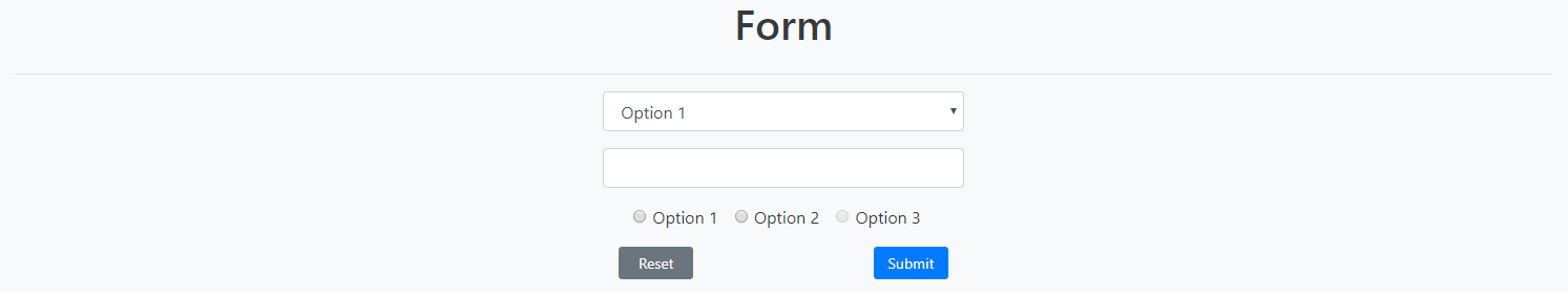
HTML
<div class="container-fluid h-100 bg-light text-dark">
  <div class="row justify-content-center align-items-center">
    <h1>Form</h1>
  </div>
  <hr/>
  <div class="row justify-content-center align-items-center h-100">
    <div class="col col-sm-6 col-md-6 col-lg-4 col-xl-3">
      <form action="">
        <div class="form-group">
          <select class="form-control">
                    <option>Option 1</option>
                    <option>Option 2</option>
                  </select>
        </div>
        <div class="form-group">
          <input type="text" class="form-control" />
        </div>
        <div class="form-group text-center">
          <div class="form-check-inline">
            <label class="form-check-label">
    <input type="radio" class="form-check-input" name="optradio">Option 1
  </label>
          </div>
          <div class="form-check-inline">
            <label class="form-check-label">
    <input type="radio" class="form-check-input" name="optradio">Option 2
  </label>
          </div>
          <div class="form-check-inline">
            <label class="form-check-label">
    <input type="radio" class="form-check-input" name="optradio" disabled>Option 3
  </label>
          </div>
        </div>
        <div class="form-group">
          <div class="container">
            <div class="row">
              <div class="col"><button class="col-6 btn btn-secondary btn-sm float-left">Reset</button></div>
              <div class="col"><button class="col-6 btn btn-primary btn-sm float-right">Submit</button></div>
            </div>
          </div>
        </div>

      </form>
    </div>
  </div>
</div>
Link to CodePen
https://codepen.io/anjanasilva/pen/WgLaGZ
I hope this helps someone. Thank you.
Related videos on Youtube
 01 : 03
 06 : 42
 01 : 24
 01 : 24
 01 : 50
eyedfox
Updated on July 09, 2022Comments
-
eyedfox almost 2 years
I am trying to align the form to the center and keep it responsive. I have tried several ways but no success. I am trying to center all the text and the form. I am using Bootstrap v4. I am not sure if that helps.

HTML:
<section id="cover"> <div id="cover-caption"> <div id="container"> <div class="col-sm-10 col-sm offset-1"> <h1 class="display-3">Welcome to Bootstrap 4</h1> <div class="info-form"> <form action="" class="form-inline"> <div class="form-group"> <label class="sr-only">Name</label> <input type="text" class="form-control" placeholder="Jane Doe"> </div> <div class="form-group"> <label class="sr-only">Email</label> <input type="text" class="form-control" placeholder="[email protected]"> </div> <button type="submit" class="btn btn-success ">okay, go!</button> </form> </div> <br> <a href="#nav-main" class="btn btn-secondary-outline btn-sm" role="button">↓</a> </div> </div> </div> </section>CSS:
html,
body{
 height: 100%;
}

#cover {
  background: #222 url('../img/stars.jpg') center center no-repeat;
  background-size: cover;
  color: white;
  height: 100%;
  text-align: center;
  display: flex;
  align-items: center;
}
#cover-caption {
  width: 100%;
}
-
 Zim almost 7 yearsThat's not a duplicate as it's relevant only to Bootstrap 3.
-
-
Artjom B. about 6 yearsWhile this code block may answer the question, it would be best if you could provide a little explanation for why it does so. Please edit your answer to include such a description.
-
Andy Weinstein over 4 yearsYes it helped me! Clearest and simplest answer from my point of view. One thing I don't understand is what align-items-center is doing here. I tried it without that and didn't see a difference. I think align-items-center has to do with vertical alignment, but I'm just getting started with this stuff.
-
 Anjana Silva over 4 yearsHi @AndyWeinstein. Glad my answer helped you.
align-items-centervertically centers the element. You are correct on that :) You can find more info through here :- developer.mozilla.org/en-US/docs/Web/CSS/align-items . Happy coding :) -
Mantej Singh about 4 yearsThanks, Finally!
-
 NikolaS almost 3 yearsThis answer does not provide
form-inlineelement styling as asked in question.