Angular 2 Material Dynamic Themes
Solution 1
As of Angular 5.1, this is how I achieved dynamic theme changes.
*Edit: This still works as of Angular 7+
Working editable example - https://stackblitz.com/edit/dynamic-material-theming
In my theme.scss file, I include a default theme(notice it isn't kept under a class name - this is so Angular will use it as the default), and then a light and dark theme.
theme.scss
@import '~@angular/material/theming';
@include mat-core();

// Typography
$custom-typography: mat-typography-config(
  $font-family: Raleway,
  $headline: mat-typography-level(24px, 48px, 400),
  $body-1: mat-typography-level(16px, 24px, 400)
);
@include angular-material-typography($custom-typography);

// Default colors
$my-app-primary: mat-palette($mat-teal, 700, 100, 800);
$my-app-accent:  mat-palette($mat-teal, 700, 100, 800);

$my-app-theme: mat-light-theme($my-app-primary, $my-app-accent);
@include angular-material-theme($my-app-theme);

// Dark theme
$dark-primary: mat-palette($mat-blue-grey);
$dark-accent:  mat-palette($mat-amber, A200, A100, A400);
$dark-warn:    mat-palette($mat-deep-orange);

$dark-theme:   mat-dark-theme($dark-primary, $dark-accent, $dark-warn);

.dark-theme {
  @include angular-material-theme($dark-theme);
}

// Light theme
$light-primary: mat-palette($mat-grey, 200, 500, 300);
$light-accent: mat-palette($mat-brown, 200);
$light-warn: mat-palette($mat-deep-orange, 200);

$light-theme: mat-light-theme($light-primary, $light-accent, $light-warn);

.light-theme {
  @include angular-material-theme($light-theme)
}
In the app.component file, I include OverlayContainer from @angular/cdk/overlay. You can find Angular's documentation for this here https://material.angular.io/guide/theming; though their implementation is a little different. Please note, I also had to include OverlayModule as an import in app.module as well.
In my app.component file, I also declared @HostBinding('class') componentCssClass; as a variable, which will be used to set the theme as a class.
app.component.ts
import {Component, HostBinding, OnInit} from '@angular/core';
import { HttpClient } from '@angular/common/http';
import { Version } from './classes/version';
import { OverlayContainer} from '@angular/cdk/overlay';

@Component({
  selector: 'app-root',
  templateUrl: './app.component.html',
  styleUrls: ['./app.component.css'],
})
export class AppComponent implements OnInit {

  constructor(private http: HttpClient, public overlayContainer: OverlayContainer) {}

  title = 'app';
  version: Version;
  @HostBinding('class') componentCssClass;

  ngOnInit() {
    this.getVersion();
  }

  onSetTheme(theme) {
    this.overlayContainer.getContainerElement().classList.add(theme);
    this.componentCssClass = theme;
  }

  getVersion() {
    this.http.get<Version>('/api/version')
      .subscribe(data => {
        this.version = data;
      });
  }

}
app.module.ts
import { BrowserModule } from '@angular/platform-browser';
import { NgModule } from '@angular/core';

import { HttpClientModule } from '@angular/common/http';

import { BrowserAnimationsModule } from '@angular/platform-browser/animations';
import { MatCardModule } from '@angular/material/card';
import { MatButtonModule } from '@angular/material/button';

import { AppComponent } from './app.component';

import { OverlayModule} from '@angular/cdk/overlay';

@NgModule({
  declarations: [
    AppComponent,
  ],
  imports: [
    BrowserModule,
    HttpClientModule,
    BrowserAnimationsModule,
    MatCardModule,
    MatButtonModule,
    OverlayModule
  ],
  providers: [],
  bootstrap: [AppComponent]
})
export class AppModule {}
Finally, call the onSetTheme function from your view.
app.component.html
<button mat-raised-button color="primary" (click)="onSetTheme('default-theme')">Default</button>
<button mat-raised-button color="primary" (click)="onSetTheme('dark-theme')">Dark</button>
<button mat-raised-button color="primary" (click)="onSetTheme('light-theme')">Light</button>
You might consider using an observable so that the functionality would be more dynamic.
Solution 2
I found my answer in Change Material design theme for Angular 2. There is a good GIT example at https://github.com/jelbourn/material2-app.
So I use the same single scss theme file, but I added to it a new class for the new theme:
.m2app-dark {
  $dark-primary: md-palette($md-pink, 700, 500, 900);
  $dark-accent:  md-palette($md-blue-grey, A200, A100, A400);
  $dark-warn:    md-palette($md-deep-orange);
  $dark-theme: md-dark-theme($dark-primary, $dark-accent, $dark-warn);
  @include angular-material-theme($dark-theme);
}
This one is used in the html, and is active or not depending on the value of a boolean:
<md-sidenav-layout [class.m2app-dark]="isDarkTheme">
Solution 3
UPDATE:
A new version of this solution was published here:
https://github.com/mirismaili/angular-material-dynamic-themes

ARCHIVED ANSWER:
Thank @K.Waite. I used his/her answer. I tried to improve it. The most important edit is use of .replace() instead of .add() for classList (in setTheme() method). There are also some other features you can see below:
stackblitz here
Most important parts:
In your styles.scss (or themes.scss if you have):
@import '~@angular/material/theming';
@include mat-core();
@mixin define-css-classes($theme) {
@include angular-material-theme($theme);
$primary: map-get($theme, primary);
$accent: map-get($theme, accent);
$warn: map-get($theme, warn);
$background: map-get($theme, background);
$foreground: map-get($theme, foreground);
// CSS THEME-DEPENDENT-STYLES ARE HERE:
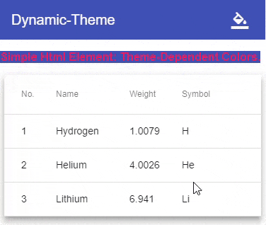
.theme-dependent-colors {
background: mat-color($primary);
color: mat-color($accent);
}
}
/**
* Define your custom themes in this map.
* The `key` of each member is the name of CSS class for that theme.
* To better understand the schema of the map, see `@each` loop below and especially pay attention to `map-has-key()` functions.
*/
$app-themes: (
indigo-pink : (primary-base: $mat-indigo, accent-base: $mat-pink),
deeppurple-amber: (primary-base: $mat-deep-purple, accent-base: $mat-amber),
pink-bluegrey : (primary-base: $mat-pink, accent-base: $mat-blue-gray, is-dark: true),
purple-green : (primary-base: $mat-purple, accent-base: $mat-green, is-dark: true),
);
@each $css-class, $theme in $app-themes {
$primary: if(map-has-key($theme, primary), map-get($theme, primary), mat-palette(map-get($theme, primary-base)));
$accent: if(map-has-key($theme, accent), map-get($theme, accent), mat-palette(map-get($theme, accent-base)));
$warn: if(map-has-key($theme, warn), map-get($theme, warn), mat-palette(
if(map-has-key($theme, warn-base), map-get($theme, warn-base), $mat-red)
));
.#{$css-class} {
@include define-css-classes(mat-light-theme($primary, $accent, $warn));
}
.#{$css-class}-dark {
@include define-css-classes(mat-dark-theme($primary, $accent, $warn));
}
.theme-primary.#{$css-class} {
background-color: mat-color($primary);
}
...
}
In typescript (see here):
import {Component, HostBinding} from '@angular/core';
import {OverlayContainer} from "@angular/cdk/overlay";

const THEME_DARKNESS_SUFFIX = `-dark`;

export class AppComponent {
    @HostBinding('class') activeThemeCssClass: string;
    isThemeDark = false;
    activeTheme: string;

    setTheme(theme: string, darkness: boolean = null) {
        if (darkness === null)
            darkness = this.isThemeDark;
        else if (this.isThemeDark === darkness) {
            if (this.activeTheme === theme) return;
        } else
            this.isThemeDark = darkness;

        this.activeTheme = theme;

        const cssClass = darkness === true ? theme + THEME_DARKNESS_SUFFIX : theme;

        const classList = this.overlayContainer.getContainerElement().classList;
        if (classList.contains(this.activeThemeCssClass))
            classList.replace(this.activeThemeCssClass, cssClass);
        else
            classList.add(cssClass);

        this.activeThemeCssClass = cssClass;
    }

    constructor(overlayContainer: OverlayContainer) {
        this.setThemeClass('indigo-pink', false); // Default theme
    }
}
See other things in stackblitz.
CAVEAT: Adding 8 dynamic material themes to the app (4 lights + 4 darks) increased the size of built styles.css by ~420 kB in my case (compared with one static material theme).
Solution 4
You can switch between themes by adding or removing css class(including material theme) on body tag at runtime based on current theme.
for example step 1.
add id to body tag in html file so that you can file element by element.
<body id="themeTag">
<app-root></app-root>
</body>
step 2.
create second theme in your scss file, file which is included in angular.json in angular 6 and .angular-cli.json in angular version lower then 6.
@include mat-core();
$primary: mat-palette($mat-blue);
$accent: mat-palette($mat-yellow);
$warn: mat-palette($mat-red);

$light-theme: mat-light-theme($primary, $accent, $warn);

@include angular-material-theme($light-theme);

$dark-theme: mat-dark-theme($primary, $accent, $warn);

.dark-theme { // css class for dark theme
  @include angular-material-theme($dark-theme);
}
step 3.
on button click change class of body tag
toggleTheme(){
   this.isDarkTheme = !this.isDarkTheme;
   if(this.isDarkTheme){
     /* here themeTag is id of body tag and dark-theme is css class created in theme file */
     document.getElementById('themeTag').classList.add('dark-theme');
   }else{
     document.getElementById('themeTag').classList.remove('dark-theme');
   }
}
Related videos on Youtube
 03 : 03 : 49
 12 : 31
 42 : 24
 39 : 35
 07 : 46
![Angular Material Theme – Custom Colors [Detailed overview, 2020]](https://i.ytimg.com/vi/99T-zQLcluM/hq720.jpg?sqp=-oaymwEcCNAFEJQDSFXyq4qpAw4IARUAAIhCGAFwAcABBg==&rs=AOn4CLDGpZyR6Rk-1e-PYI3kiKueUKnkRw) 09 : 52
09 : 52
 23 : 45
![Dynamic Colors in Angular Material in Hindi (part 1) | #ngMaterial | Uxtrendz (2021) [#9.1]](https://i.ytimg.com/vi/WCFczF3MFhQ/hq720.jpg?sqp=-oaymwEcCNAFEJQDSFXyq4qpAw4IARUAAIhCGAFwAcABBg==&rs=AOn4CLAASdkmvITC9S0gjsxz9dRamFrkeA) 08 : 37
08 : 37
Monica L
Updated on May 18, 2020Comments
-
Monica L almost 4 years
I've created my own scss theme and declared it in angular-cli.json, all works fine.
Now I need to dynamically change the theme.
I've tried to add the second theme in angular-cli.json, but as expected it overrides the first one.
So maybe one option would be to remove the theme declaration from angular-cli.json and have 2 components, each with it's own scss style, one overriding the other, the only difference between them being the styleUrls.
Or is there other recommended way to load dynamically a scss?
-
 Fredrik Lundin about 7 yearsIf you can extract your theme into a
css class, you can just toggle theclasson someroot html elementwith[ngClass] -
Monica L about 7 yearsThank you Fredrik, it might have worked but I found an example that uses the scss file. I had to add a new class to the scss file. I wrote more in the answer.
-
 Ben Taliadoros almost 6 yearsIs there any way to do this at runtime?
-
-
 Stefan Falk over 5 yearsAwesome! Is there a chance that you know how to create a new color and use it in components similar to the colors
primary,accentandwarn? -
K. Waite over 5 yearsFrom my research @StefanFalk that is not currently possible in the current version of Angular Material without creating a hacky solution.
-
 Halil İbrahim Oymacı about 5 yearsI think that this solution is better than
overlaycontainerbecause you must add class attribute to all component in overlay, but in this solution after you set body, all other components changed automatically. Thank you. -
Charles Robertson about 5 years@K. Waite Does this change affect the theme in every component, or do I need to add the code in 'app.component.ts' to every other component? I have hundreds of components, which would make this a major headache. Or is this the purpose of your observable? Maybe the observable propagates the changes to all its listeners. Although, this would still require a lot of extra work...
-
K. Waite about 5 years@CharlesRobertson - The change you make here would affect the theme in each component(as long as those components are using angular material standards, like using 'primary', 'accent', etc.) without having to change the code in every single component.
-
Charles Robertson about 5 years@K. Waite That's great news! I know I have added the odd class to a bootstrap button here & there, to get it to match the Material theme. But, generally, I haven't tampered with the theme. I think I will replace my bootstrap buttons with Material buttons & then I am sorted.
-
 kumaheiyama over 4 yearsExcellent! Works without a hitch in latest Angular CLI (8.0.6)