Animate circles on circular path
Solution 1
CSS will give smoothness take a look at this
It is better to use CSS3 instead of JavaScript because the resultant animation is always guaranteed to be smoother (especially on mobile devices) plus it can save on battery power.
Solution 2
You asked for a JavaScript solution, but it's possible to do this in most modern browsers without any JavaScript by using keyframe animations.
CSS
@keyframes rotate {
    0%, 50% {
        /* Keep the element at 12 o'clock until halfway through animation. */
        transform: rotate(0deg) translateY(-150px) rotate(0deg);
    }
}

#centre {
    /* Position circles in the centre of the viewport. */
    position: fixed;
    left: 50%;
    top: 50%;

    /* IE 10 bug: force hardware acceleration to prevent edge pixels
       being left behind on animation. */
    transform: rotateZ(0.01deg);
}

.circle {
    background: red;
    border-radius: 50%;
    position: absolute;
}

.middle {
    height: 200px;
    width: 200px;
    left: -100px; /* top/left equal to radius. */
    top: -100px;
}

.outer {
    /* Note: first half of animation duration is spent at 12 o'clock. */
    animation: rotate 2s ease-out 1;
    height: 60px;
    width: 60px;
    left: -30px; /* top/left equal to radius. */
    top: -30px;
}

.at-8-oclock {
    /* Two rotate transforms are used to maintain orientation while turning.
       First rotate is angle about centre from top; second is just minus this.
       translateY is set to the radius of the circular path being followed. */
    transform: rotate(-120deg) translateY(-150px) rotate(120deg);
}

.at-10-oclock {
    transform: rotate(-60deg) translateY(-150px) rotate(60deg);
}

.at-12-oclock {
    transform: rotate(0deg) translateY(-150px) rotate(0deg);
    z-index: 2; /* This one stays on top. */
}

.at-2-oclock {
    transform: rotate(60deg) translateY(-150px) rotate(-60deg);
    z-index: 1; /* Make this slide out from between 12 and 4 o'clock. */
}

.at-4-oclock {
    transform: rotate(120deg) translateY(-150px) rotate(-120deg);
}
HTML
<div id="centre">
    <div class="middle circle"></div>
    <div class="outer circle at-8-oclock"></div>
    <div class="outer circle at-10-oclock"></div>
    <div class="outer circle at-12-oclock"></div>
    <div class="outer circle at-2-oclock"></div>
    <div class="outer circle at-4-oclock"></div>
</div>
It gracefully degrades to showing the circles in their final positions when CSS animation isn't supported. Dabblet automatically adds prefixes where needed; in production, you would either use -prefix-free or manually add prefixed versions of the @keyframes rule and the animation and transform properties.
Unfortunately, IE 9 doesn't support keyframe animations and is still in widespread use, so it doesn't get the nice animation effect. If it's important to you, you could remedy this by using JavaScript for browsers that don't support CSS animation. Here's a demonstration on jsFiddle that uses Modernizr to detect for @keyframes support and -prefix-free to get the prefixed CSS transform property. Here's the bit of code that does the animation:
JS
// Delay animation for specified time.
setTimeout(function() {

    // Start animating.
    interval = setInterval(function() {

        // Increment step or finish animation.
        if (step > steps) {
            clearInterval(interval);
            return;
        } else {
            step++;
        }

        // Move each circle to its new position.
        for (var i = 0; i < circleCount; i++) {
            var circle = circles[i],
                newAngle = Math.easeOutQuad(
                    step,
                    circle.startAngle,
                    circle.rotateThrough,
                    steps
                );

            // Update circle angle.
            circle.currentAngle = newAngle;
            setCircleAngle(circle.element, newAngle);
        }

    }, intervalMs);

}, startAfterMs);

// Set the angle of one of the circle elements.
function setCircleAngle(circle, angle) {
    var x = pathRadius * Math.cos(angle * Math.PI / 180),
        y = pathRadius * Math.sin(angle * Math.PI / 180);

    circle.style.top = (x - circleRadius) + 'px';
    circle.style.left = (y - circleRadius) + 'px';
};

Math.easeOutQuad = function (t, b, c, d) {
    t /= d;
    return -c * t*(t-2) + b;
};
I've tested this in an IE9 VM and the result is comparable, if not so smooth. It doesn't work in IE8 and below; -prefix-free doesn't support those versions, and it would take more hacks than I can easily justify just to get border-radius working. As of date, this gives a conservative estimate of ~90% current browser support, increasing as people update from older versions of IE or switch to other browsers.
Solution 3
You could go with jQuery.Path for that. Its not perfect but may you can take a look in the scr and add the functionality you need.
Here's a Fiddle showing basic functionality.
var arc_params = {
    center: [100,100],
        radius: 50,
        start: 0,
        end: 72000
  }
function animate(){
$(".animatingDiv").animate({path : new $.path.arc(arc_params)}, 100000)
}

animate();
Nickon
Updated on April 30, 2020Comments
-
Nickon about 4 years
I have an object (image) in the center of the screen. Now I want to animate some circles around this object. What is the best idea to realize that task? Should I use any dedicated
JSlibrary for animation?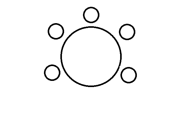
-
Nickon over 10 yearsJSFiddle doesn't work for me, but I will read about JQuery paths, thanks
-
 Mx. over 10 yearsseems like you have to use firefox :-/
 -
Mx. almost 10 yearsAll browsers - no. All modern browsers - yes. Take a look at the other answers. I recently found GSAP to be very useful.
-
Mx. almost 10 yearsJavaScript is not allways a bad decision for animations. jQuery is. You should have a look at GSAP - greensock.com/transitions