Ant Design - Vertical Group of Checkboxes
Solution 1
Doesn't appear like it does since the <label>s it renders are display: inline-block. The simplest solution (other than rewriting the component) is to change .ant-checkbox-group-item's attributes from (you can always wrap the CheckBox with another class name to apply selectively, instead of globally):
.ant-checkbox-group-item {
    display: inline-block;
    margin-right: 8px;
}
to:
.ant-checkbox-group-item {
    display: block;
    margin-right: 0;
}
Which will make it appear like so:
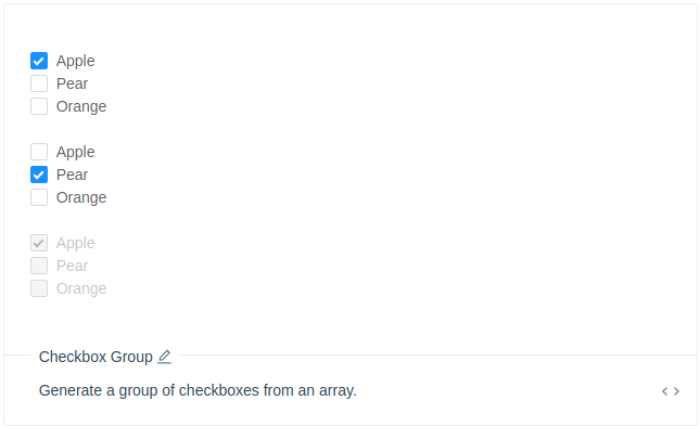
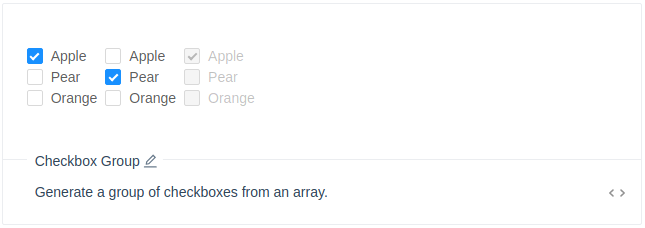
Optionally, you can also add a display: inline-block attribute to .ant-checkbox-group's styles.
Which will then make it appear like so:
Another solution is to create some reusable components and apply the above via the style property (admittedly, not an elegant solution since CheckboxGroup's onChange function expects to handle options, but you'd have to intercept them in order to alter the Checkbox's style property).
Working example: https://codesandbox.io/s/w0voxxxzm5
Checkbox.js
import React from "react";
import { Checkbox } from "antd";

export default ({ disabled, label, value, handleChange }) => (
  <Checkbox
    style={{ display: "block", marginLeft: 0 }}
    disabled={disabled || false}
    label={label}
    checked={value}
    onChange={handleChange}
  >
    {label}
  </Checkbox>
);
CheckboxGroup.js
import React from "react";
import Checkbox from "./Checkbox";

export default ({ options, ...props }) => (
  <div
    className="ant-checkbox-group"
    style={{ display: "inline-block", marginRight: 10 }}
  >
    {options.map(label => (
      <Checkbox
        key={label}
        label={label}
        disabled={props.disabled}
        handleChange={props.handleChange}
        value={props[label]}
      />
    ))}
  </div>
);
Form.js
import React, { Component } from "react";
import CheckboxGroup from "./CheckboxGroup";

const options1 = ["Apple", "Pear", "Orange"];
const options2 = ["Strawberry", "Grape", "Mango"];
const options3 = ["Kiwi", "Banana", "Cherry"];

export default class Form extends Component {
  state = {};

  handleChange = ({ target: { label, checked } }) =>
    this.setState({ [label]: checked });

  handleSubmit = e => {
    e.preventDefault();

    alert(JSON.stringify(this.state, null, 4));
  };

  render = () => (
    <form onSubmit={this.handleSubmit}>
      <CheckboxGroup
        {...this.state}
        options={options1}
        handleChange={this.handleChange}
      />
      <CheckboxGroup
        {...this.state}
        options={options2}
        handleChange={this.handleChange}
      />
      <CheckboxGroup
        {...this.state}
        options={options3}
        handleChange={this.handleChange}
        disabled
      />
      <div style={{ marginTop: 20 }}>
        <button className="ant-btn ant-btn-primary" type="submit">
          Submit
        </button>
      </div>
    </form>
  );
}
Solution 2
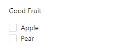
Not sure if this was always working (since the question is 2 years old), but it is possible to arrange the checkboxes within a group vertically without tweaking the styles by simply wrapping each of them in a <Row> component:
import { Checkbox, Row, Form } from 'antd';

function onChange(checkedValues) {
  console.log('checked = ', checkedValues);
}

const GoodFruitForm = () =>
  <Form>
    <Form.Item label="Good Fruit">
      <Checkbox.Group onChange={onChange}>
        <Row><Checkbox value='Apple'>Apple</Checkbox></Row>
        <Row><Checkbox value='Pear'>Pear</Checkbox></Row>
      </Checkbox.Group>
    </Form.Item>
  </Form>
And the content renders as expected:
Solution 3
Following Matt Carlotta example if you are using a variant of styled component, you can achieve that with
export const ColumnCheckbox = styled(Checkbox.Group)`
.ant-checkbox-group-item {
    display: block;
    margin-right: 0;
}
`
<ColumnCheckbox options={['Hello','Hello1','Hello2']}/>
Solution 4
you can do this, and the content in item is also aligned and right!
   .ant-checkbox-group {
      display: flex;
      flex-direction: column;
    }
Comments
-
Foobar over 1 year
I am trying to make a column of checkboxes using Ant design. I have tried:
 <Checkbox.Group>
          <Checkbox>Hello</Checkbox>
          <Checkbox>Hello1</Checkbox>
          <Checkbox>Hello2</Checkbox>
</Checkbox.Group>
And:
<CheckboxGroup options={plainOptions} value={this.state.checkedList} onChange={this.onChange} />However, there does not seem to be an option to make checkboxes appear in a column instead of a row. I know I can use flexbox, but I was hoping Ant design would have a builtin method for making checkboxes appear vertically (in a column) instead of appearing in a horizontal row.
Is there a simple solution for stacking the checkboxes vertically?
-
 Silambarasan N over 3 yearsPlease refer the <div className={styles.content}> </div>, this will give you vertical checkbox group for two columns. You can increase/decrease the column count by adding or removing the grid.