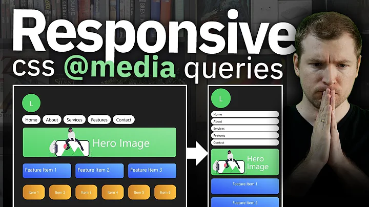
Apply CSS class based on media query
Solution 1
Use the col-xs-2 on the div, and add a custom media query to take when screen fits the col-lg-* size.
For example you have this setup:
<div class="container-fluid">
   <div class="row">
       <div class="col-xs-2 custom-lg-col">
           .....
       </div>
       .....
   </div>
</div>
then you can add this to your styles file:
@media (min-width: 1200px) {
  .custom-lg-col {
    width:...;
    display:table;
    ......
  }
}
But you can also leave the col-lg-2 and just add a custon class like this
<div class="container-fluid">
   <div class="row">
       <div class="col-xs-2 col-lg-2 only-desk-class">
           .....
       </div>
       .....
   </div>
</div>
Style:
@media (min-width: 1200px) {
  .only-desk-class {
    width:...;
    display:table;
    ......
  }
}
If you don't want to change the col-lg-* default style, just apply your custom div to the content inside..
Solution 2
use matchmedia javascript if statement. Also a better idea to use the Monderizer library which will handle this functionality a lot better.
if (window.matchMedia('your_query').matches){
 //add class
}
Related videos on Youtube
Francisco Goldenstein
I'm a Software Engineer certified in JavaScript/jQuery/AJAX/CSS3 (Microsoft Exam 70-480) and ASP.NET MVC 4 (Microsoft Exam 70-486). I'm very good at: C#, ASP.NET MVC, JavaScript, jQuery and AJAX. Database: T-SQL, Entity Framework, database design and index improvements. Object Oriented Programming and Design Patterns. Teaching (I've been working as a professor at College for more than 7 years).
Updated on October 23, 2022Comments
-
 Francisco Goldenstein over 1 year
I'm using Bootstrap 3. What's the best approach to apply different CSS classes based on media queries? I need to apply Bootstrap col-xs classes when it's a mobile device but only apply a custom CSS class when it's the desktop version (md, lg). Right now I have 2 divs and one gets visible based on media queries but I don't want to have the DIV repeated because of that.
I know I can apply col-md and col-lg to a DIV and I'm doing it in many places but this case is different. In mobile devices I want to apply col-xs-2 but in the desktop version I need to make it behave like a table so I use display:table.
-
Rodrigo C about 8 yearsI think you are misunderstanding how these get applied and used. You can use col-md-x and col-sm-x etc on the same element. If you want to hide one in particular on a certain media query, you can use the utilities like hidden-xs, hidden-md, hidden-sm, etc
-
-
 Francisco Goldenstein about 8 yearsThis is what I needed, the key was to override width property. In my case I set it to '' to take the default value.


