Change Bootstrap column class attribute based on screen size/media query
Paul Fitzgerald, Hi there. Are you just wanting to change this from 6x6 when lg... to 9x3 at md ?
If so have a look at this Fiddle.
Resize the window. I you do not want this to stack then let us know.
<div class="container">
    <div class="row text-center">
        <div class="col-md-9 col-lg-6 block1"><h2>Header 1</h2></div>
        <div class="col-md-3 col-lg-6 block2"><h2>Header 2</h2></div>
    </div>
</div>
The screenshot below shows the change when resized from LG 6x6 to MD 9x3.
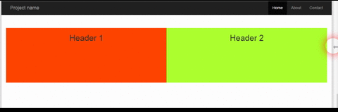
Added to this post
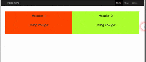
Paul, I think this is what you are wanting here, to have a new media breakpoint between MD and LG.
In the screenshot below I added text to show when it is using LG and XLG and MD.
Here is the Fiddle.
Hope this gets you started with how you want this.
Paul Fitzgerald
Mostly coding in React, React Native and Node.js 💻📱✌🏻 https://github.com/Pau1fitz
Updated on June 27, 2022Comments
-
Paul Fitzgerald almost 2 years
I am using Twitter's bootstrap and I have a problem. I am using the grid system and in my html have used the
col-lg-6class to create a two different columns with equal width. See code below:<div class="row"> <div class="row sameHeightCols"> <div class="col-lg-6"> <div class="contentBlock"> <h3>Header</h3> </div> </div> <div class="col-lg-6"> <h3>Header2</h3> </div> </div> </div>The issue I am having is that when it hits a certain screen size it breaks and some of the content in the left block disappears. This occurs when screen size is between
col-lgandcol-md. What I would like to to do is change the classes at a certain screen size so it changes to this.<div class="col-lg-9"> <div class="contentBlock"> <h3>Header</h3> </div> </div> <div class="col-lg-3"> <h3>Header2</h3> </div>Is this possible in css with a media query? or do I need to use javascript? Any help would be greatly appreciated as I have done a lot of research and cannot find a solution. Please also let me know if any further code/info is required.
Thanks.